Blog
What Lies in Your Future?
My first assignment for my Vector Graphics class was to design twelve related icons about anything I wanted. Now, I am going into this with very, very minimal experience in Adobe Illustrator. I’ve messed around in it a couple times, but other than that, I’m about as amateur as you can get, so this task was a little daunting for me. I wracked a couple ideas around in my brain, and finally settled on designing an icon set for the horoscopes–Gemini, Leo, Taurus, etc. I’ve always been embarrassingly interested in stuff like this. I’ll check my horoscope from time to time (I’m a Gemini) just for fun, and I decided to indulge in this weird hobby of mine.
SKETCHES
I first started by taking notes of the different horoscope signs. I also learned while doing a bit of research of all the symbols, that each sign has its own elements attached to it as well, and I wanted to somehow incorporate that into the design as well. I then started by sketching out designs for Libra, the scales; Cancer, the crab; Sagittarius, the archer; Pisces, the fish; and Aquarius, the water-bearer. After sketching out some starter designs in my sketchbook, it was time to dive in to the computer.
DRAFT
I was really pleased with how my sketches turned out, and I wanted to keep a hand-drawn element to my icons, rather than them having incredibly clean lines and leaning more towards the geometric side. I uploaded images of my sketches into Adobe Illustrator and used the Blob Brush tool to trace the sketches that I drew. After tracing all of the sketches into Illustrator, I then added color, but I didn’t want the colors to be too bright, so I leaned more towards desaturated and pastel shades. I also added Gemini, the twins, to my draft as well. However, since I needed twelve icons, it was back to the literal drawing board.
SKETCHES AND DRAFT PT. 2
I finalized my sketches for the rest of the icons–Capricorn, the sea-goat; Virgo, the maiden; Scorpio, the scorpion; Leo, the lion (and my personal favorite); Taurus, the bull; and Ares, the ram. I then jumped back in to Illustrator and did what I did with the past icons by tracing them in with the Blob Brush tool to keep the same style as the first six.
After looking at these sketches drafts of the icons, I still felt there was something wrong with them. I then remembered the notes that I took about the signs and how each one is assigned to an element, and I decided to add those as a background to the icons to give them a better sense of unity.
After designing the backgrounds, I finally went in and did some minor adjustments to the icons. I made the strokes a little thinner, changed the colors of the detail lines within the icons (the scales of the fish and the handles of the water jug), and then added the backgrounds to each icon.
FINAL
As you can see, I changed some colors, like Virgo’s dress, changed the colors of the detail lines so they didn’t look so heavy and bogged down, and simplified other parts, like the gem at the top of the scales.
I am still so proud of these, even after looking at them after a few weeks of designing them. If course, there are still things that I would go in and change and fix–you’re never truly satisfied with what you’ve created–but for a first dive in to Illustrator to work on a large project, I’d say I’m pretty happy with how it turned out.
Miniature Portfolio
I’m sure that this won’t be the first time that I mention this, but I really love vintage and antique stuff. There’s this old antiques shop about twenty minutes away from me, and I will definitely stop by some time. That being said, I really want to try and incorporate that into my personal style of my photographs. I’m a huge fan of vignetting images to make the edges look more faded and to draw attention to the subject in the frame. I’ve also discovered split toning, and it is amazing. You’re able to achieve so much that you wouldn’t be able to have in a regular camera–unless it’s an old Polaroid.
Unfortunately, I don’t have one of my own, so I have to cheat a little bit in post. But it’s worth it.
Below are some of my favorite images that I’ve taken throughout the semester in my COMM 316 class–Professional Imaging. I’ve learned so much in this class and I’ve met some of the best people who share the same passions as me. So thank you to my friends in that class and my wonderful professor, Caryn Esplin, for teaching me so much about photography and solidifying my love for it.
Anyway, enjoy this miniature portfolio of some of my favorite work I’ve done over the semester!
Thank you COMM 316 for everything! I’ll miss everyone in that class, and for all of you guys who might be reading this:
Happy Photographing!
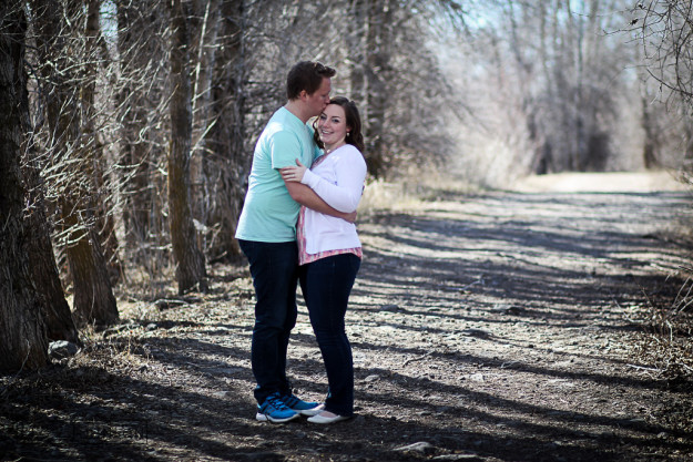
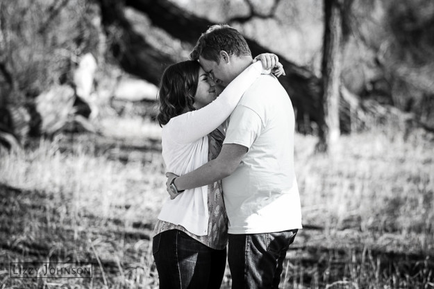
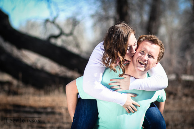
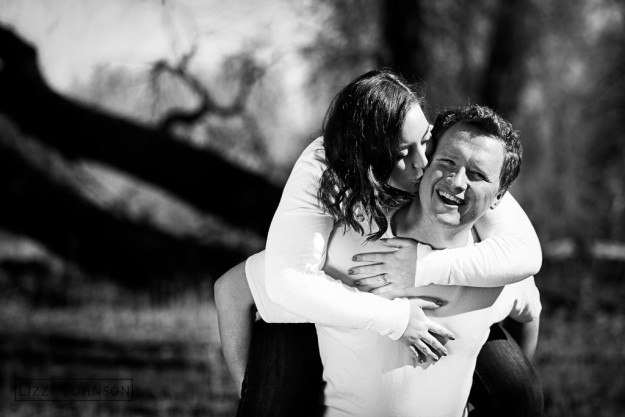
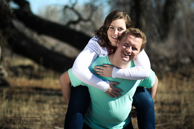
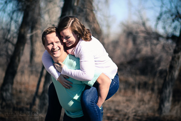
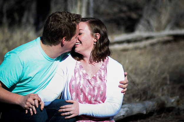
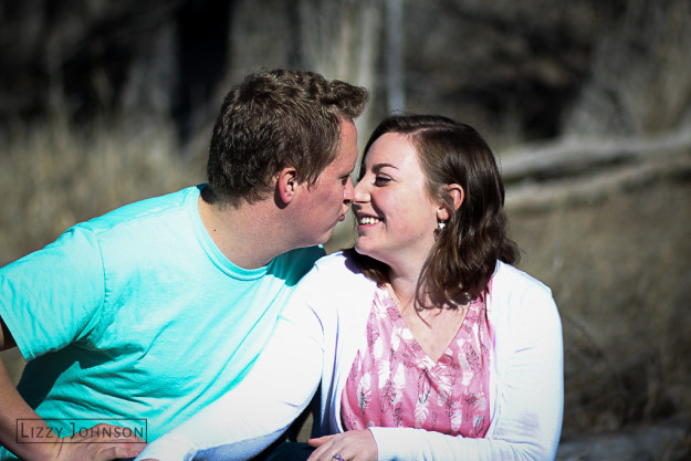
Chloe and Timmy
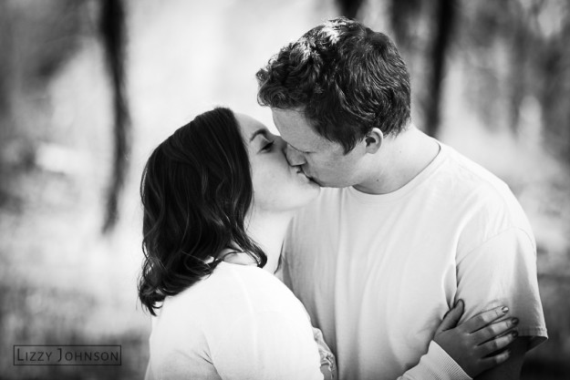
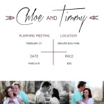
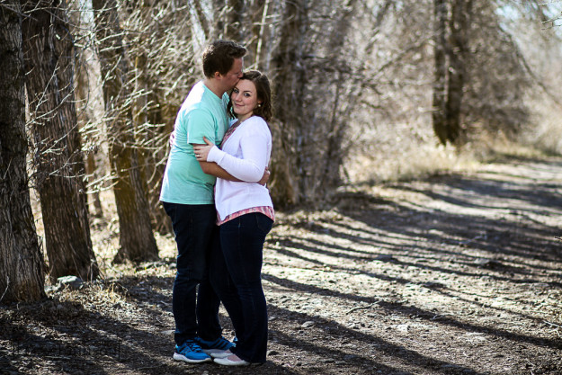
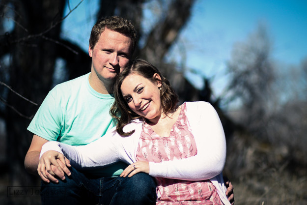
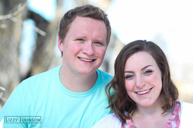
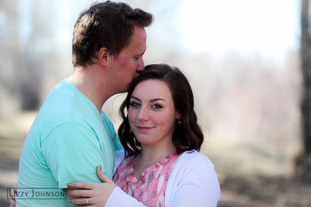
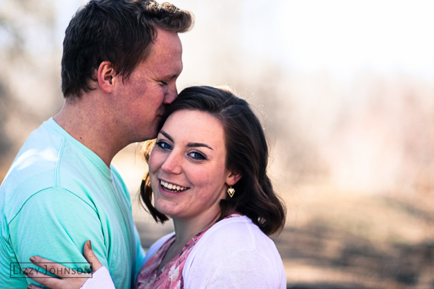
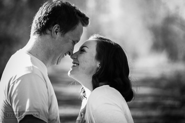
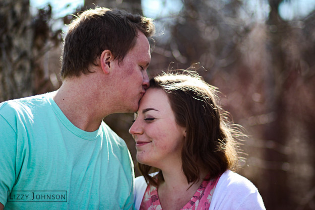
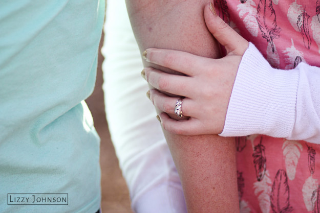
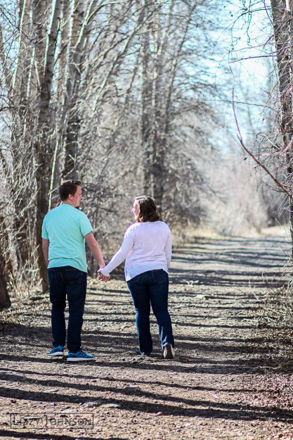
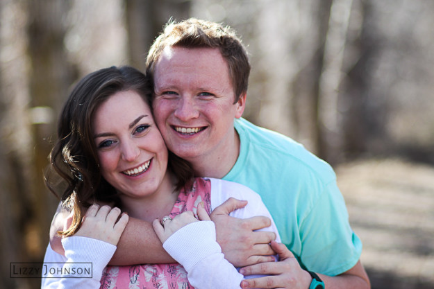
This was my first full client shoot, and it went better than I could have hoped! The happy couple were two of my friends, Chloe and Timmy, who are getting married in July. We got together on the 27th of February to talk about the locations and how long we’d be out shooting. I also had Chloe put together a Pinterest board of potential poses and photographs that she’d want. Here’s a layout of the plan that we discussed:
We went out to a local campground, Beaver Dick–yes, that’s what it’s called–where it has a lot of trails out into the fields and trees of Rexburg. Even though we took the pictures March 19th, where there wasn’t as much green in the trees and grass as I’d hoped, the pictures still turned out great! I used an 85 mm portrait lens with the aperture set to 1.8 to get the background as blurry as possible.
This shoot went great! There wasn’t a bump in the road as we took these photos. I do have to give a shout out to my friend Zoie for being my assistant and helping me out with the reflector and the on-hand beautician. You rocked it.
The pictures have been delivered to Chloe and Timmy, and I’ll be helping them print a few as well. Thank you, Chloe and Timmy, for asking me to take these photos for you and being so patient for my first engagement shoot. You made it so easy for me, and your photos turned out great!
Creative Resume Handout
Hello to you!
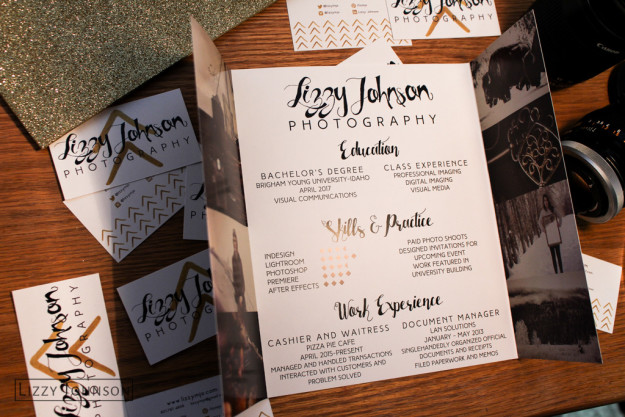
My name is Lizzy Johnson and I am an aspiring photographer and designer. I’m really grateful for this opportunity to show off photographs that I am proud of, as well as showcase skills in design. Plus, my resume needed a bit of a revamp.
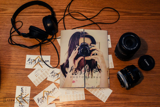
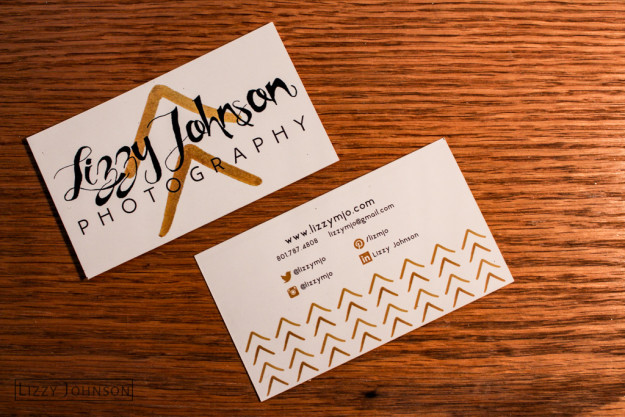
I’ve wanted to be a photographer for a long time. I remember stealing my parent’s old point and shoot camera and going out to take pictures of flowers in the garden. It’s surreal to see business cards and a resume that I’ve designed for my future career. It really solidifies my choices and where I am in my life now. It’s making extremely excited just thinking about it!
This project took hours of time. I completely redesigned my logo and colors for this project, and I like it much better than my original logo I had designed. Also, getting the alignment on the gate fold brochure I had made for the resume was tricky. It took hours of hunching over my computer to get it just perfect. I changed all of the colors in the eight images on either side of the resume to be synonymous with the maroon and gold that I had chosen for my color scheme.
I did all the designing, folding, cutting, and sizing for this project. The eight photographs featured on the resume are also taken and edited by me.
Architecture
Sometimes we don’t realize that buildings have personality.
Architecture photography is beautiful. Buildings and architecture hold a lot of history, and they have their own personalities. One thing that I love about Rexburg is that it is filled with old buildings. Main Street is old buildings with modern stores–some still have paint on them from signs saying what they used to be. Architecture doesn’t have to be just a simple square, brick building. A lot of thought gets put into architecture, and I think that photographers should capture their design.
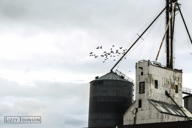
This is probably my favorite picture I took for this post. I love the industrial feel to the old buildings. You can see the rust and wear on the side of the white building, and the silo has great texture. Birds were flying all around the buildings, and I was able to capture a few mid-flight. The sky was also this beautiful steel gray that really enhanced the mood of the photograph.
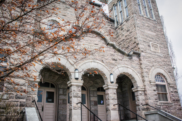
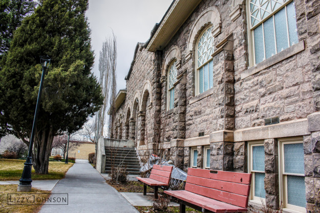
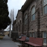
The bottom two photographs are HDR shots of the Rexburg Tabernacle. I had always seen this building in passing, but I had never really gotten a closer look before. I love the rough, gray stone of the building, and the HDR shot helped bring out the orange of the small leaves on the tree and the texture in the rock.
I had no idea there was a small park just behind the Tabernacle too! It was really quiet and peaceful. It was a happy accident that I found it.
I’d love to get more into photographing architecture. Sometimes we don’t really think about the time and effort it takes to designing beautiful buildings, and I think that photographing it can help us appreciate it more.
Here’s an article about architecture photography if you want to learn a bit more about it, and maybe get some ideas of your own.
Happy Photographing!
Vintage Planes and Cars
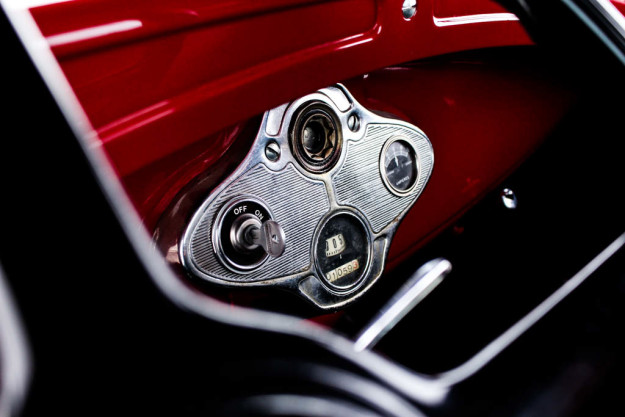
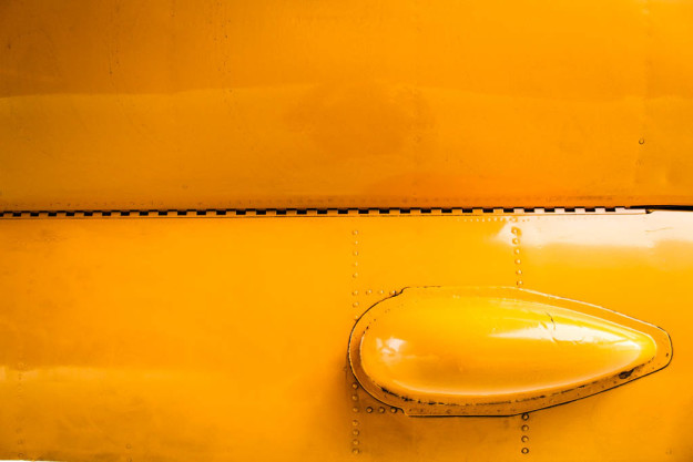
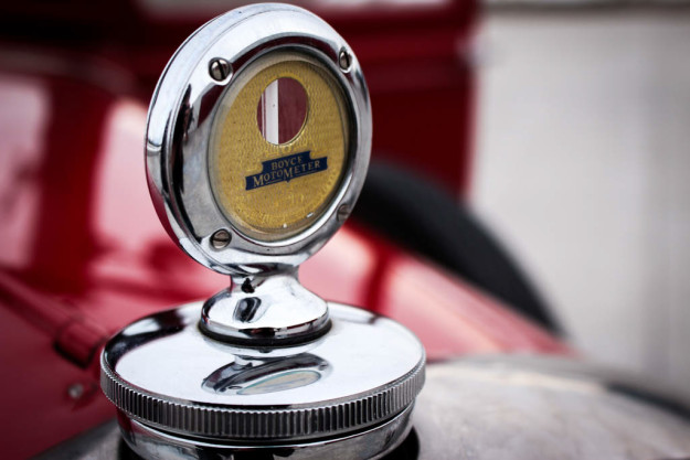
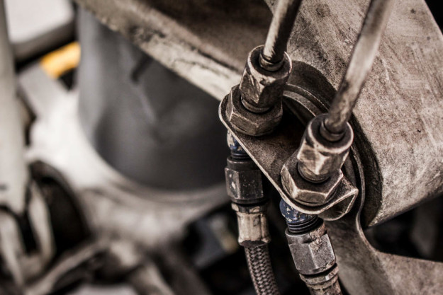
When taking pictures of the vehicles they used in the 1940s, I definitely wanted to take a different approach by focusing on the details rather than taking a picture of the whole airplane or car. This really helps you see more of the airplane or car that normally gets overlooked.
The photograph above and the photograph below are my two favorites from taking pictures of the planes and cars in the museum. The yellow of the airplane was textured and had rust around the different bolts and screws, and the grooves in the metal in the photograph above also add great texture to the photo, and it also contrasts against the sleek red finish of the vintage Ford.
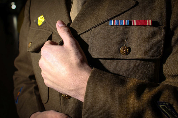
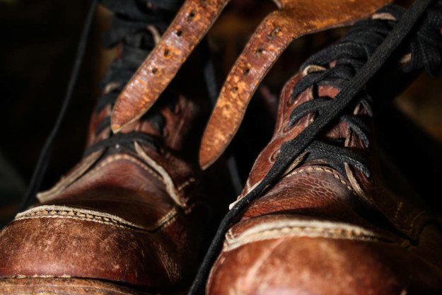
Accessories of the 1940s
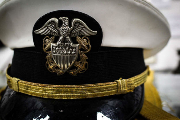
War accessories for the 1940s were everywhere. World War II was so embedded in the culture of that time, and it integrated itself into daily life.
I wanted to focus on the buttons and insignia’s on the uniform, and adding a human element by incorporating the hands really personalizes the image.
Speed lights were such a life saver for this shoot. I used them for the last two images, and it really helped me illuminate the subject and add awesome shadows to the photos. I adds a great mood to the photos that I feel is cohesive to the time period.
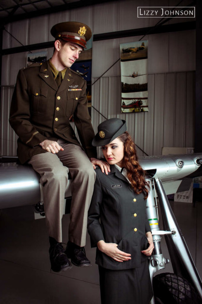
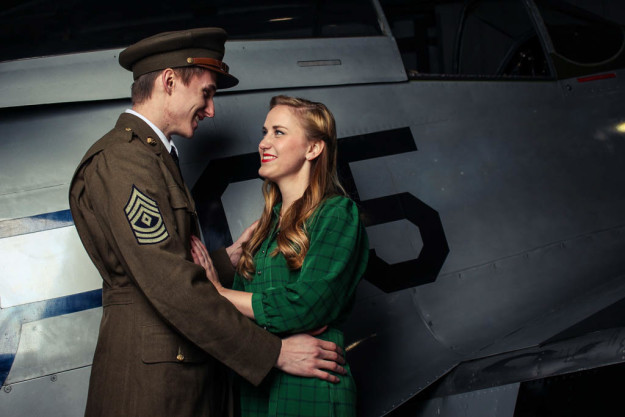
1940s Group Shots
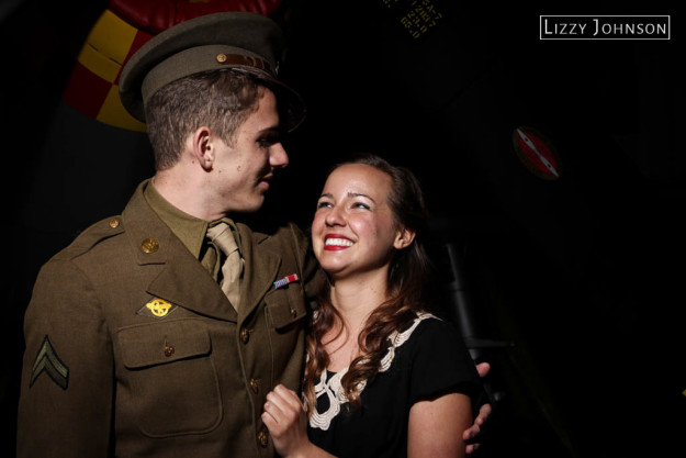
When I was taking these photos, I definitely played with the man-off-to-war trope, but it just fits in so well with the 1940s. It’s just so timeless and romantic! I couldn’t help myself. Shout out to all the models that hadn’t met each other before this shoot that I made sidle up to each other. Ya’ll were the best and helped fulfill the ideas that I had in my head. Good sports, all of you!
Women of the 1940s
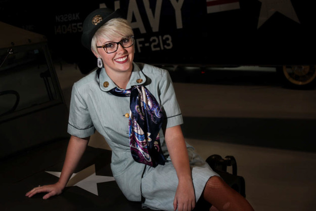
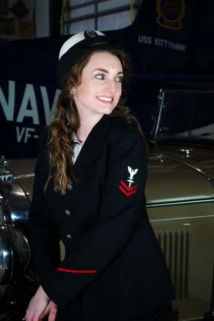
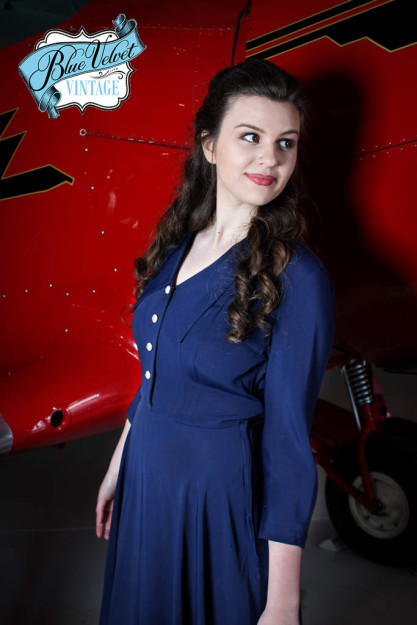
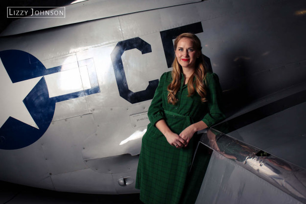
1940s fashion is so classic, and it just amplifies a persons attractiveness–and these ladies were no exception. They were all so cheerful and willing to do anything, which was really helpful to me as a photographer. They definitely worked those authentic 1940s clothes that they were given, that’s for sure! Those girls were so beautiful.
The 1940s had such a timeless style. You are definitely seeing those dress styles coming back now! I feel like this post is also quite appropriate: it’s Women’s History Month! Shout out to the women that served in the military during World War II. We wouldn’t have won the war without you!
Men of the 1940s
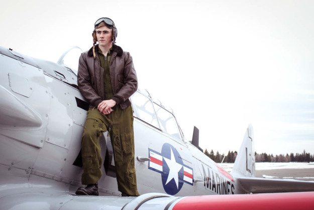
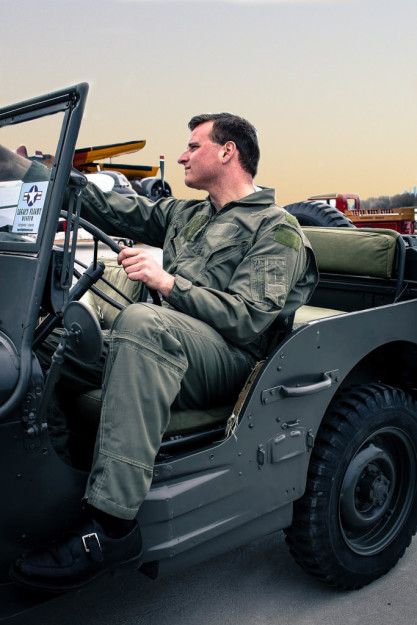
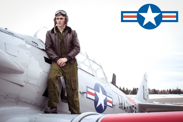
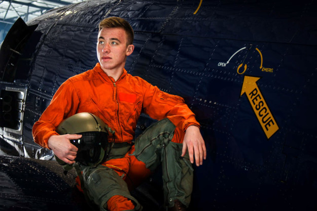
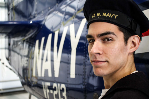
I don’t know about you, but there is a certain something about a man in authentic 1940’s war uniforms that just increases his attractiveness. This shoot was probably one of the most fun I’ve ever had doing portraits, and after doing this, I can definitely say that I love doing fashion photography. The models we had were so fun and nice to work with, and I am very happy with all of the photographs that I was able to get.
For this shoot, we went out to a WWII airplane museum that had authentic planes from that time, as well as all of the clothing that that is featured in this shoot. So cool!
For this image above, the sky was very overcast. So I blended in an image of a gradual sunset that I had taken in California a few months ago. It definitely makes the photograph look more dynamic.
It was so cool working with the different planes and being able to place myself back in time to the 1940s. The fashion back then was definitely centered around the war, and I loved being able to get a glimpse of what life was like back then.
This link gives great tips on photographing fashion! Go check it out to learn more about it!
Happy Photographing!


