Blog
Hildog Honey
I was commissioned by Hildog Farms in Kalaheo, Hawaii to design a logo to put on jars for their new honey farm. I was given a lot of creative freedom in designing this logo, so I immediately got to work.
The first thing I wanted to do was incorporate the classic image of a beehive. However, I didn’t want the logo to look like every other beehive that has been designed before.
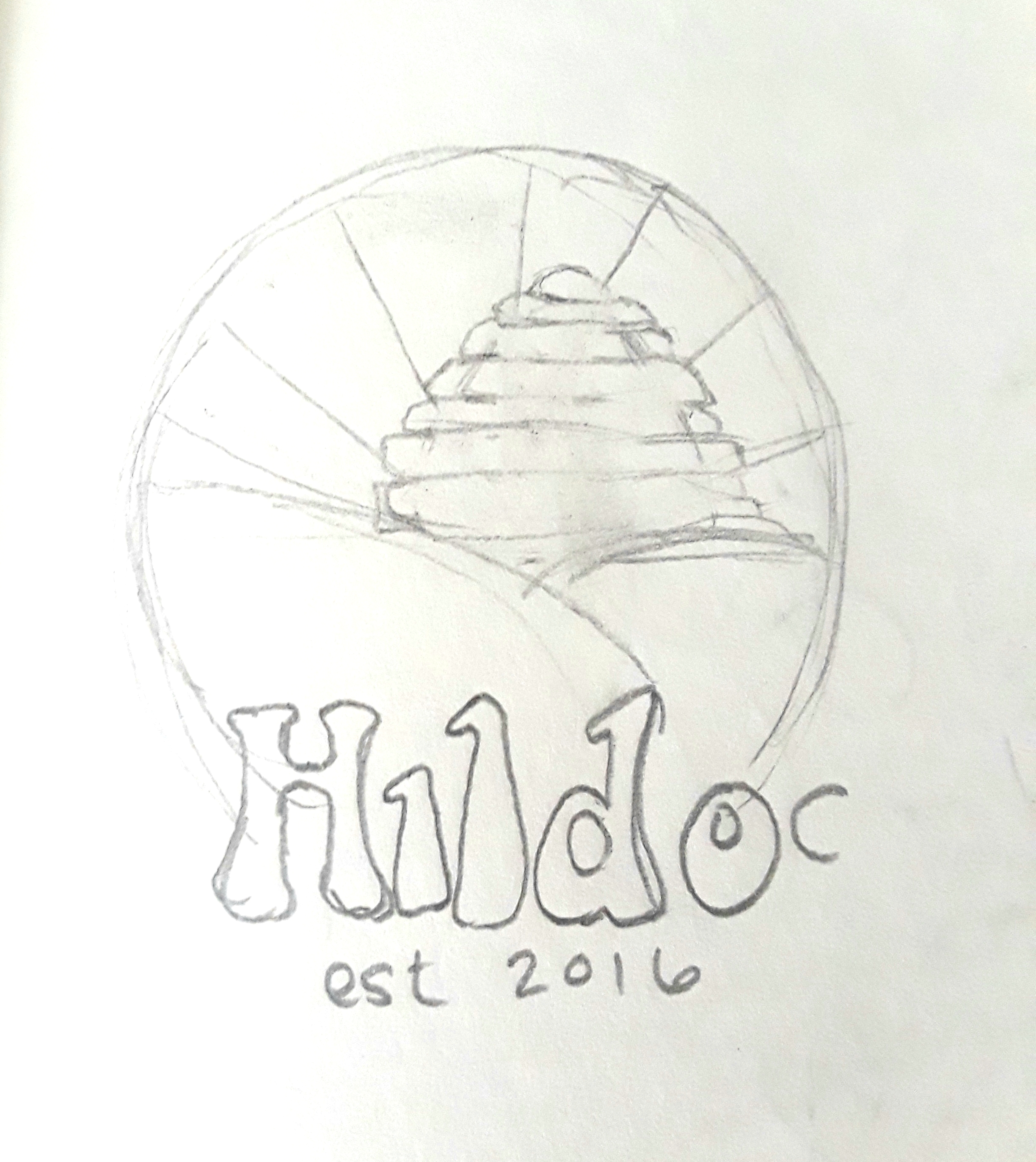
I started designing an initial basic logo for the farm itself, with a rising beehive representing the sun, rays of light emitting from the hive, and then two rolling hills in the foreground. However, I felt like while this logo could be given to represent the farm in its entirety, I felt that there should be a separate logo for the honey jars. Speaking with the owners, they agreed, and I immediately got to work.
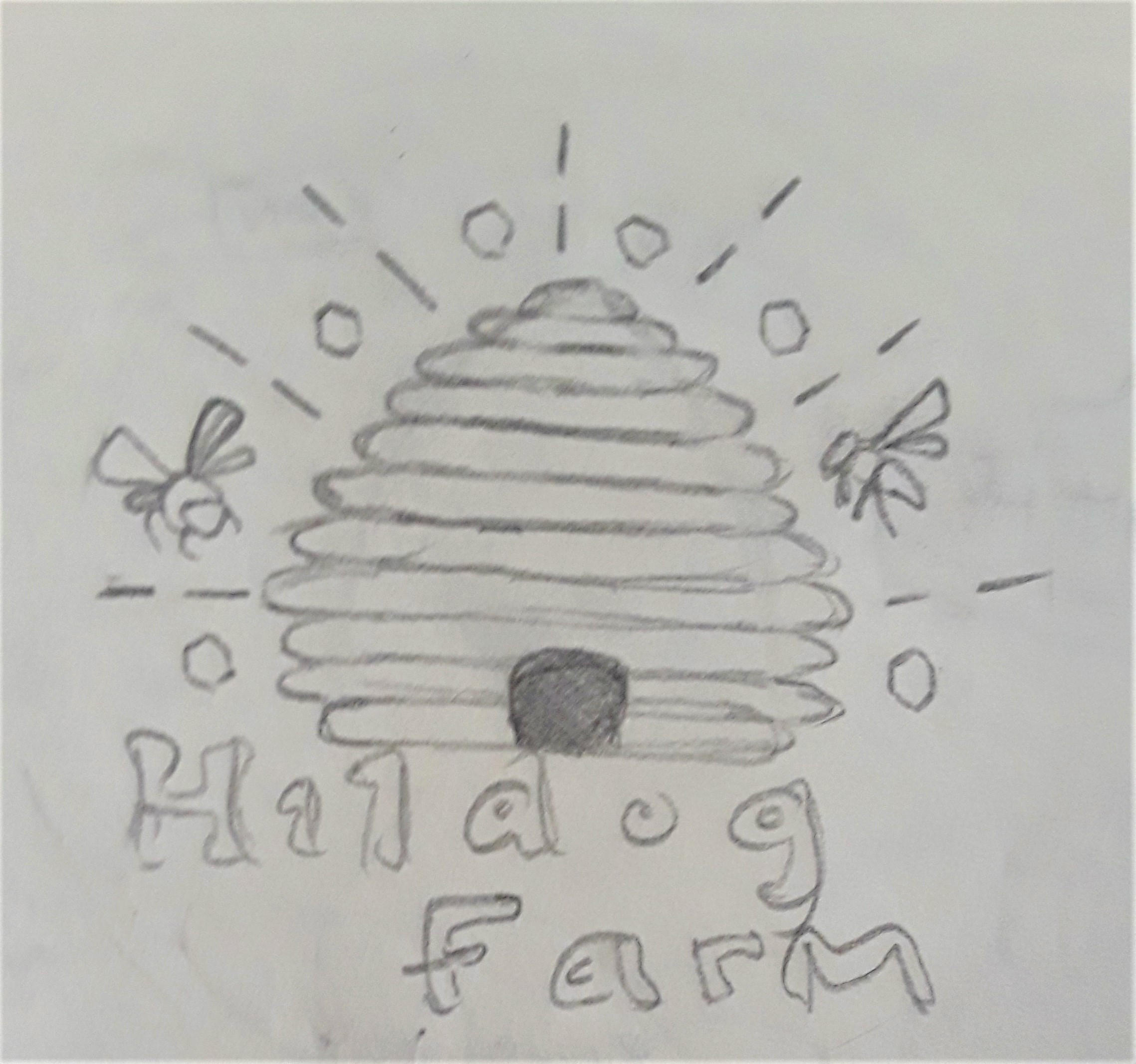
I’ve always loved the line art style of illustration and graphic design, and I wanted to create that instead of a fully colored logo to go on the labels. I initially started with just the beehive and then the words “Hildog Farm” underneath. It was still looking plain, so I decided to add more to the logo. I did some research by looking up images of honey bees flying and landing on flowers, and knew that this would be a great addition to have the bees floating around the hive. I also added accent lines surrounding the hive, as well as several hexagons within the empty areas between the lines.
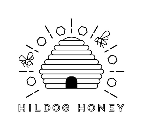
Creating the logo was fun and simple! I first used the Rounded Rectangle tool to build the shape of the beehive and its lines. Once I created the shape I liked, I then imported the sketch that I created above and used the Pen tool to trace around the shapes of the bees flying around the hive. Lastly, I used the Pen tool to draw two lines and the hexagons, and then copied both to surround the beehive at equal intervals using the Rotate tool.
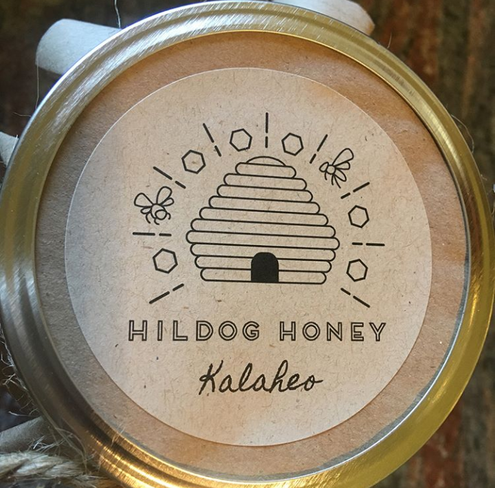
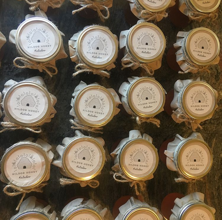
The logos turned out wonderful! The clients were incredibly happy with how they turned out, and they look perfect on the homemade jars of honey.
Cinemagraphs
I have been wanting for ages to create a successful cinemagraph–a photograph with one small element of movement added to it. I created one once before of a dripping faucet but I wasn’t really happy with it and I struggled with creating it in high quality.
So I decided there’s no time like the present!
Basically, the way to create a cinemagraph is to use a camera that has video capability, and instead of taking a photo of your subject, you take roughly a 10-15 second video of your subject and the movement you want to isolate.
I asked my roommate Zoie to go out with me and shoot, and I have no idea how I talked her in to standing in 15 degree weather without a coat as I ran around her fixing my settings on my camera to get the right shot. Regardless, she was a trooper. We were both freezing by the end of the shoot, but I would the results were worth it!
Once I took the videos I wanted we headed back home and I opened up my footage in Premiere Pro. You want to do your color grading and basic editing in Premiere so you can export the video in to Photoshop. At least, that’s what I initially did. Once I created the looping cinemagraph and masked in the movement I wanted to keep, I wanted to export the cinemagraph as a GIF.
However, the thing about GIFs is that they only have the capacity of about 256 colors. And most videos and photos are in the thousands when it comes to colors. The quality was pixelated and grainy, and the colors weren’t even close to what I intended.
Here’s a still from the GIF I originally made. Yeah, it wasn’t good.
So I did a ton of Googling to see if there was any way to keep the quality while exporting as a GIF, and I found out that it’s pretty much impossible if you have a high quality video with a lot of colors–which is what I had. All that was coming up was creating the cinemagraph as an MP4 instead.
The next hurdle was having to dive back in to my HTML knowledge and relearn how to embed a short video into a webpage while having it auto play upon loading and to play in an infinite loop–so basically a GIF, but a much higher quality than a GIF could give. And I did it! After these frustrating hurdles of GIFs being terrible and trying to figure out how to embed video, and even thinking that I’d never create a cinemagraph I’d be proud of, I managed to pull it all together!
You can definitely see the difference between the two! Again, above is a still from the pixelated GIF, and above is an HD looping MP4.
And then just for fun here’s another still photo of my beautiful friend:
Needless to say, now that I’ve successfully pulled off creating cinemagraphs, I have a feeling that I’ve opened the floodgates. This has just whet my appetite, and I will definitely be making a zillion more of these things in the future.
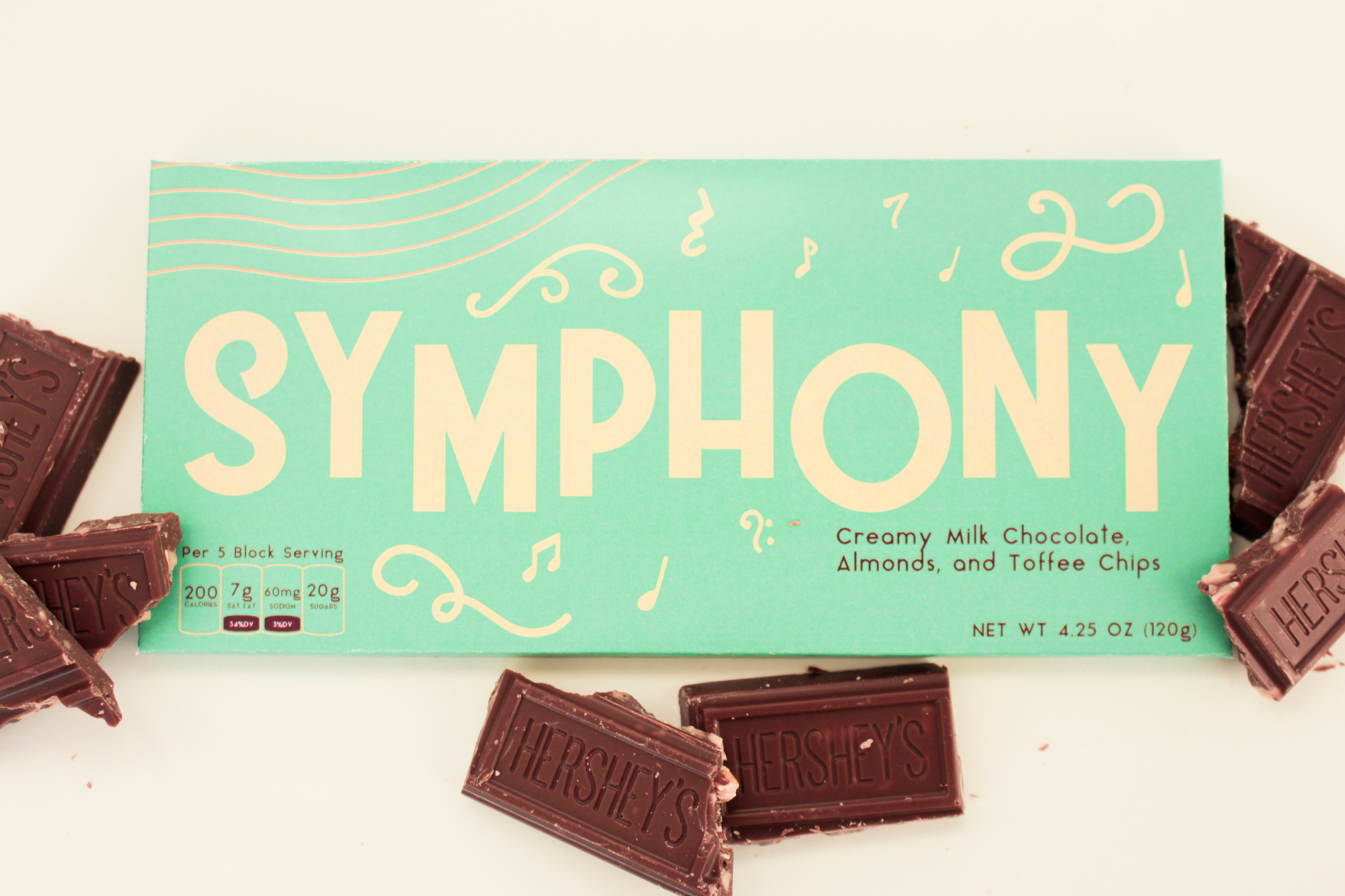
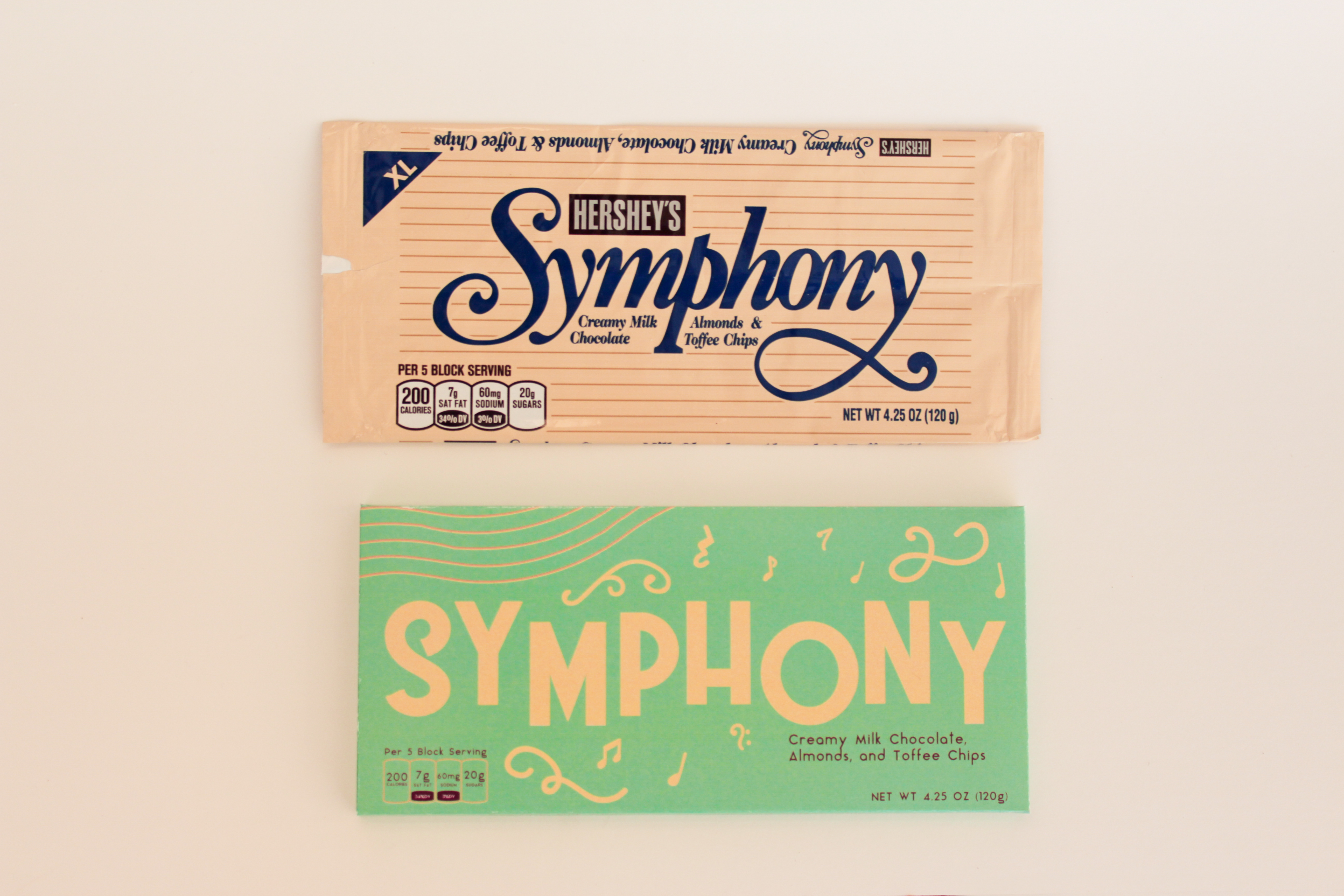
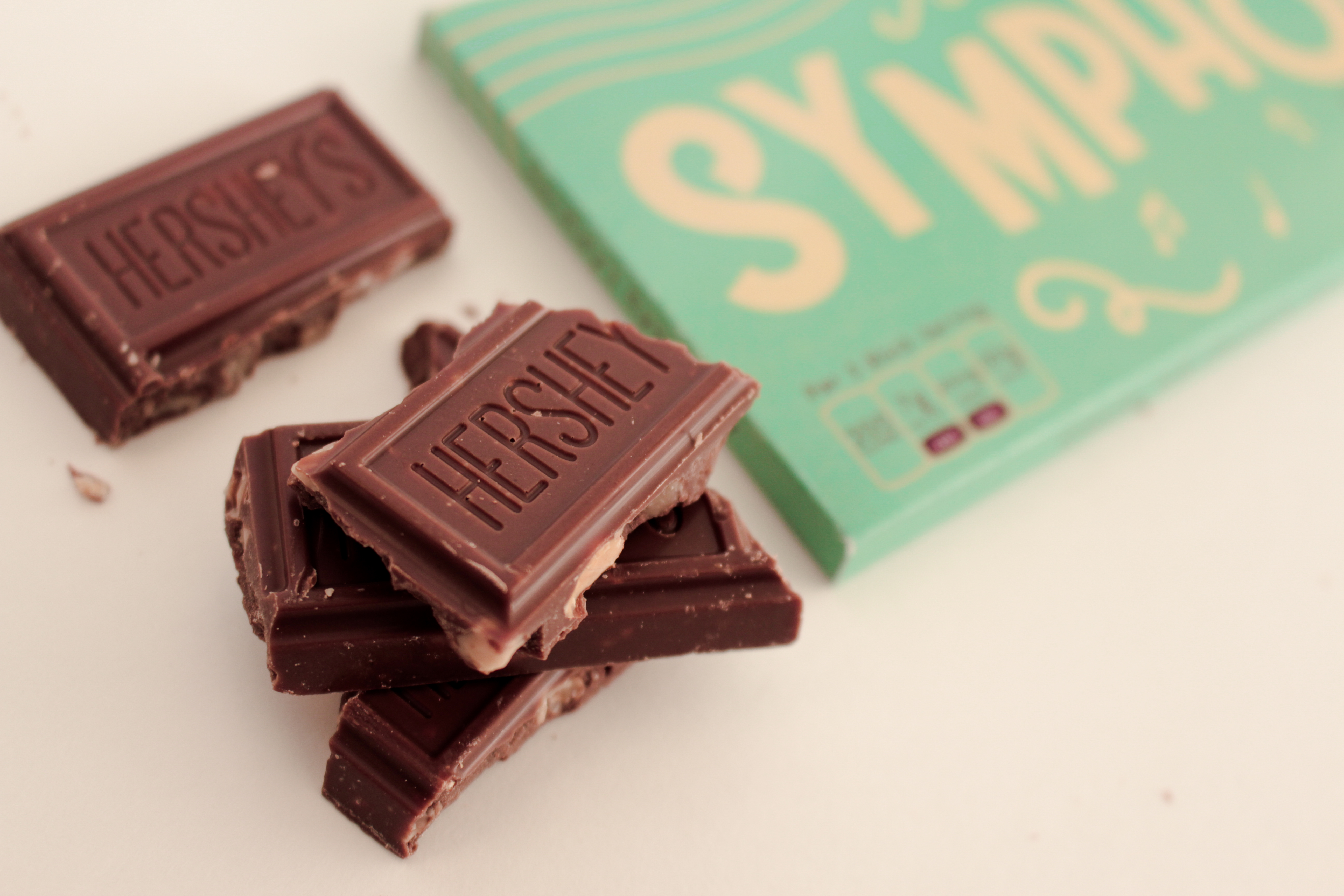
Symphony Bar Pitch Book
I recently redesigned a Hershey’s Symphony bar, and you can read all about that process on my last blog post here! After creating the potential redesign of the packaging, I created a mock Redesign Pitch Book that could be presented to the company to pitch the design and potentially have the design picked up. Within the pitch book is details pertaining to specific colors, fonts that were used in the design, and product photography of the new packaging.
I created the pitch book in InDesign, which was a program that I hadn’t touched in a while. While it was a slight learning curve trying to remember all the keyboard shortcuts and usage of the program, it came back easily to me.
PRODUCT PHOTOGRAPHY
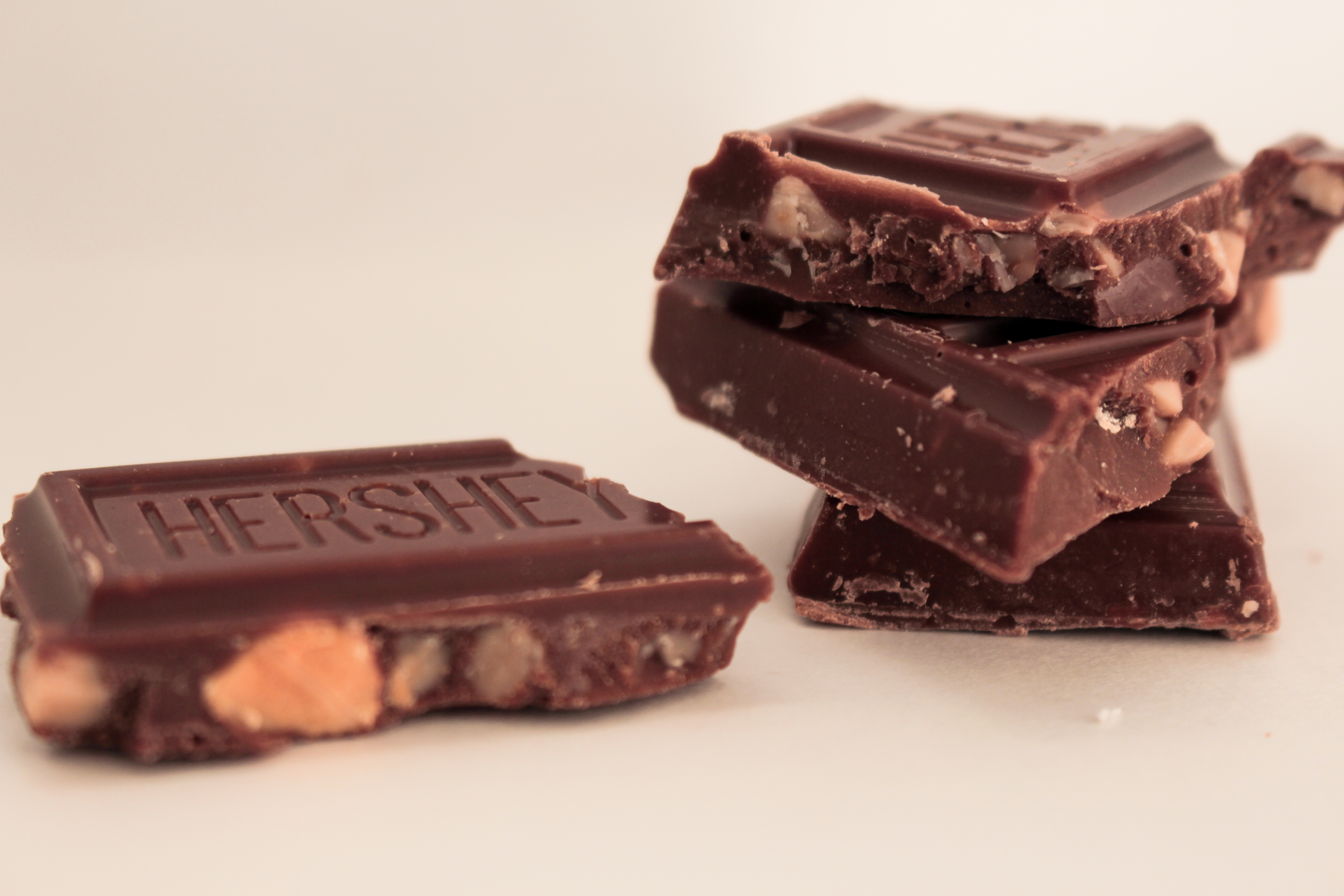
I took my own product photography for the project, and I’m really pleased with how it turned out. I just used a white poster board taped to the brick outside my apartment and used natural 9:00 AM sunlight as nice, clear lighting. I then went in to Lightroom, tweaked the exposure and colors a little bit, and then I was good to go!
FINAL PITCH BOOK
When the pitch book is printed, it’ll be 6×6 and placed in a saddle stitch, which will look great with the two full-page spreads I have of the product photography that I took.
I also have details of the colors and fonts I used, a flat package layout of what the template of the chocolate bar would be, and a potential Instagram post for the Hershey Company Instagram page. I also simplified my Table of Contents page, fixed up a couple grammatical errors and added missing commas, and completely changed the advertisement I had originally. I didn’t like what I had initially at all. I realized that since my target group for the new chocolate bar was 18-35 year olds, I decided instead to create a fake social media post to reach out to the demographic I was wanting to hit, rather than the magazine spread I had before.
I think the small changes that I made really helped pull the pitch book together. Take a look at what I made!
[scribd id=364831549 key=key-NEK5slRKl6wOfz7msCEs mode=slideshow]
Logo Redesign
Time for a rebrand!
Since I’m now further down the road to graduation, it means that I was asked to redesign my logo for my own personal brand. I was really excited for this project because I that I’ve gotten more confident in my skills in Adobe Illustrator, and I felt like my own logo needed to be changed for watermarks on my photos and design projects. The blue and the gold of my current logo were sometimes hard to see or contrasting against the images, so I wanted to go in the direction of something simple and easy to see.
SKETCHES
I’ve been really interested in the simple, rounded design that’s easily timeless and won’t fall out of style–something that falls in the design of small icons. So I went to the literal drawing board and started sketching out some ideas.
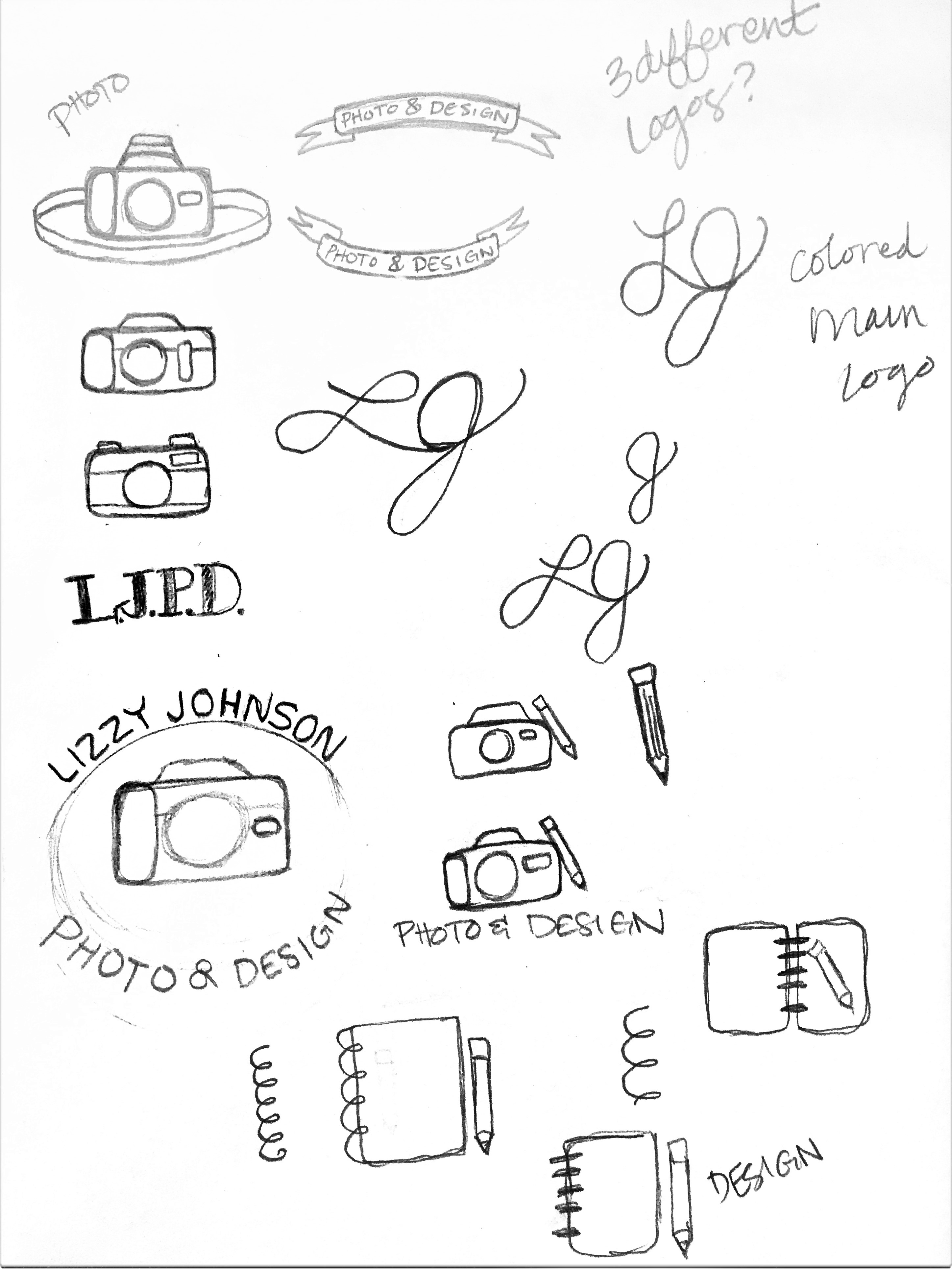
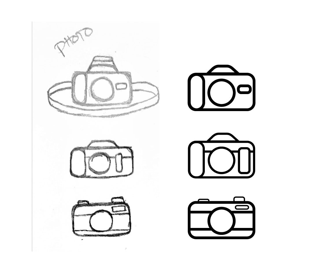
I was originally thinking of doing some sort of use with my initials, but I wasn’t very happy with what I was doodling, and I felt like a lot of designers and photographers have been using just their initials as their logo or brand, and I wanted to do something different. After drawing some simplistic cameras, I first came up with the idea of creating something that looked almost like a stamp that I could place in the corners of my artwork to brand it as my own. As I was sketching, I decided to come up with three different logos for myself. One for my entire “Photo & Design” brand, and then one for my photography and another for my design.
PAGE TO SCREEN
![]()
I then started to transpose my three ideas of simplistic cameras into Illustrator. I used both my own DSLR and vintage cameras to inspire ideas for the design. Once I created these three, I chose my favorite–the top one–and then added my name and desired business. I initially didn’t want to have a circle surround the design, as I was afraid that circles encasing a logos was overused, and instead created the circle with my brand surrounding the camera and pencil. I also added an “Established” and “2016” to fill the empty spaces in between the words to help close the circle, and then moved on to my other two logos for solely photography and graphic design.
INITIAL LOGOS
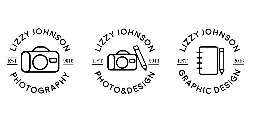
I liked how these logos looked at first, I felt like I had managed to capture a stamp-like, simplistic design, but then realized that even though my design was simple, having too many logos for different projects might get confusing. Having three different logos could becoming too convoluted for people to immediately recognize my brand. So I scrapped the Photography and Graphic Design logos and decided to go in for a refinement of the main Photo & Design logo instead.
REFINED LOGO
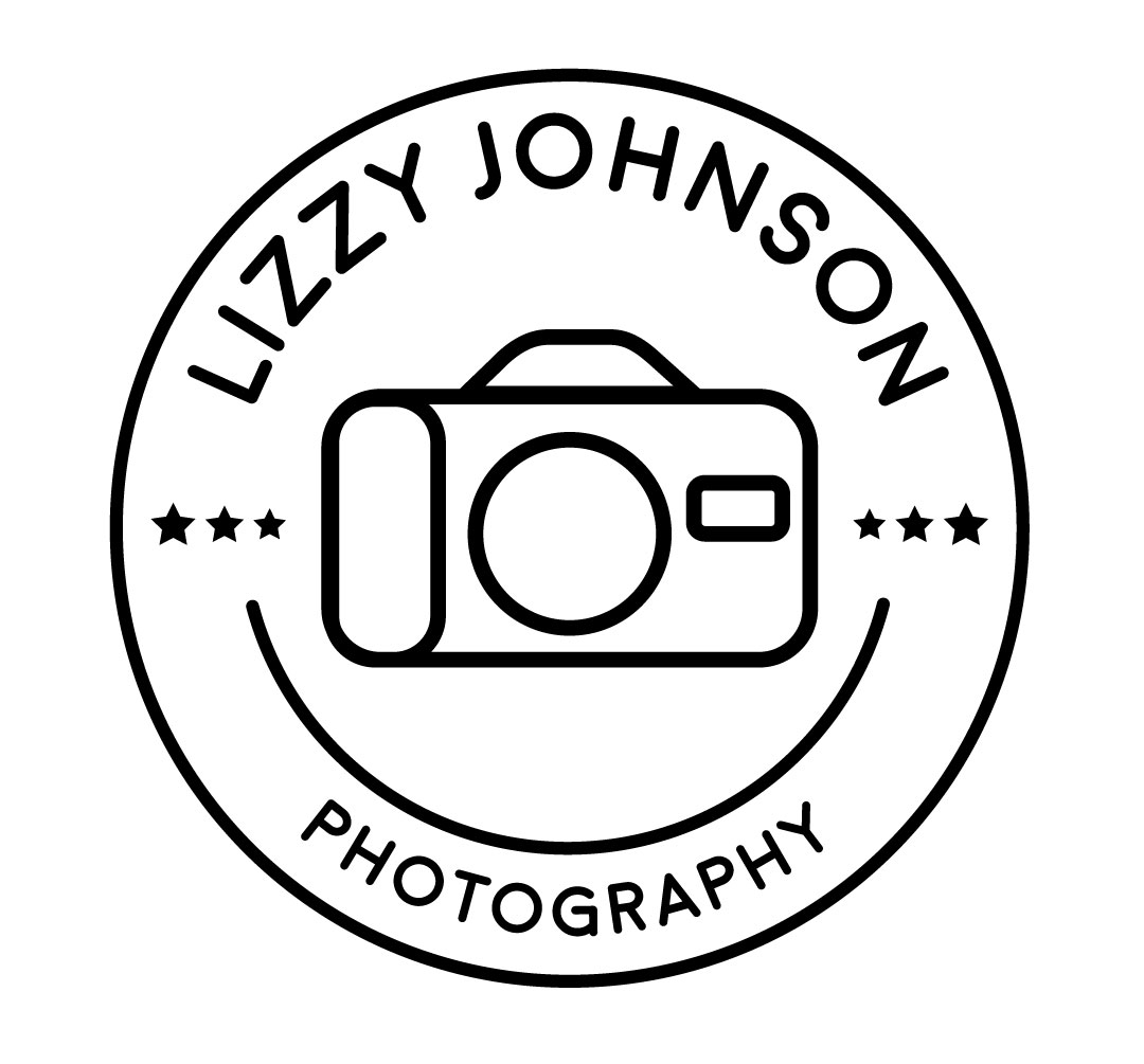
I also scrapped a few things with the Photography logo as well. Instead of using an “Established” and “2016”, I replaced them with three stars on either side of the camera. I’m still building my portfolio and trying to put my best work out there, and I decided that showing how young my brand was wouldn’t really help. I completely got rid of the pencil and added a circle around the logo. Since my inspiration for my design was vintage stamps and camping logos, I realized that having a circle encapsulate the design really helped pull the entire thing together, and with the accent line underneath the camera helped make the logo turn more into a target with the camera lens being the bulls-eye.
I’m really glad I decided to refine my logo to make it look the best it could be. I think it really reflects my personality, style, and love for simplistic design. I can’t wait to use this in the future!
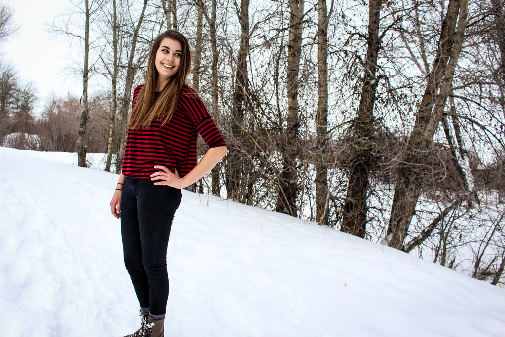
Danae Senior Portraits
One of my close friends has graduated college, and I was so excited when she asked me to take her senior portraits for her announcement.
We went out to the local farm fields and found a really pretty patch of small purple flowers that she could stand and sit in. Later on during the shoot we went to some cute murals around town that she wanted to take some pictures in front of as well.
Danae, congratulations for graduating college and getting your degree! I’m so happy to have been your friend these past four years.
![]()
![]()
![]()
![]()
![]()
![]()
![]()
![]()
![]()
![]()
![]()
![]()
The Final Frontier
This is it! The last project of the semester, and I have to say, I am really pleased to see how far I’ve gotten as an artist because of this class. This class and these projects have definitely pushed me, my skills, and my creativity, and I’ve had a lot of fun coming up with new ideas for each project and learning new things along the way. For this project we had to design three stickers, and I wanted to try my hand at the flat, simplistic style that’s popular right now, and what better way to apply that than to space stickers?
SKETCHES
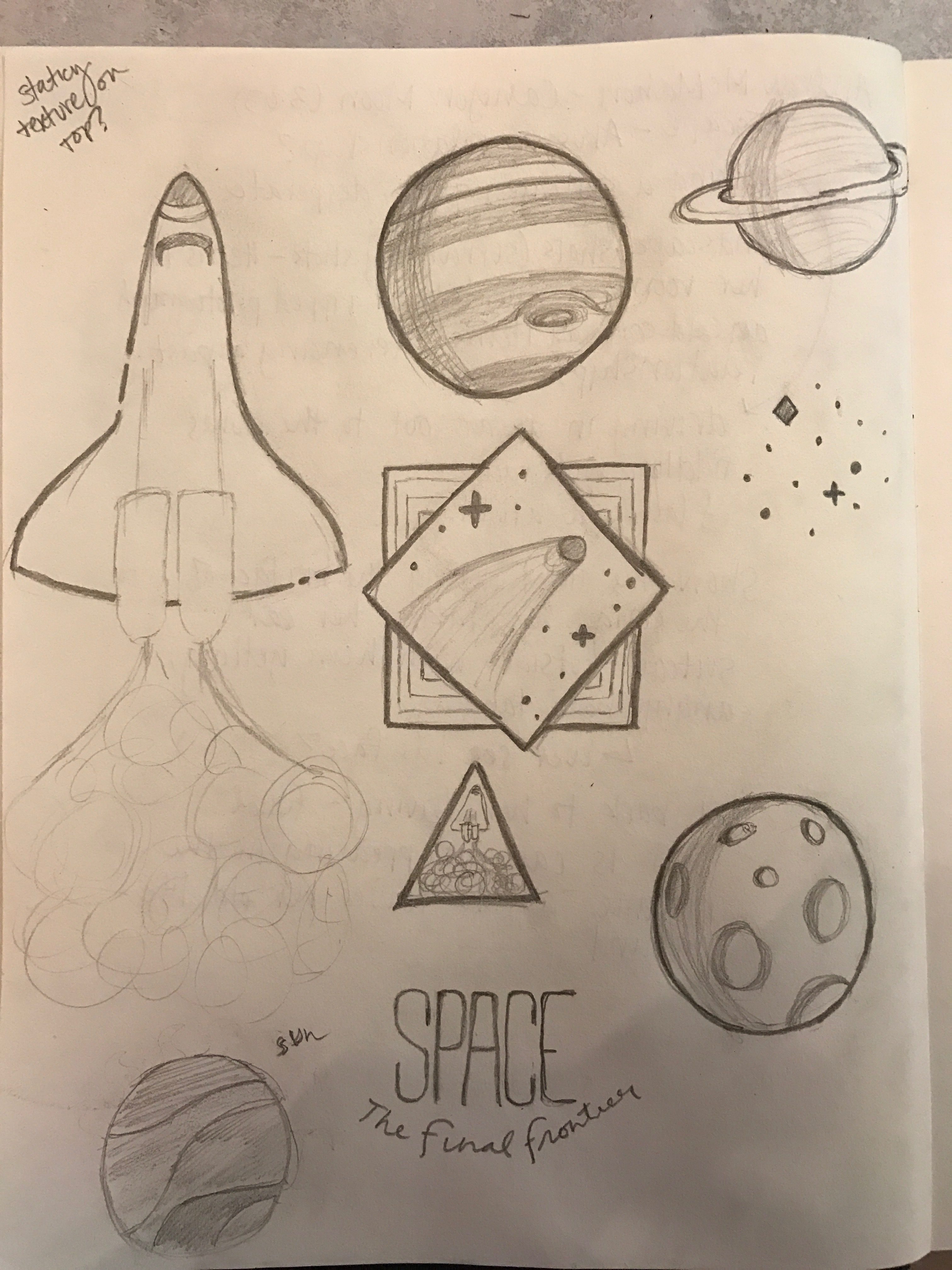
I came up with a few ideas of different icons and recognizable objects in space, and I finally settled on the three sketches I was most proud of–the space shuttle, the comet in the diamond, and Jupiter. I then took this photo and uploaded it into Illustrator so I could work off of my sketches and convert them in to vector images.
DRAFT
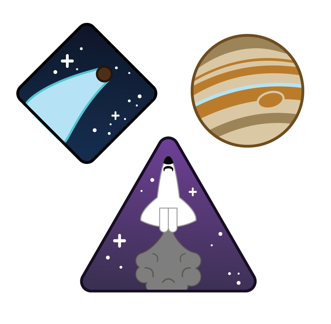
I was pretty happy with how these turned out! I was really proud of my Jupiter, and I really liked how I added a triangle around the space shuttle sticker, but I was still pretty unsure about my comet. It just seemed to plain and now quite how I wanted it. After looking over my drafts, I first wanted to bring a bit of unity to the stickers by putting each object into its own shape–so for Jupiter, I placed it in a rounded hexagon, instead of it being just a round sticker on its own. I also went in and added some shadows to add a sense of depth to the shuttle and the planet. Finally, I did a complete redo of the comet, and I feel like it accomplished what it was a bit better than how I originally had it.
FINAL
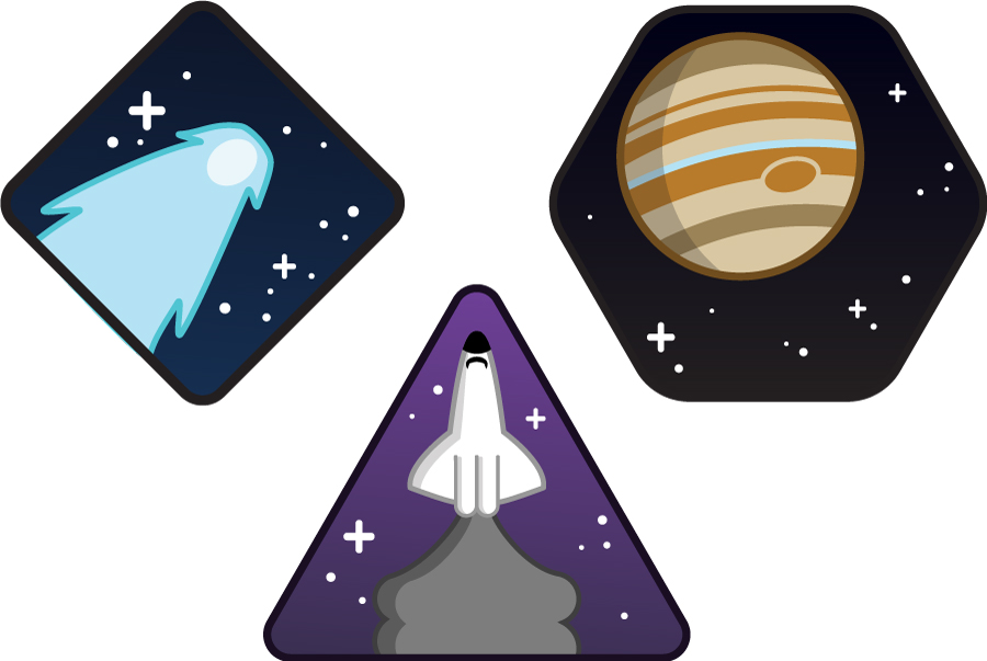
I am really happy with how these turned out! I think my favorite one has to be the Jupiter sticker. Every time I look at it, I get really pleased with myself and how I was able to actually simplify down what Jupiter looks like. I can’t wait to get these stickers printed and had them out to my family and friends. I also want to come back sometime and add more of my sketches into this sticker set.
I’m really happy with what I’ve accomplished in this class, and I’ve learned a ton. Taking this class has really solidified my love for design, and I really hope that I’m able to do this for the rest of my life.
Jessica and Brooks
This post has been a LONG time coming. These two are some of my closest friends–and when they asked me to help them with their engagement photos, I of course said yes! The hilarious thing is that they’ve been married for about eight months now, so Jess, I’m very sorry it has taken me this long to get your session up.
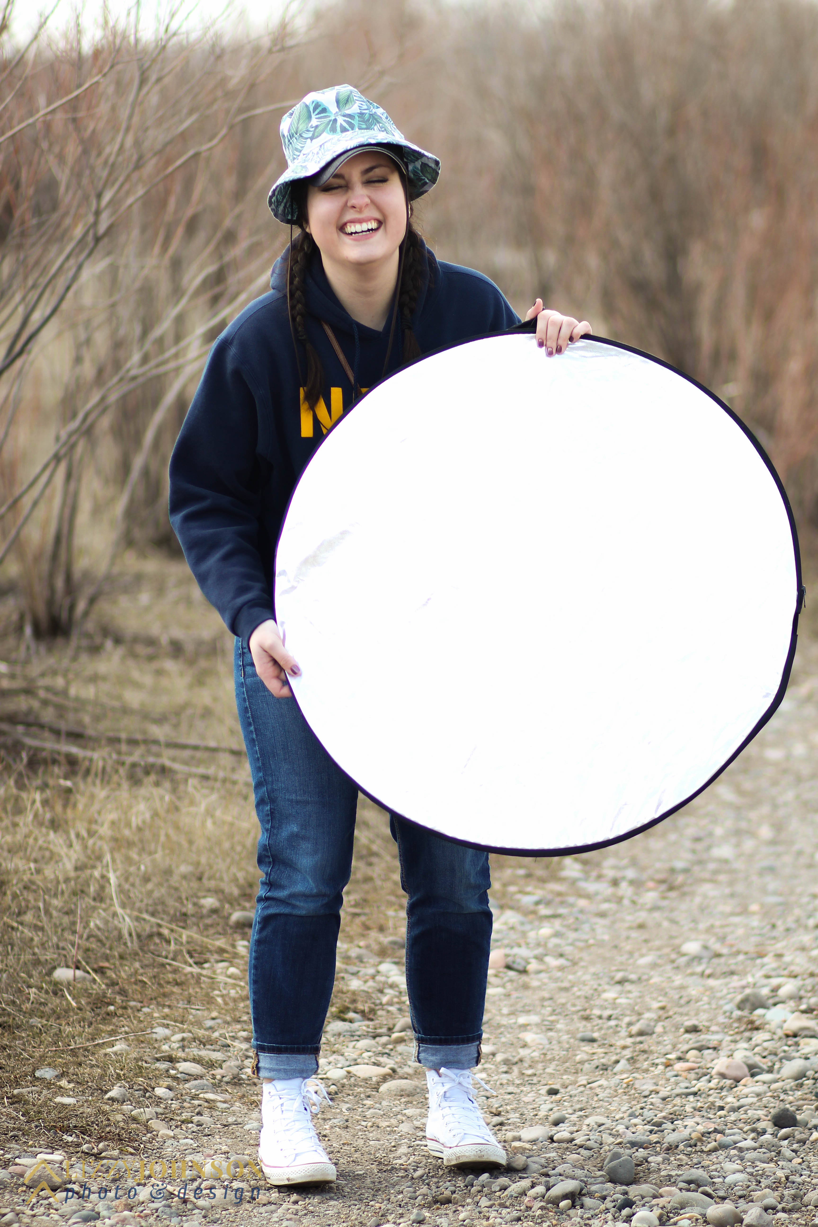
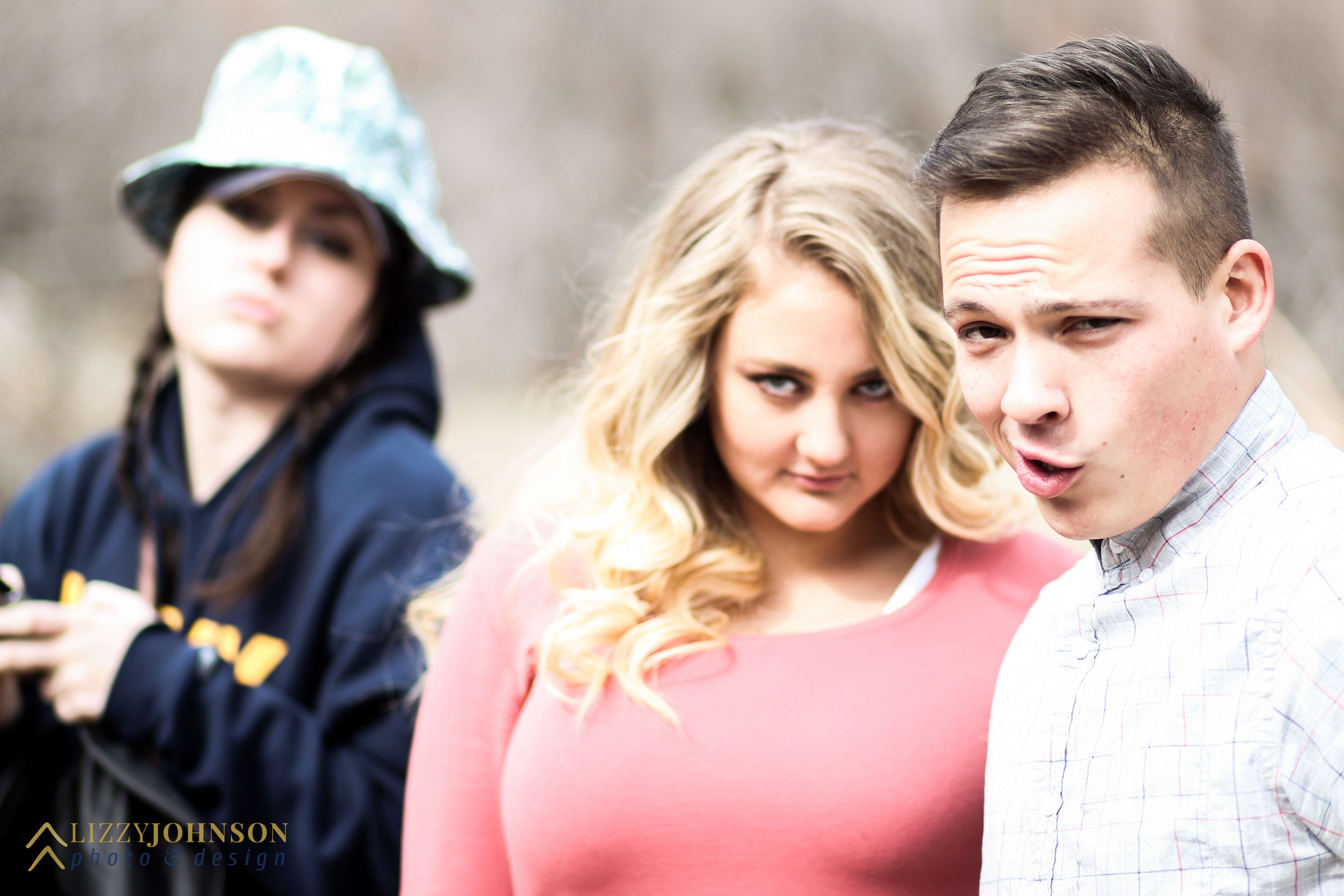
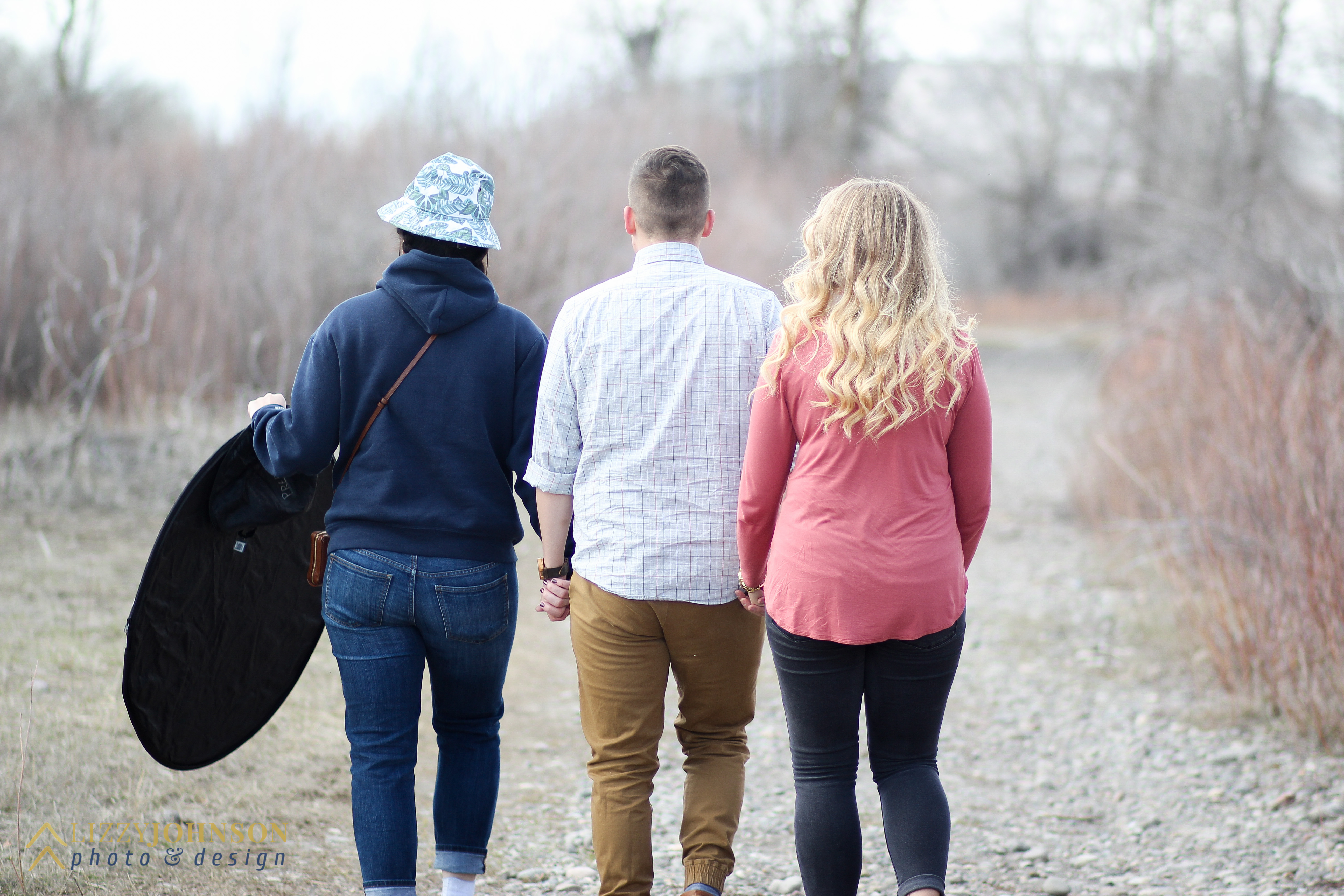
We went out to a local park that has a lot of hiking and walking paths that’s perfect for photos. This is not the first time I’ve been out there to take pictures–I used this location for Chloe and Timmy, my surreal photography shoot with Zoie, and a few others. Zoie, who has been mentioned on this website more times than I can count (thanks for everything, my friend) helped me out on this shoot by running around with reflectors to make sure Brooks and Jess were lighted properly.
She’s such a great assistant. I think she ran back and forth thirty times to fix fly-aways and make minor clothing adjustments.
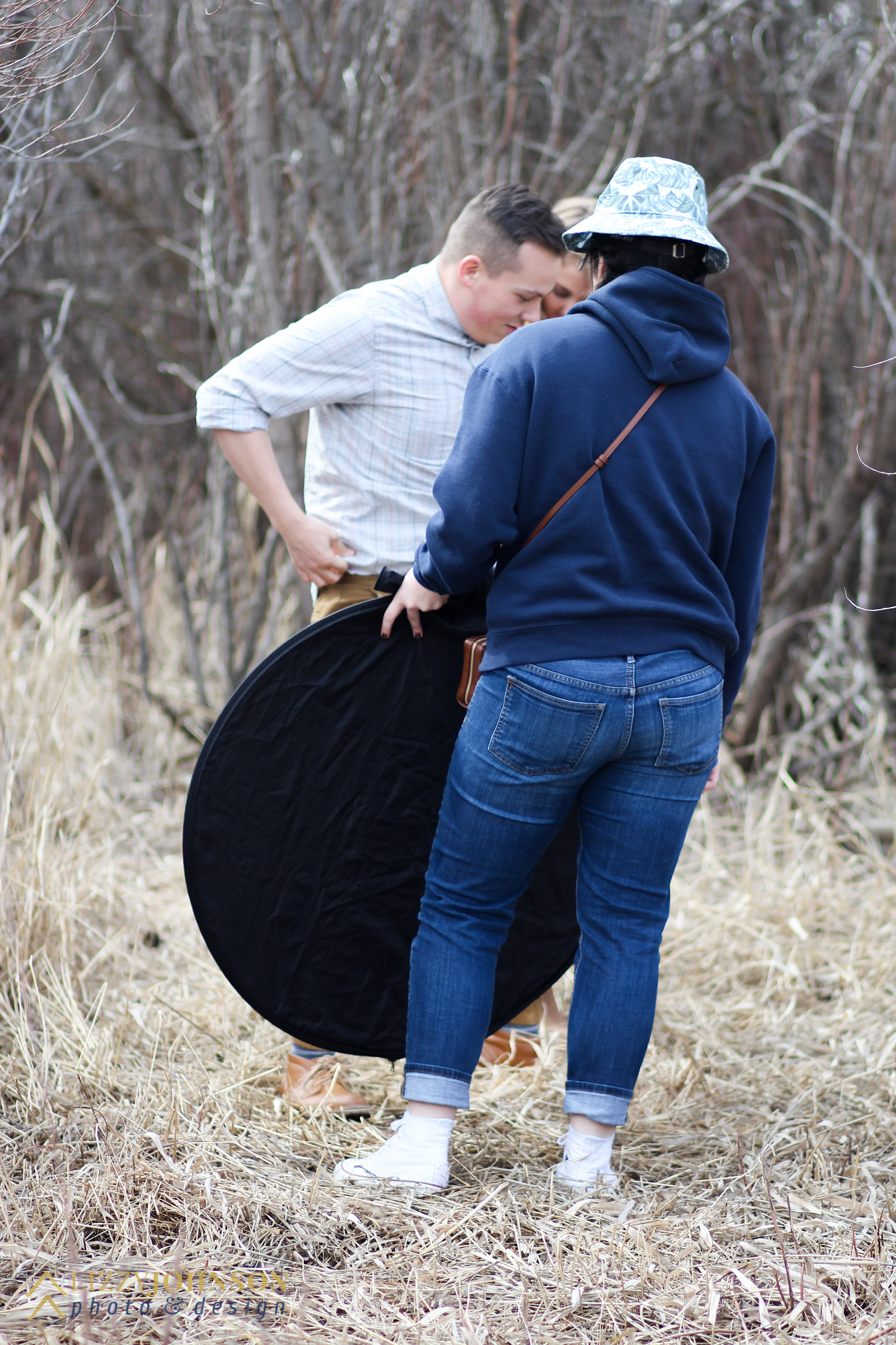
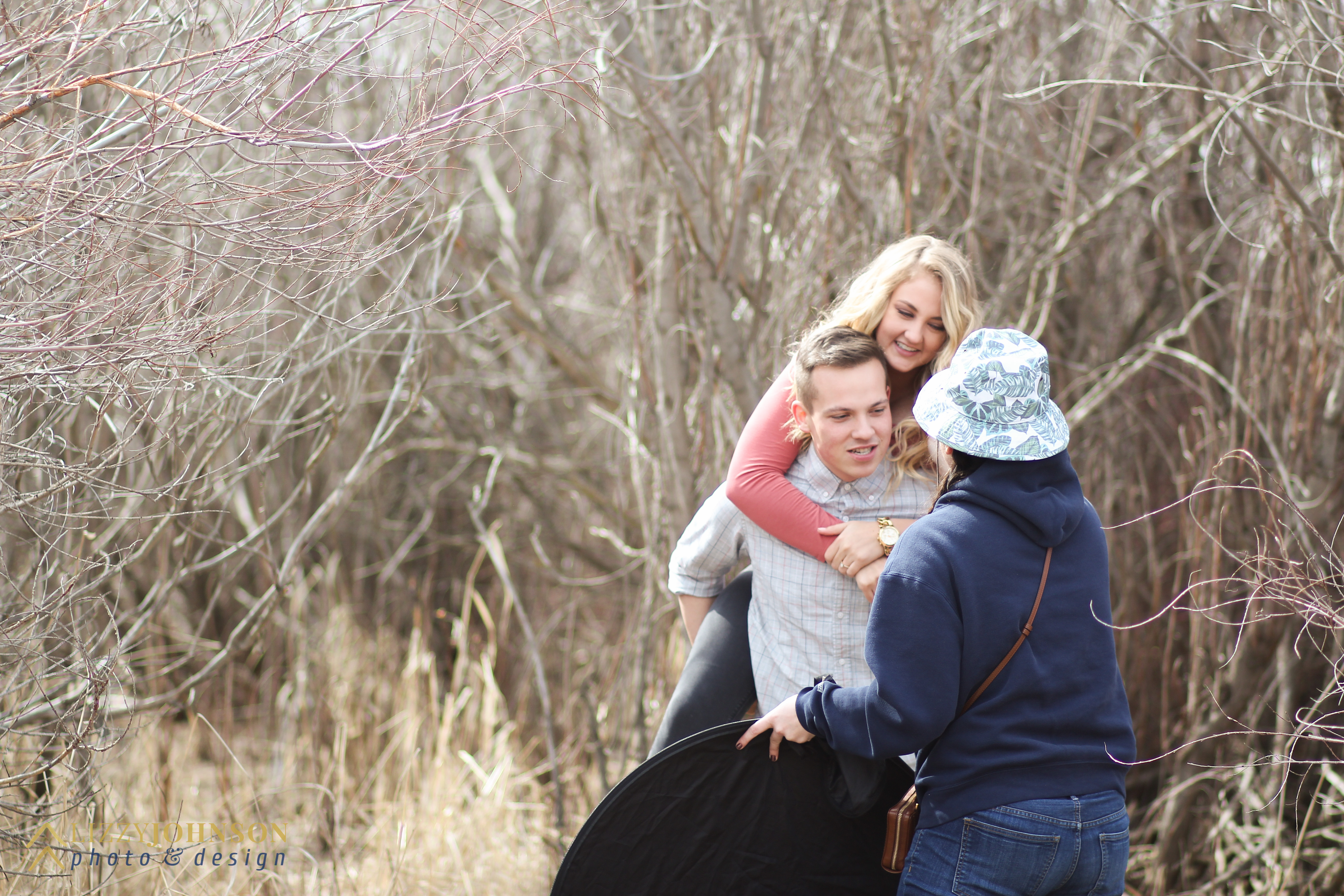
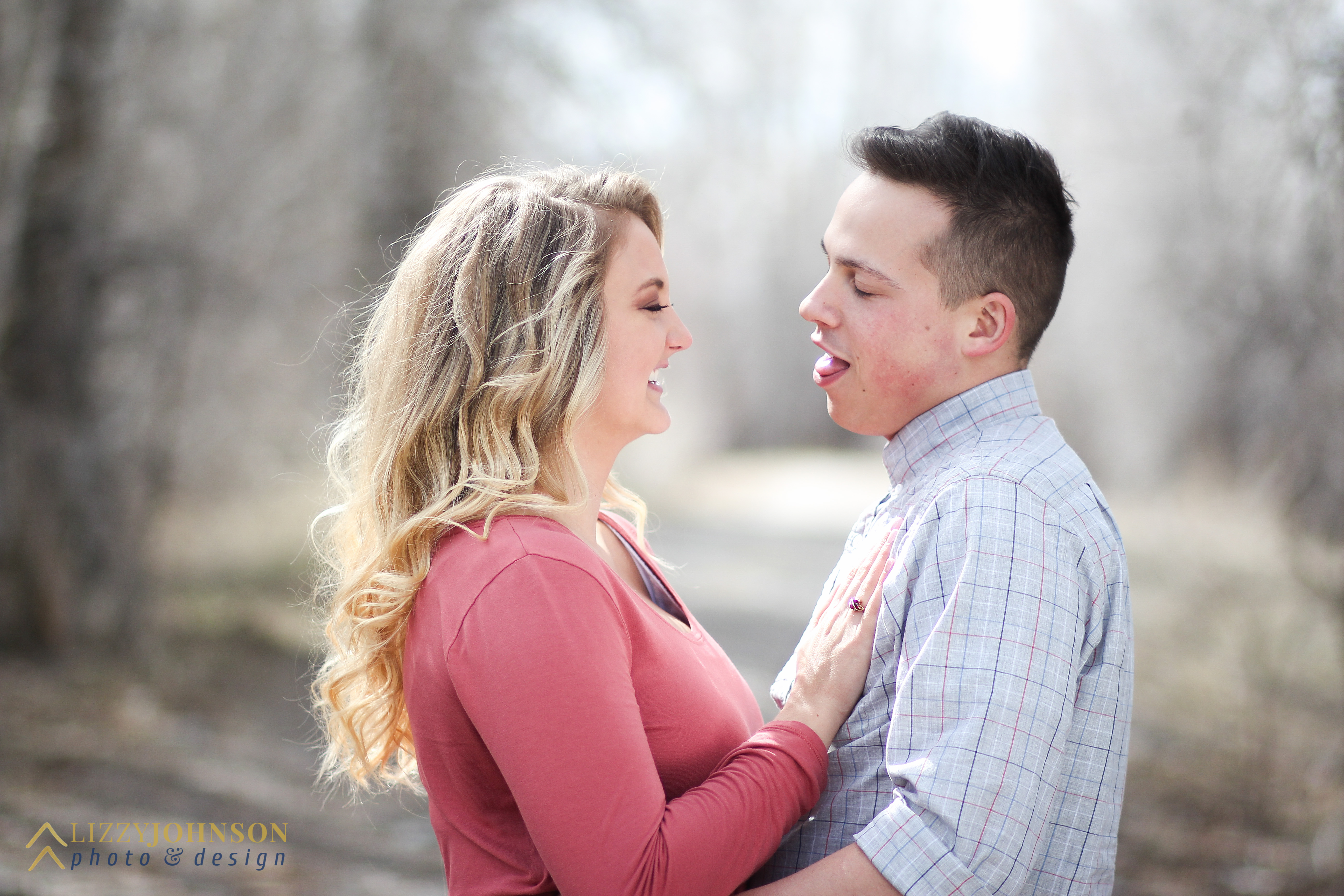
So without further ado, here’s Jess and Brooks!
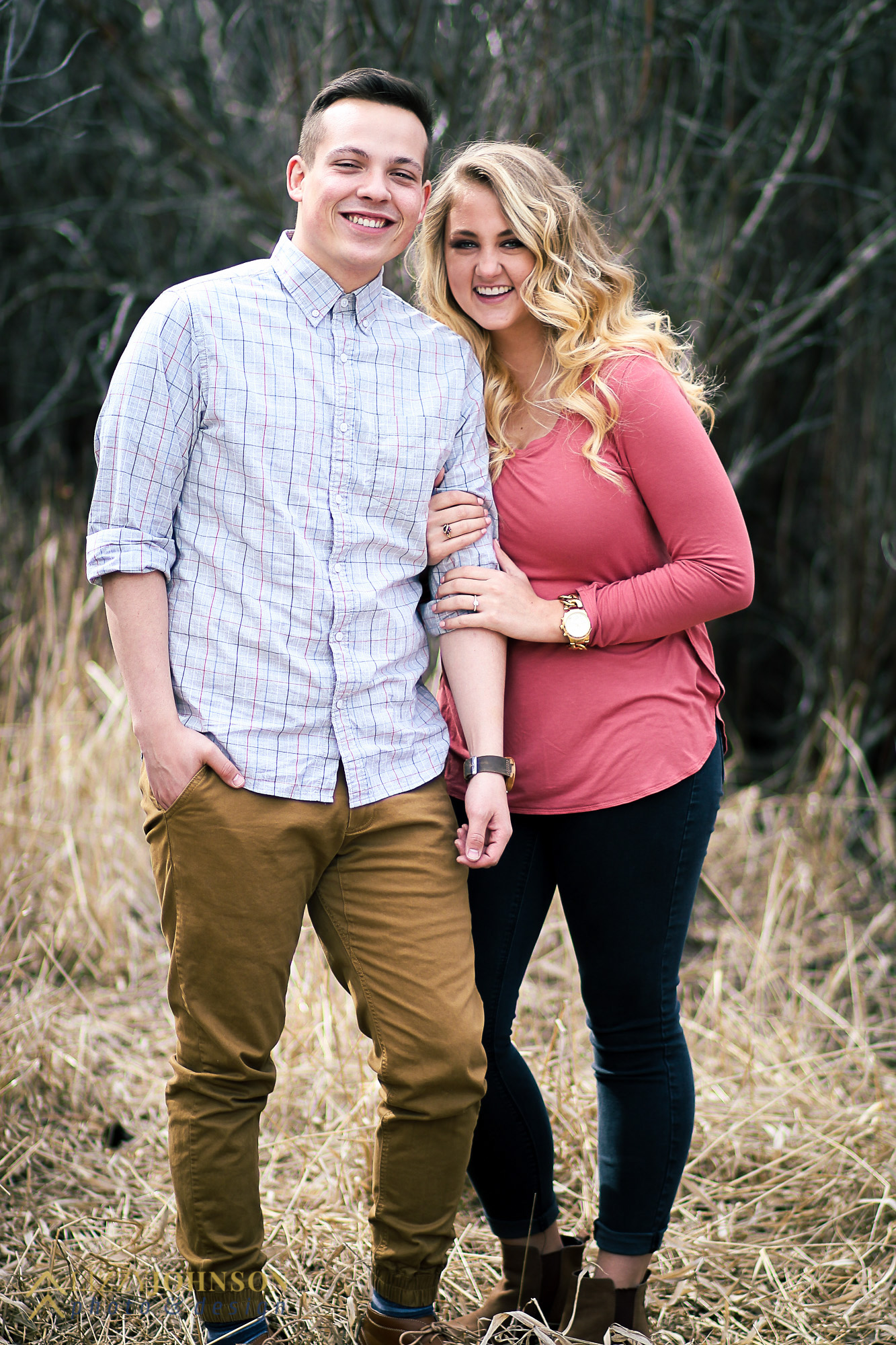
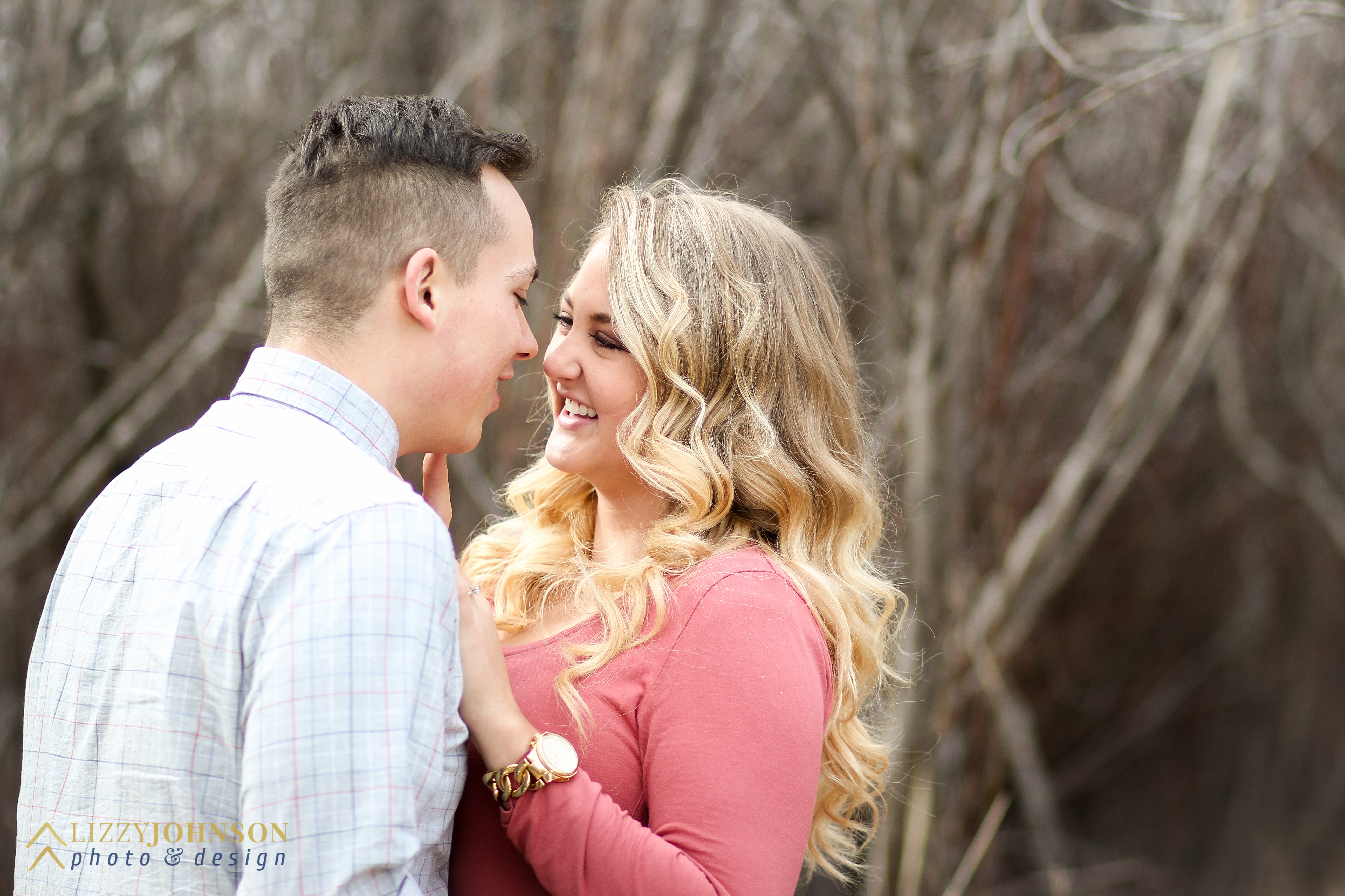
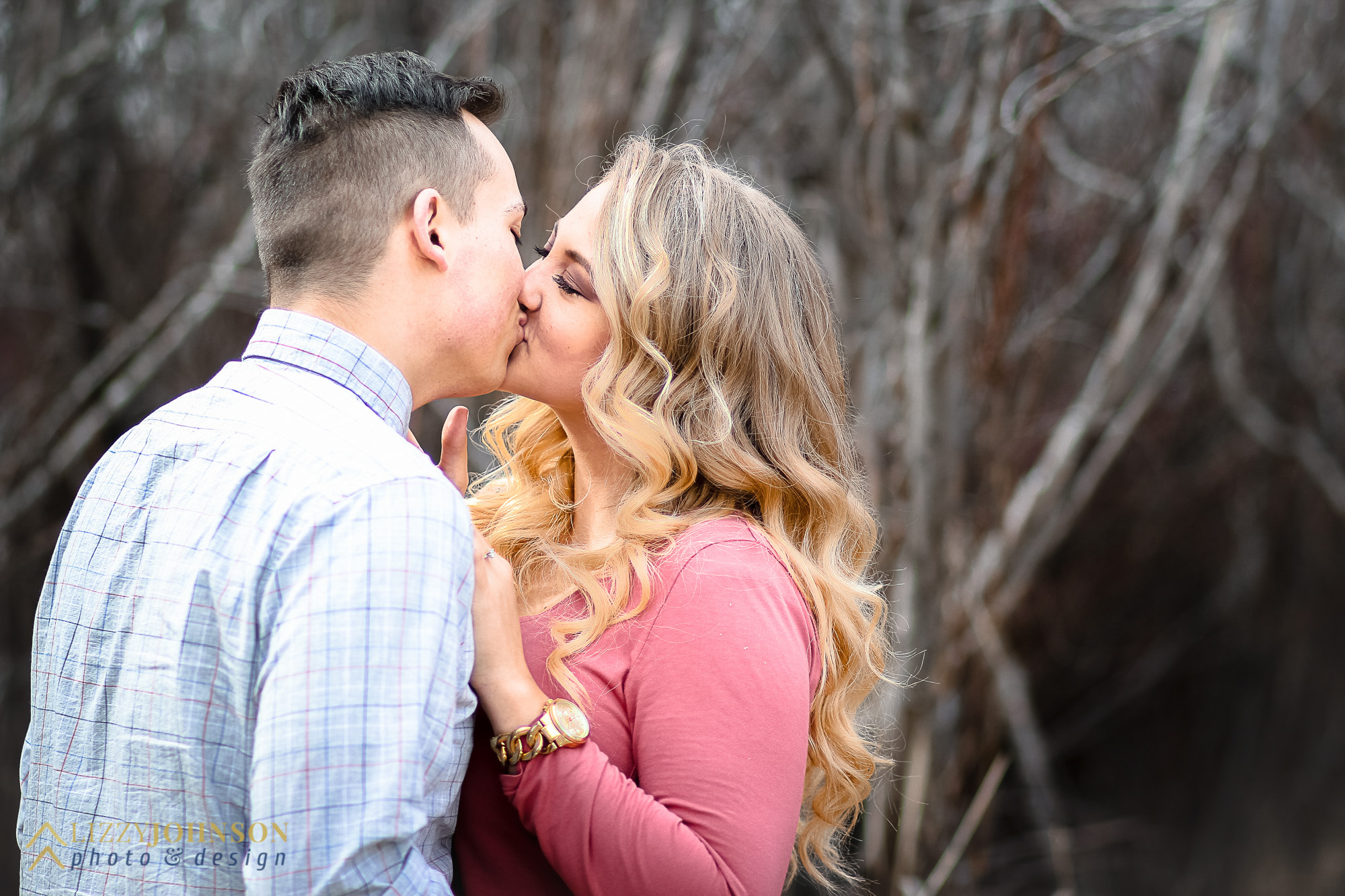
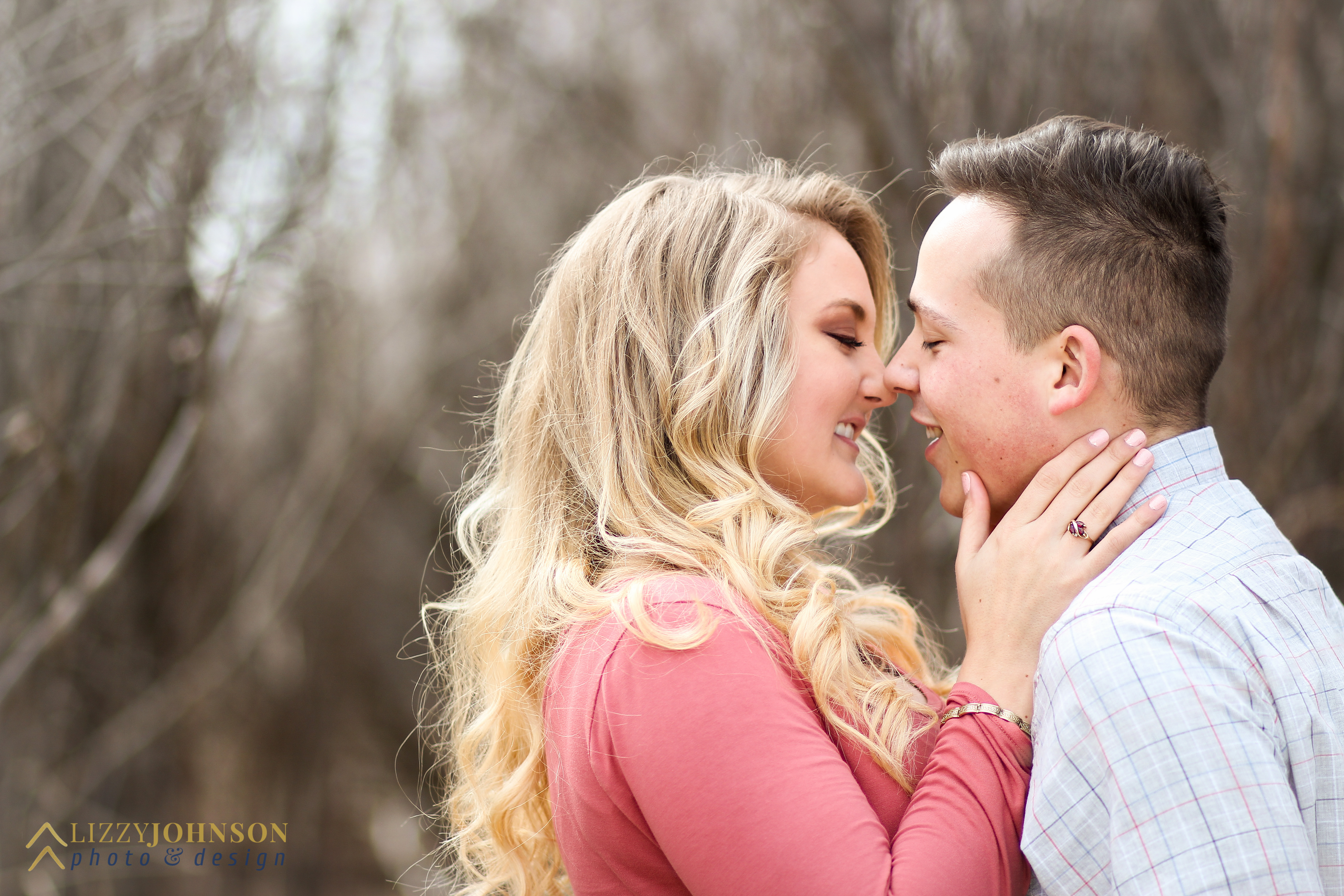
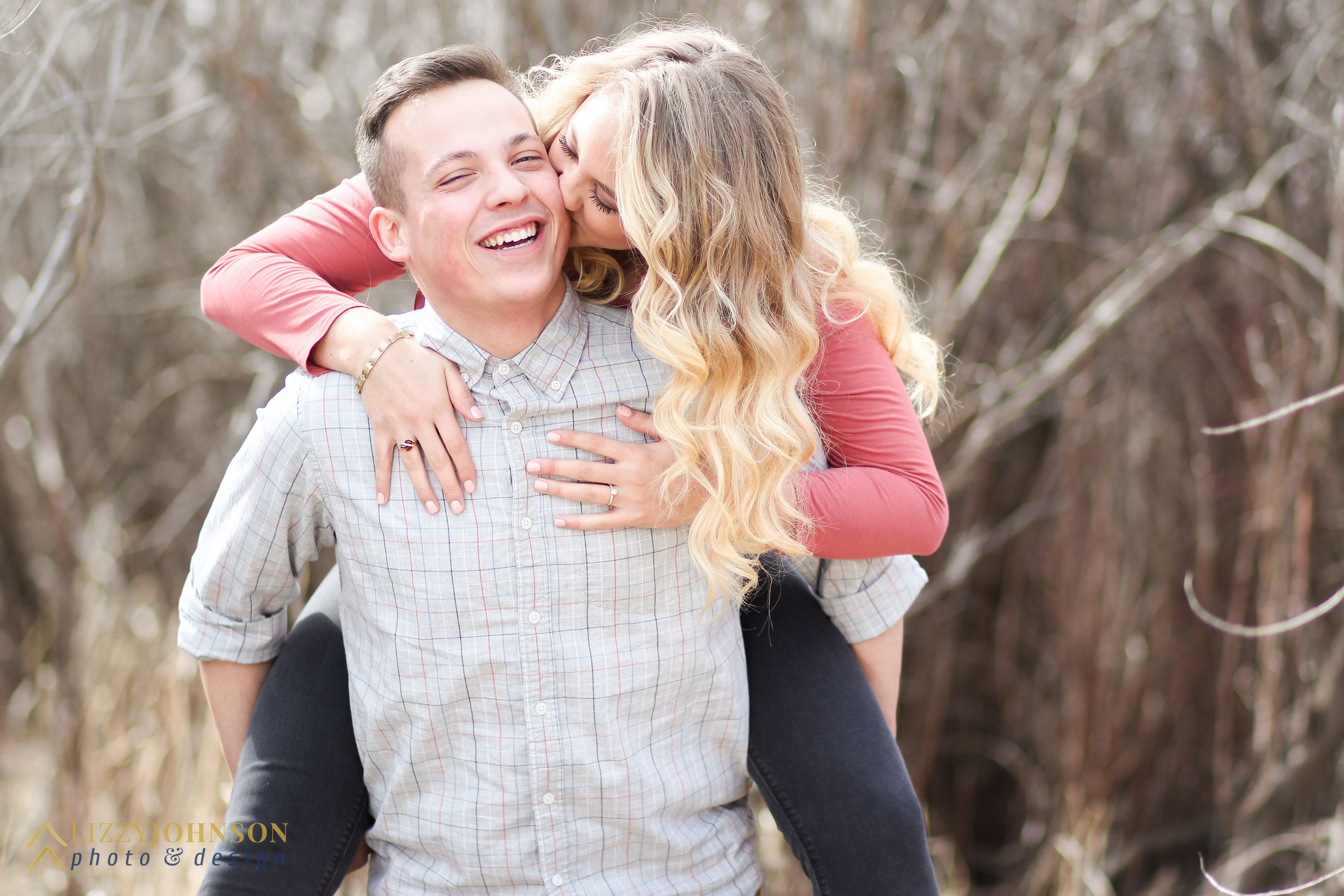
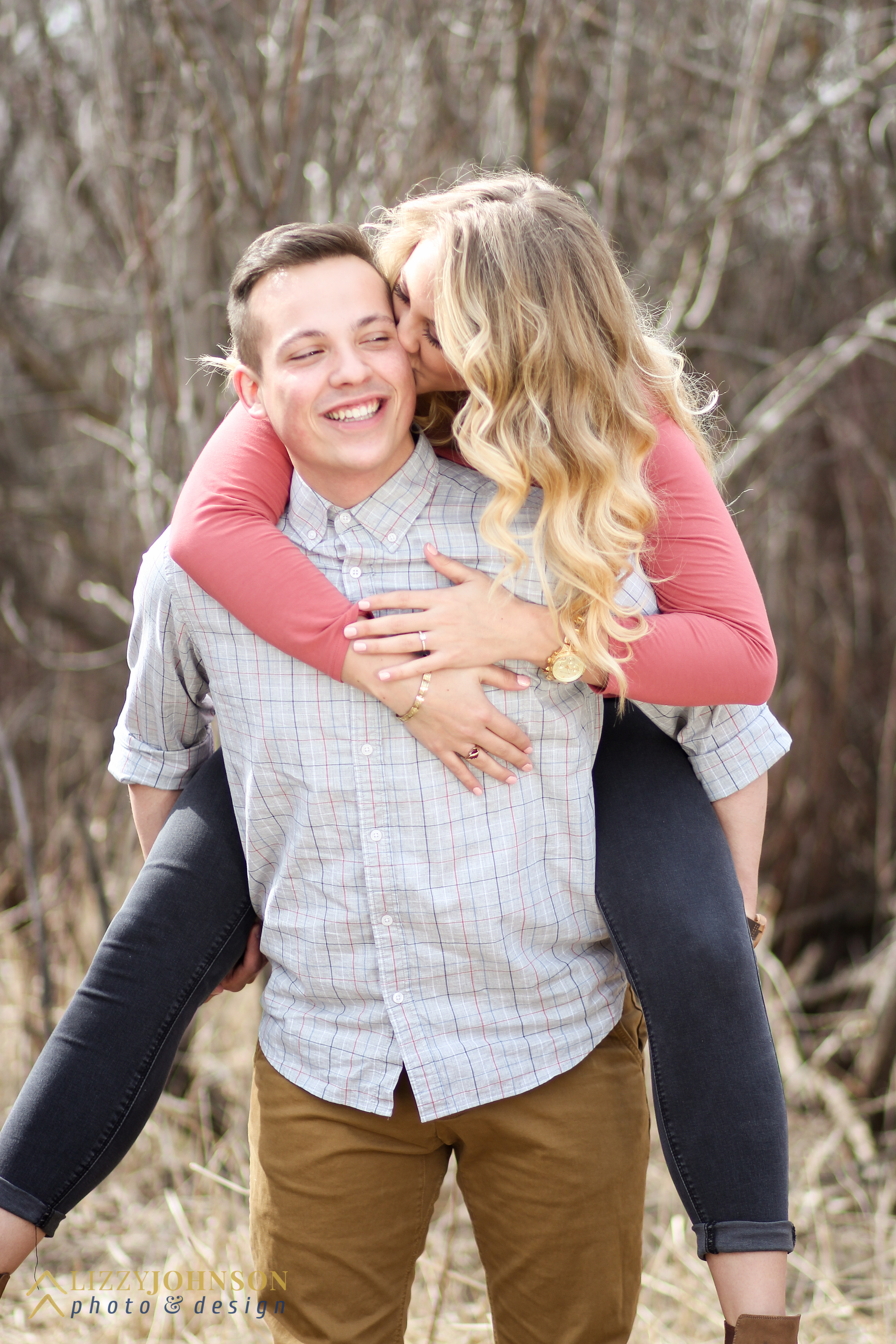
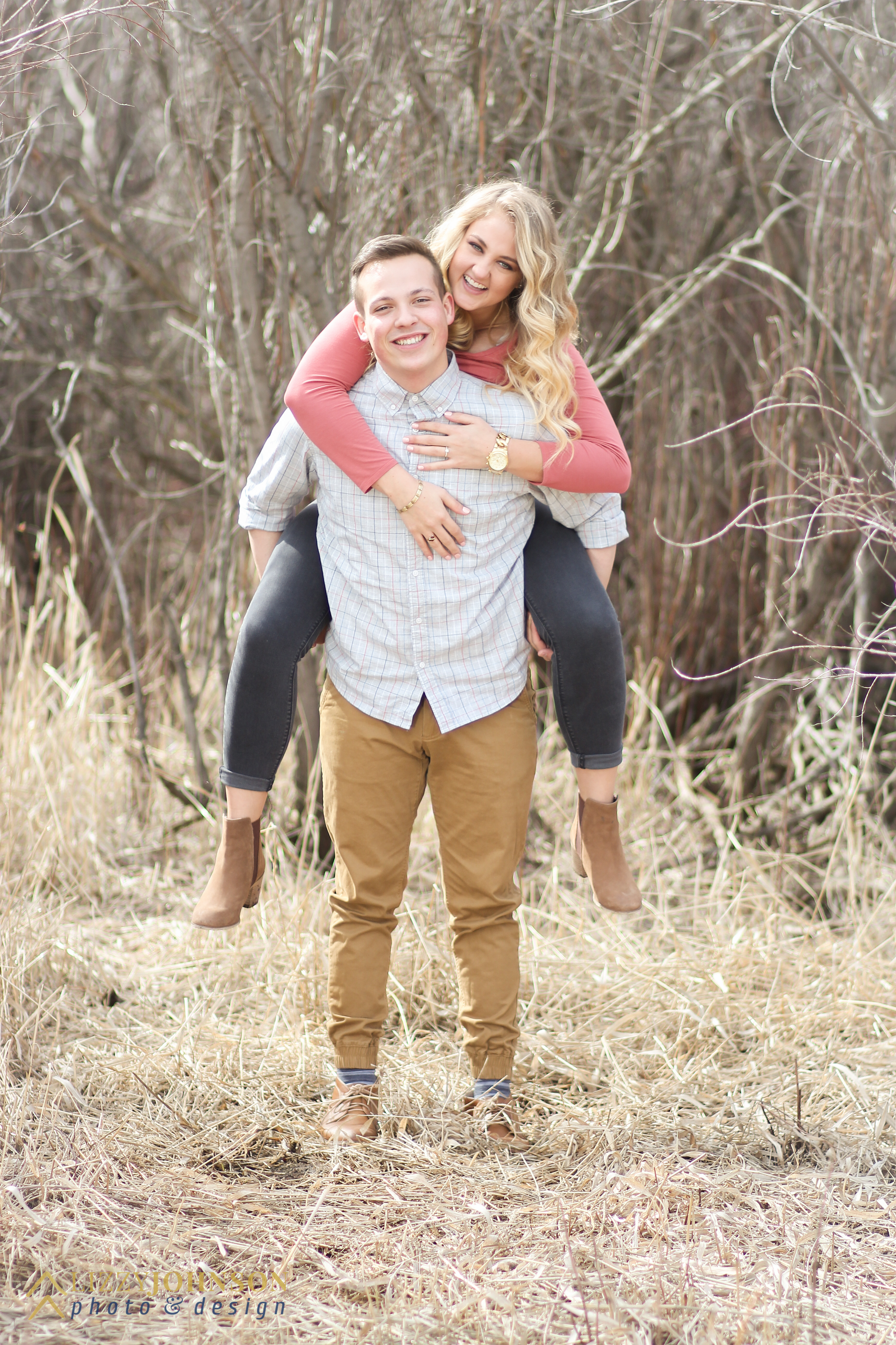
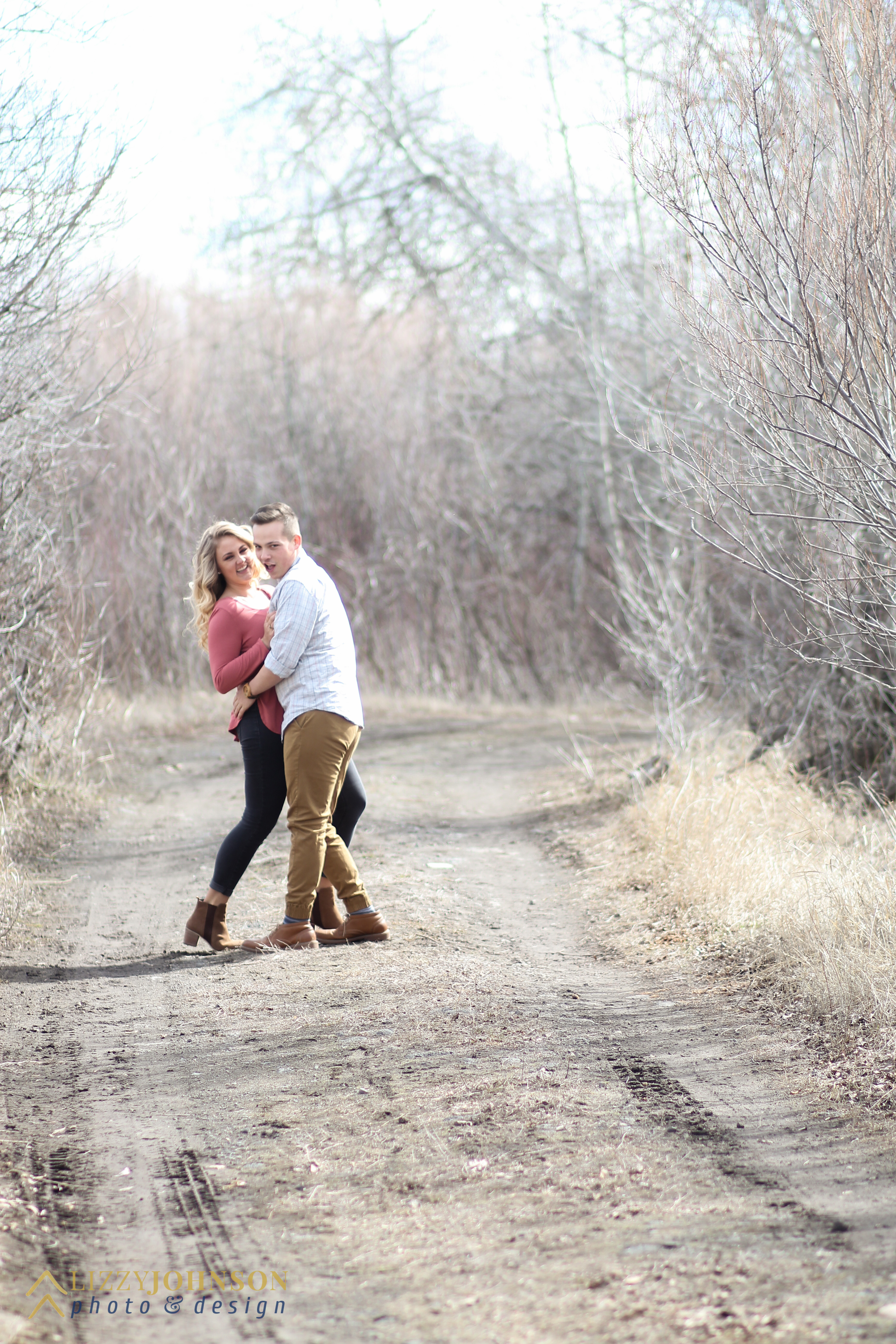
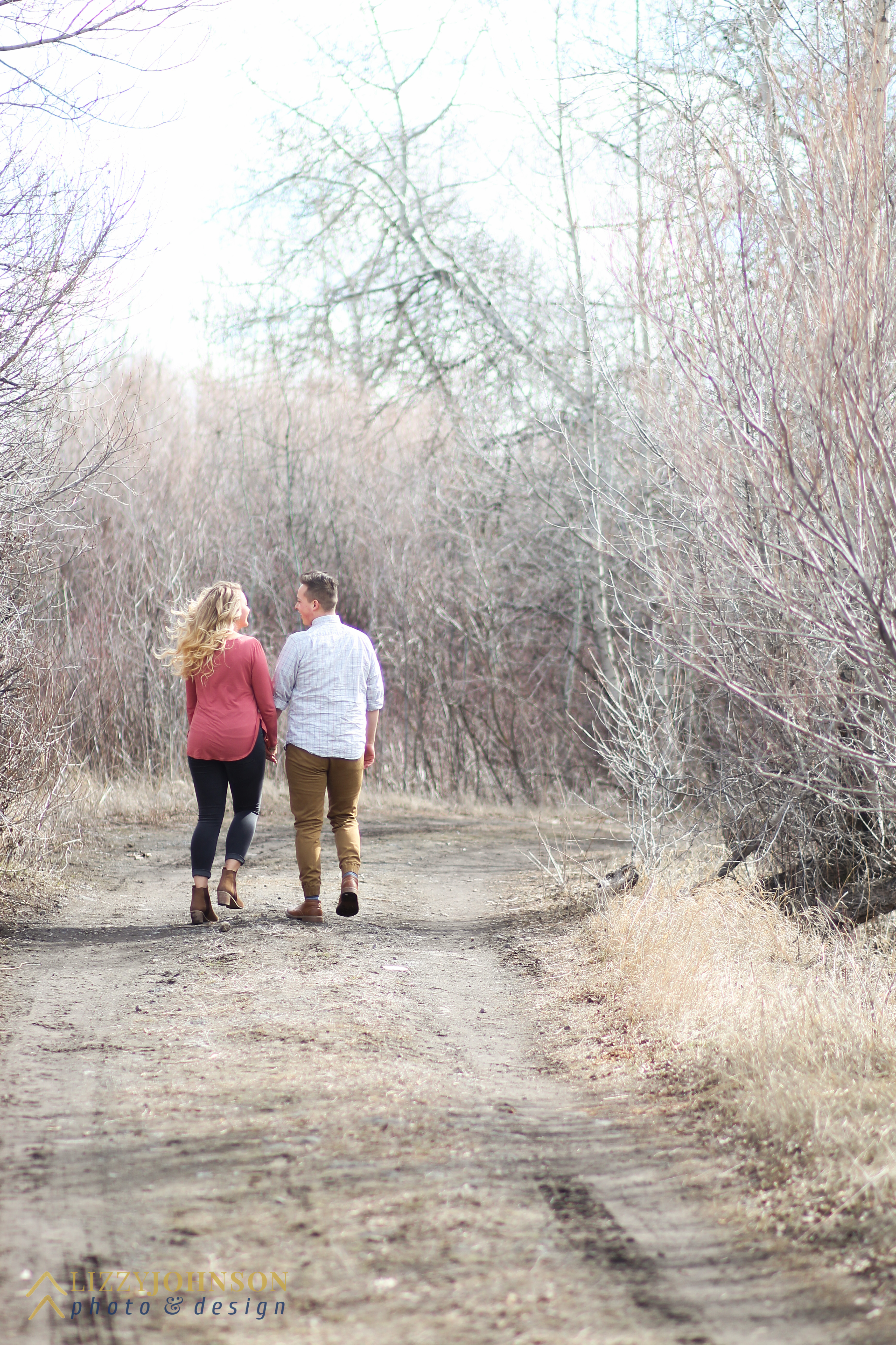
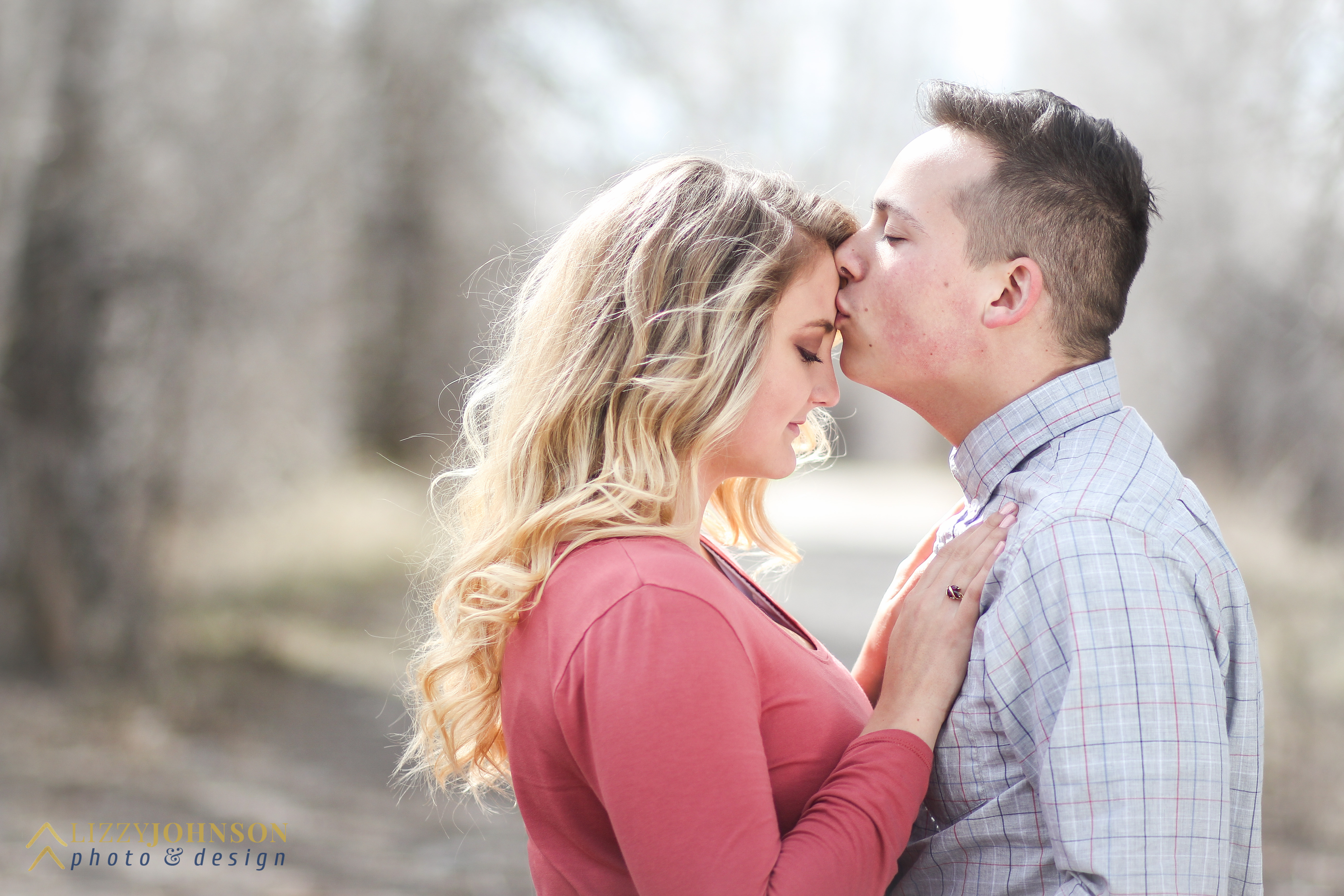
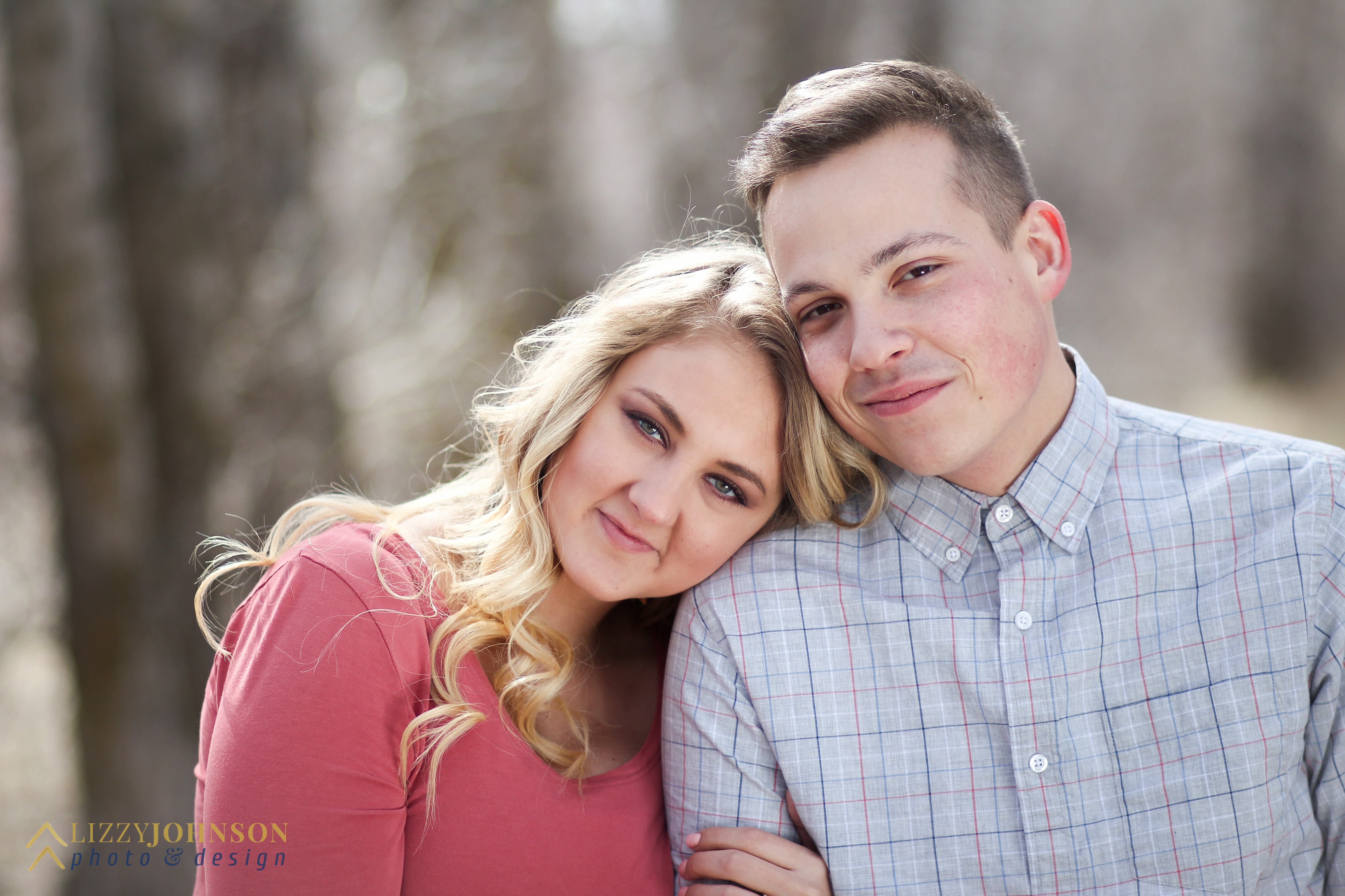
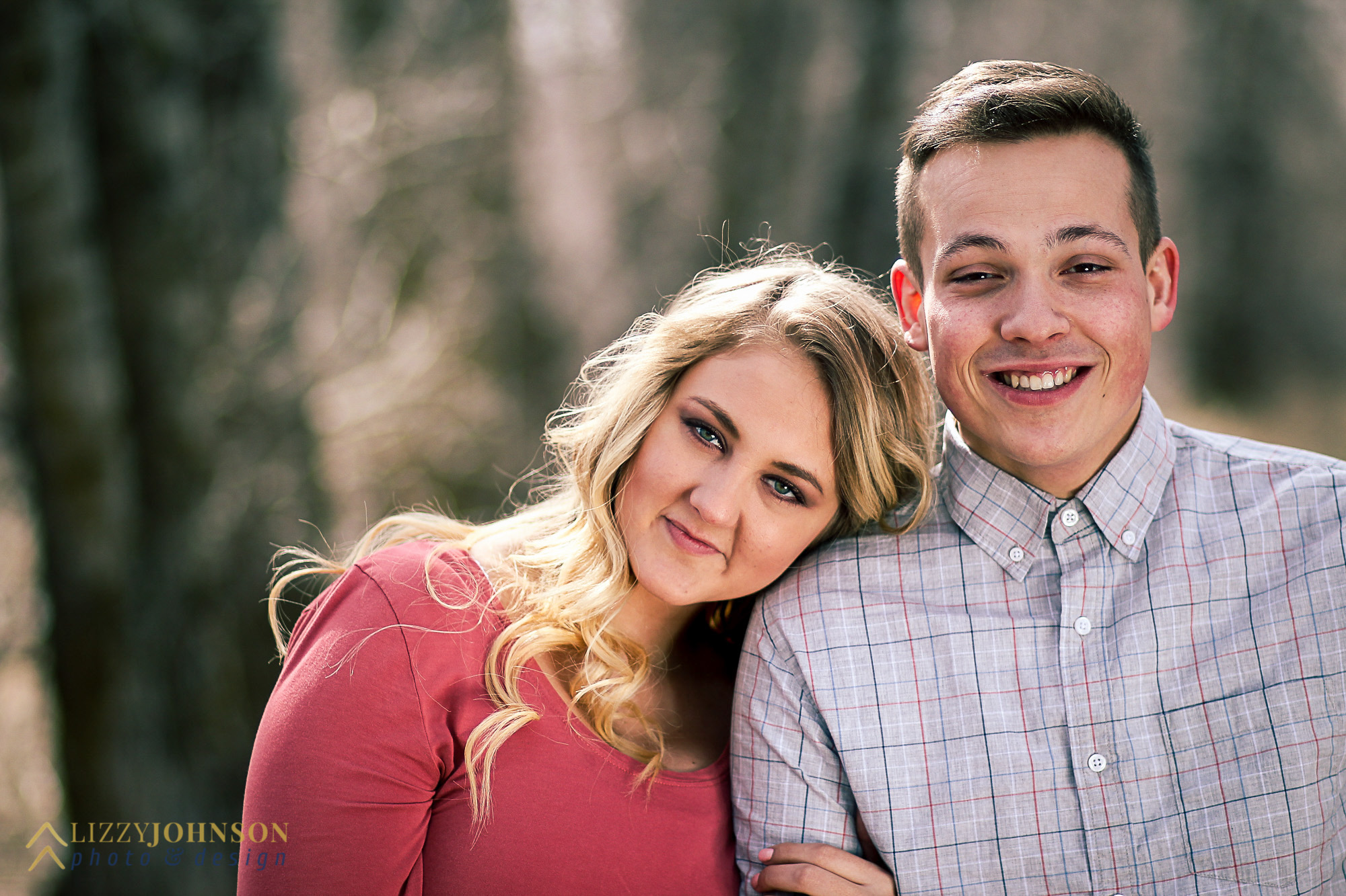
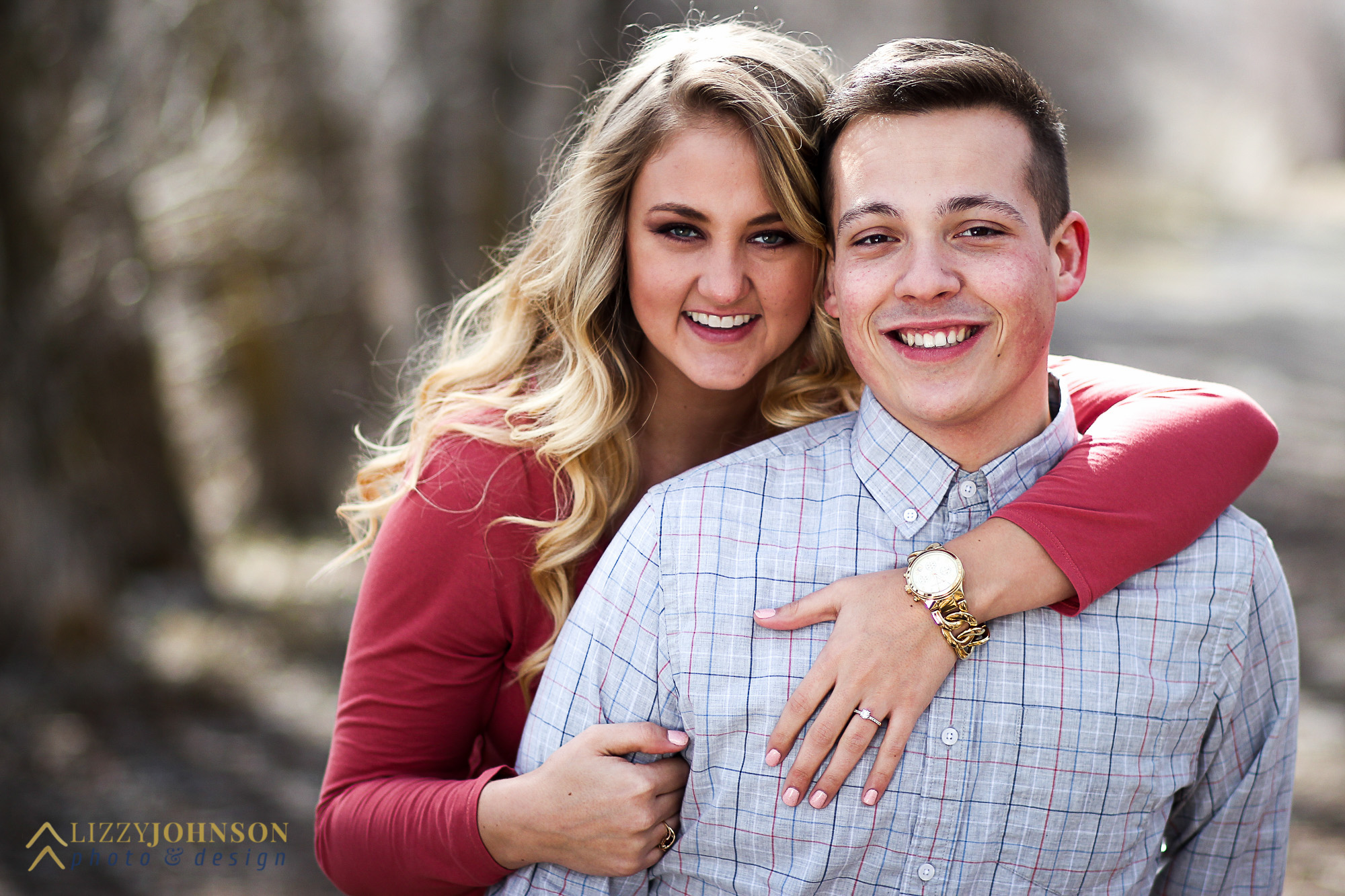
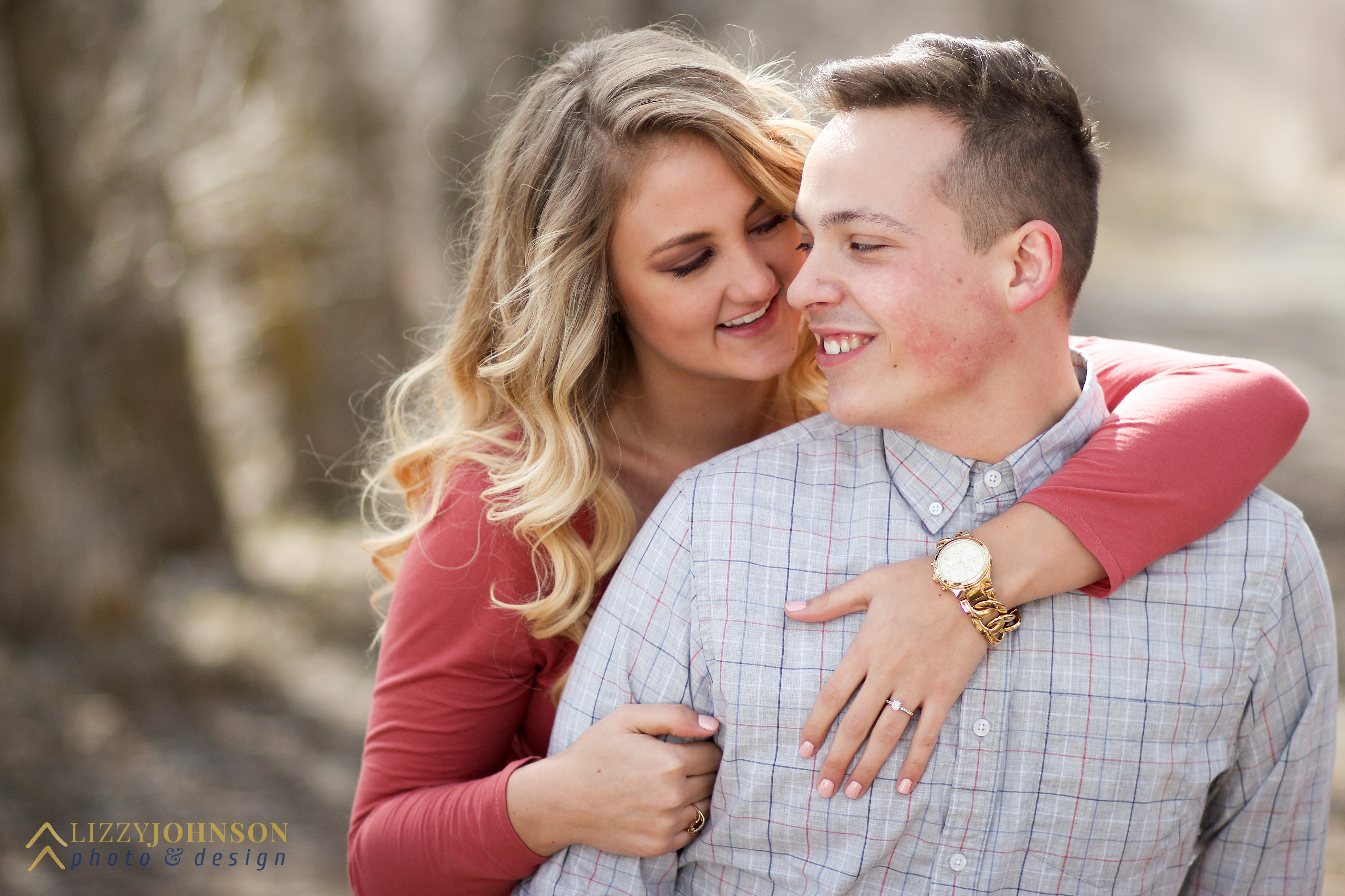
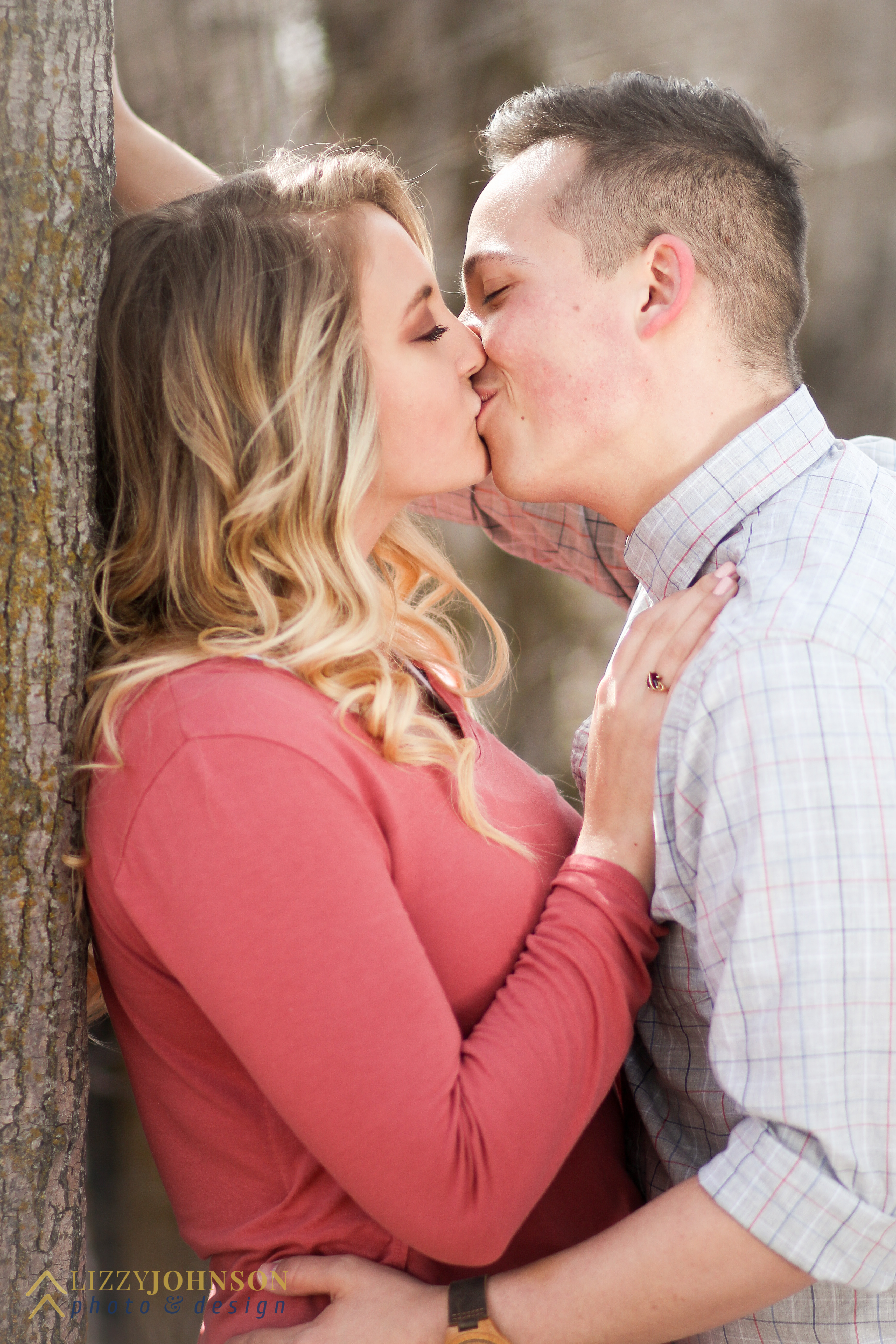
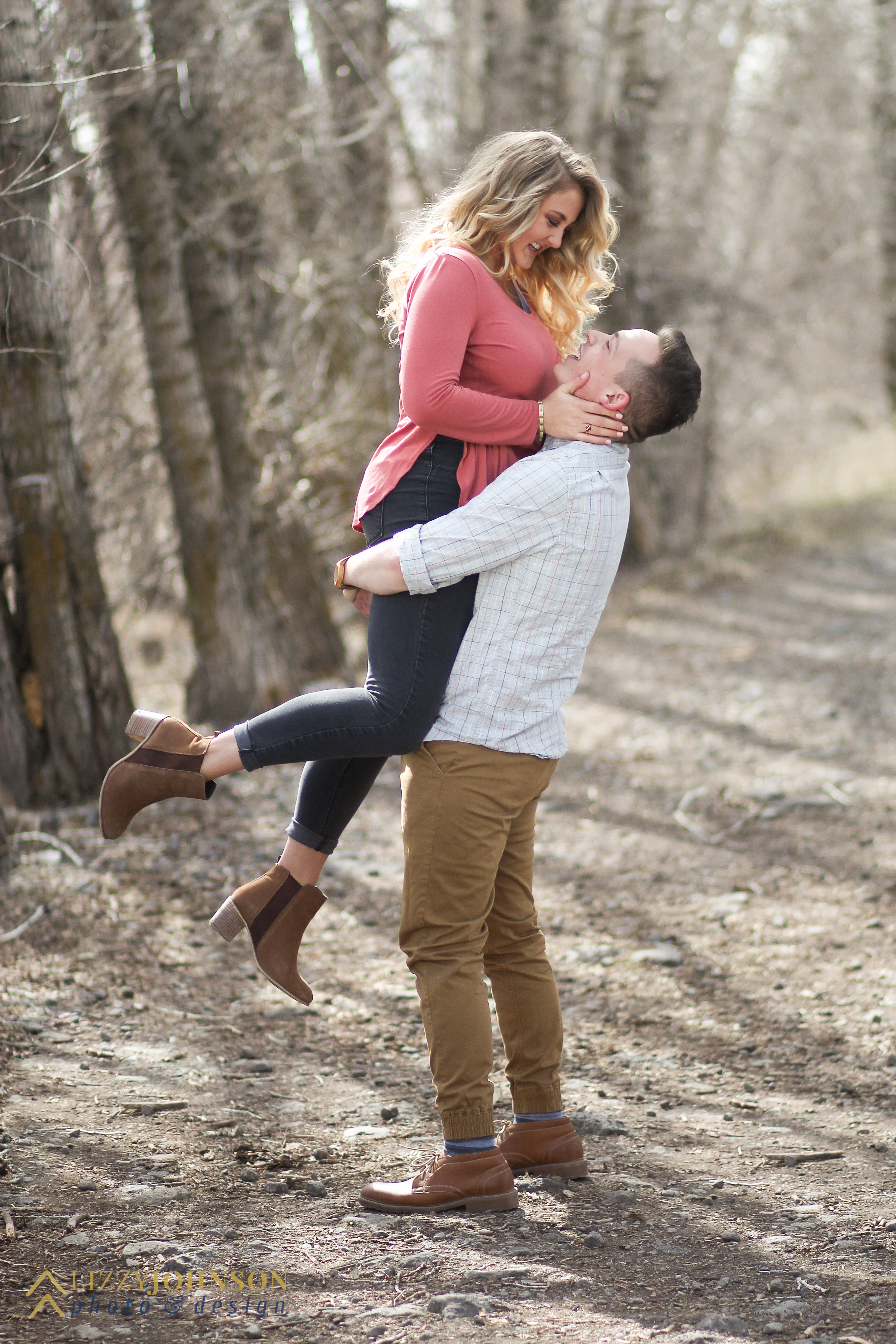
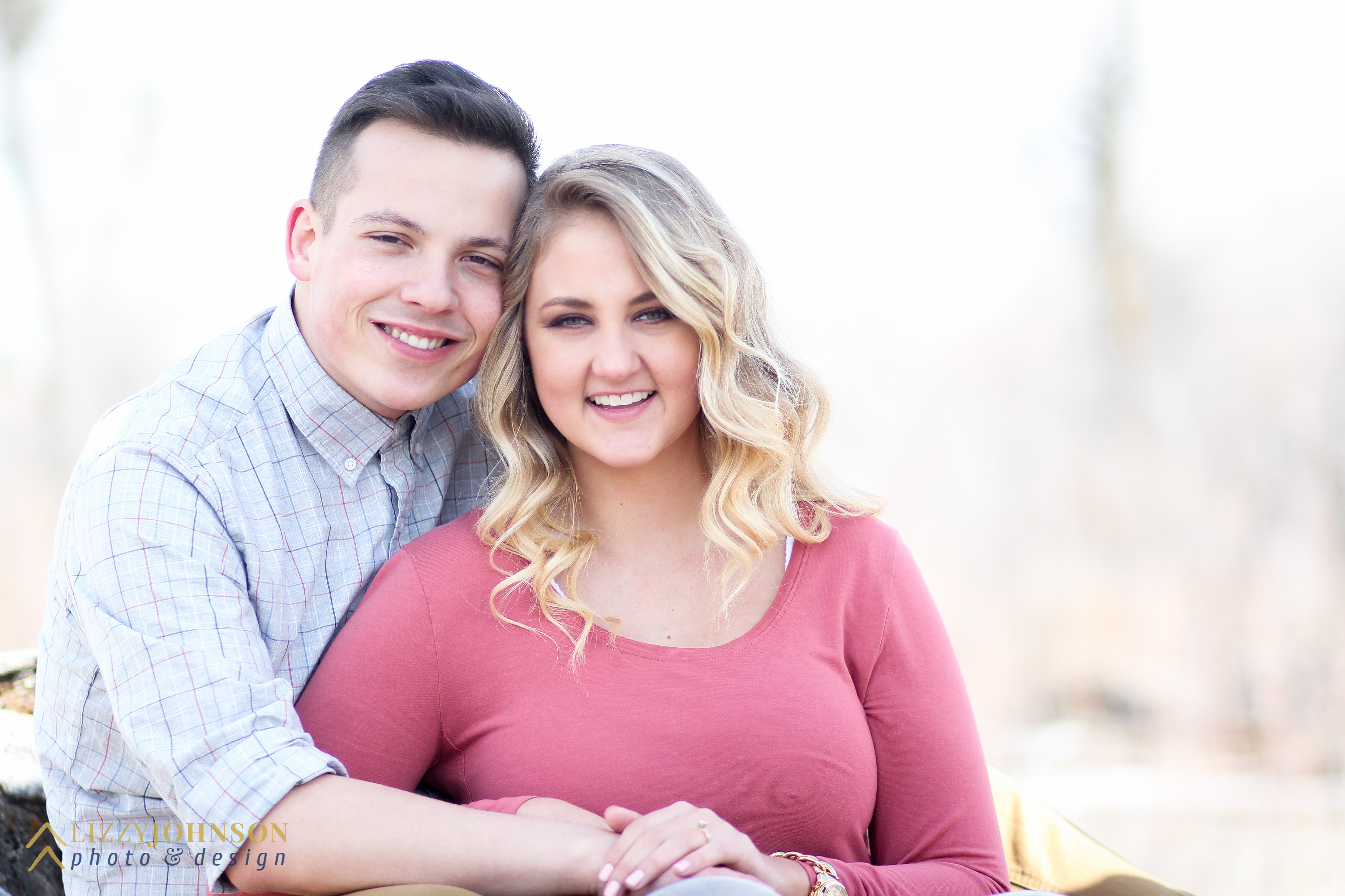
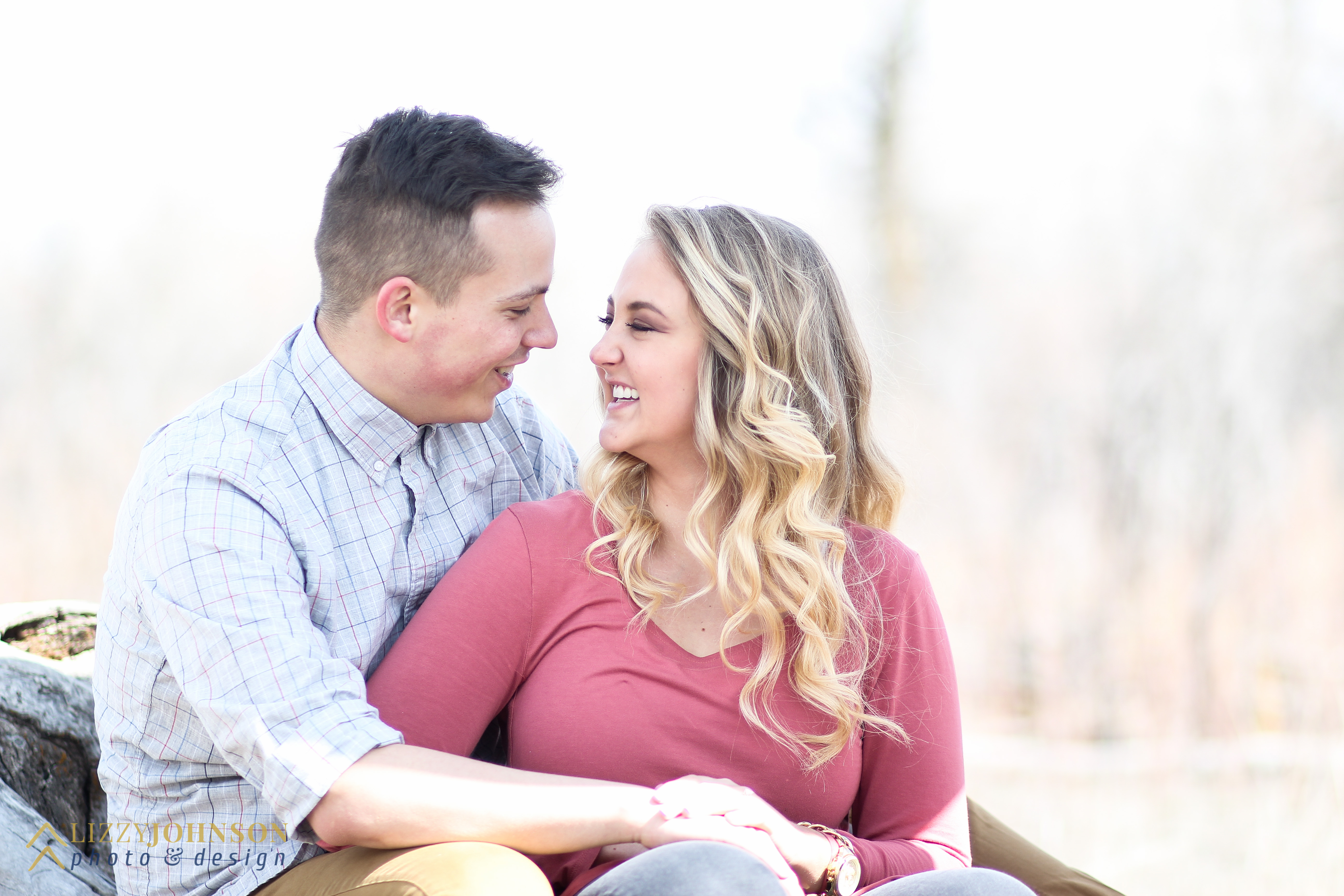
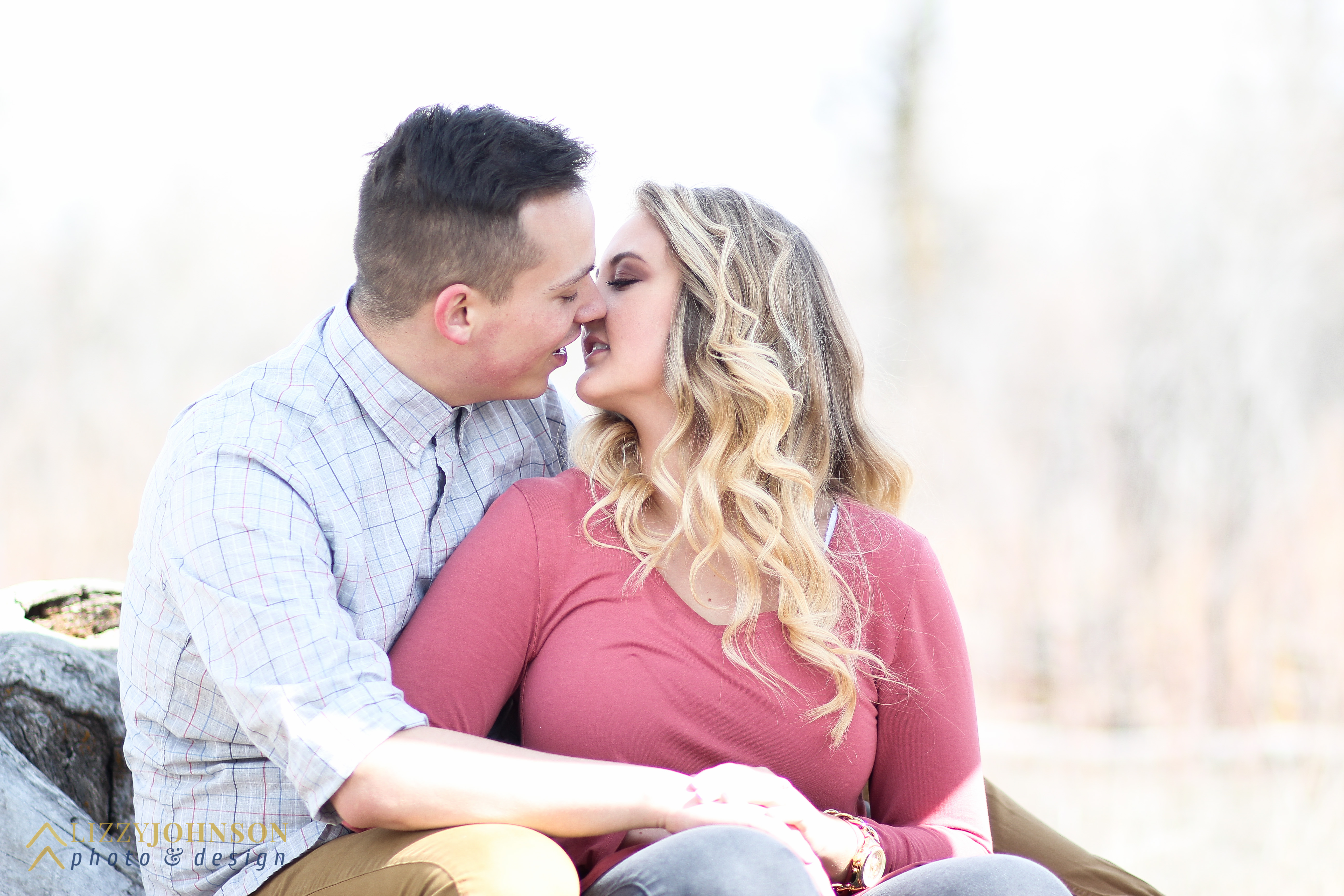
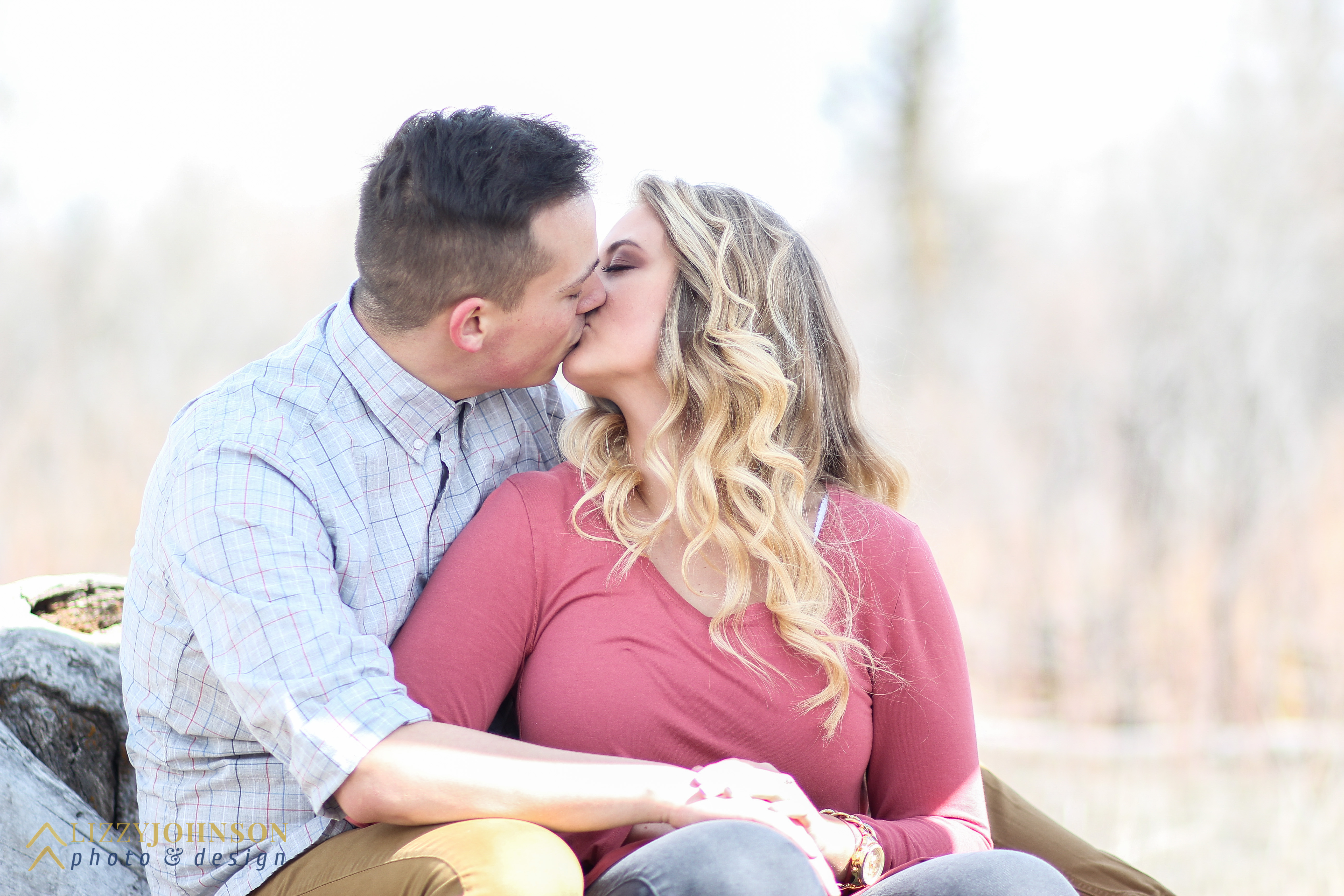
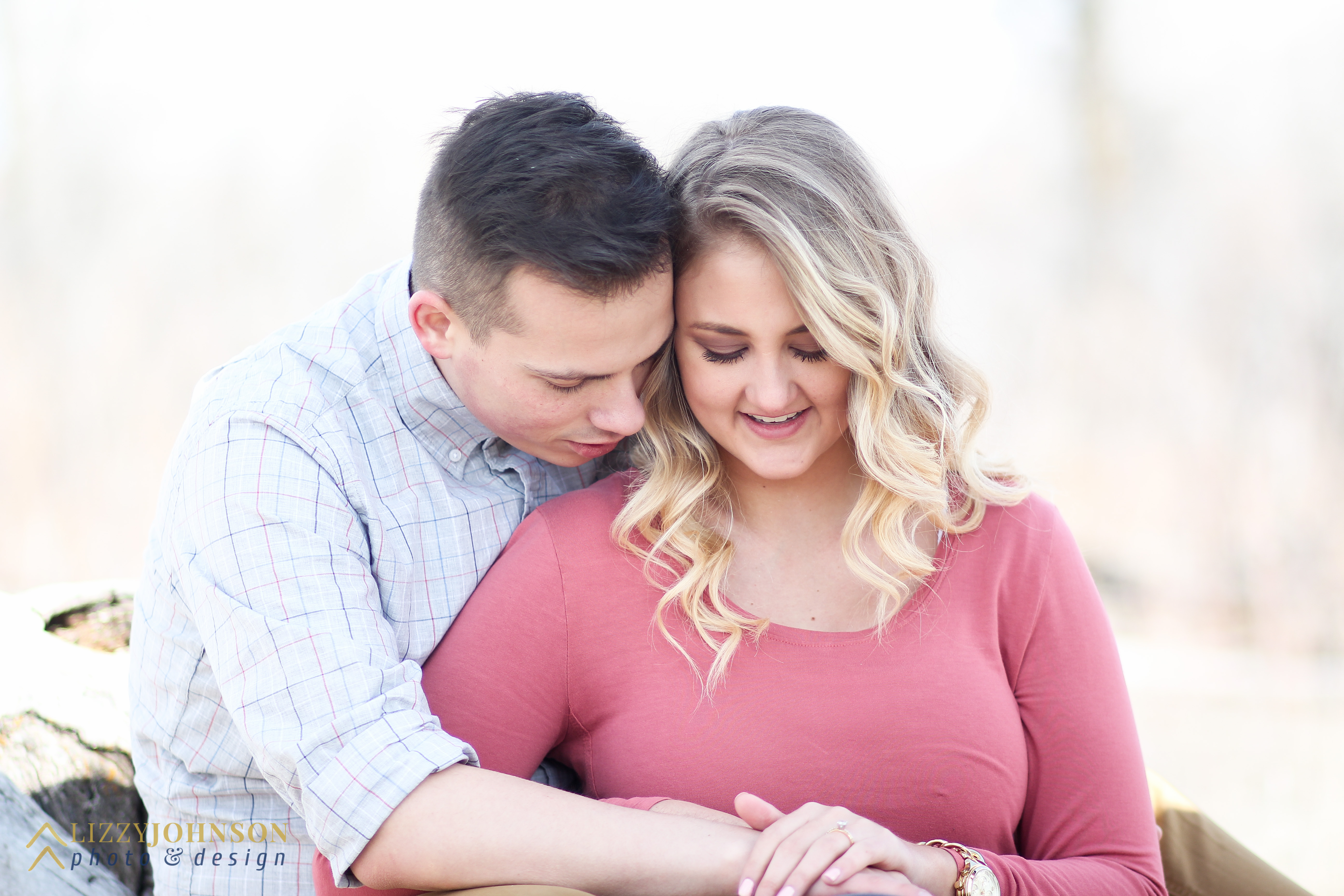
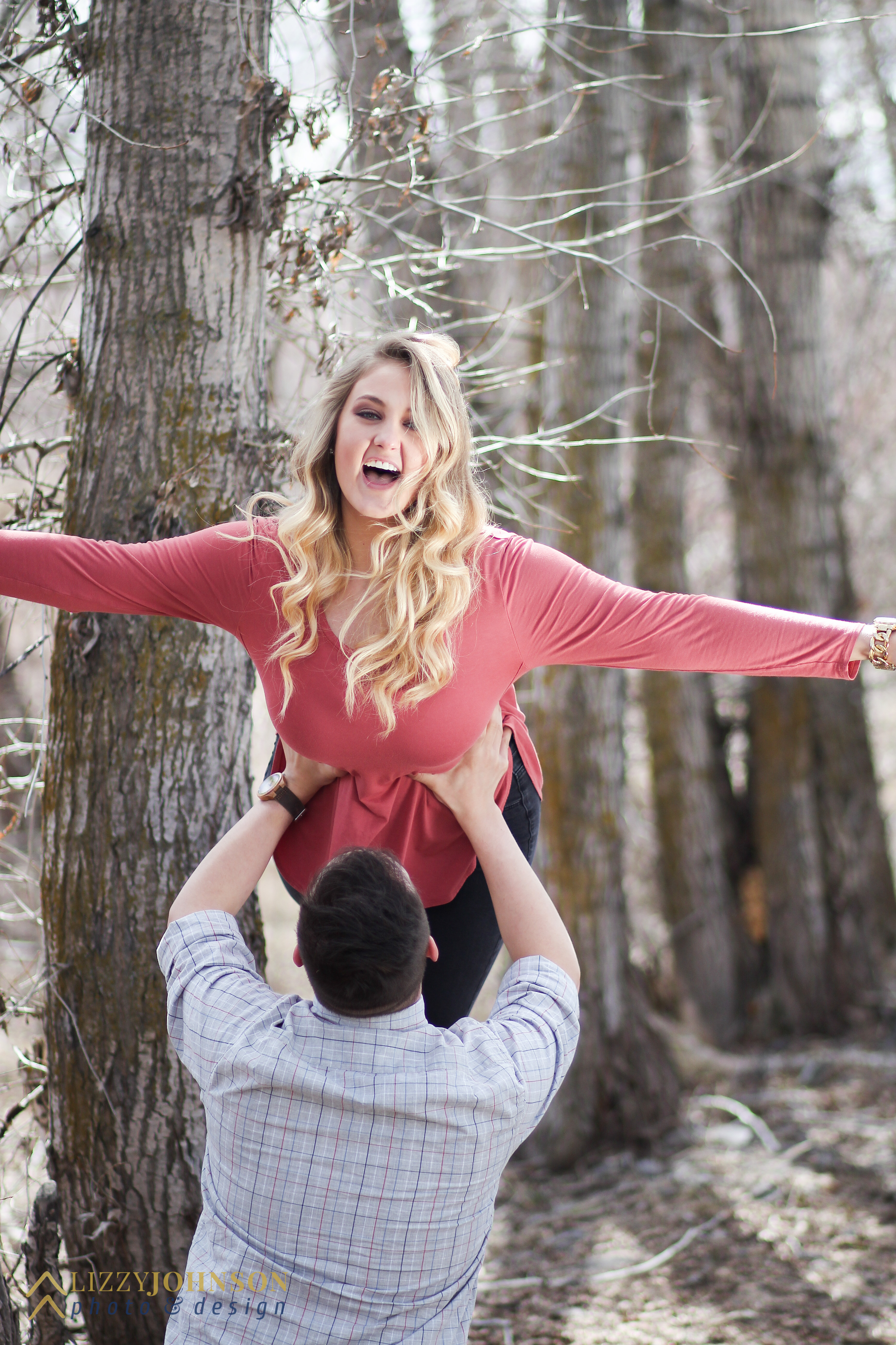
They were so fun to take pictures with! We were messing around and making jokes the whole time. I’m so grateful that they are my friends, and that they allowed me to take their engagements. Of course, I couldn’t end the post without showing a few outtakes from the session.
Hush of Night Band Poster
This was a project I was really excited for! We were supposed to create a gig poster for a band that we created that embodied the feeling that the band creates with its music. I wanted to do some sort of indie folk, acoustic guitar sounding band, but I wasn’t entirely sure what to name it. I’m gonna be honest though, my initial inspiration for this poster is a little ridiculous. I was with my roommate and we had run to Walmart to go grocery shopping. We passed by the men’s clothing section, and you know those outrageous t-shirts that have the massive falcons or wolves with mountains and lightning and stuff?
I’ll just show you. Because I totally bought the shirt.
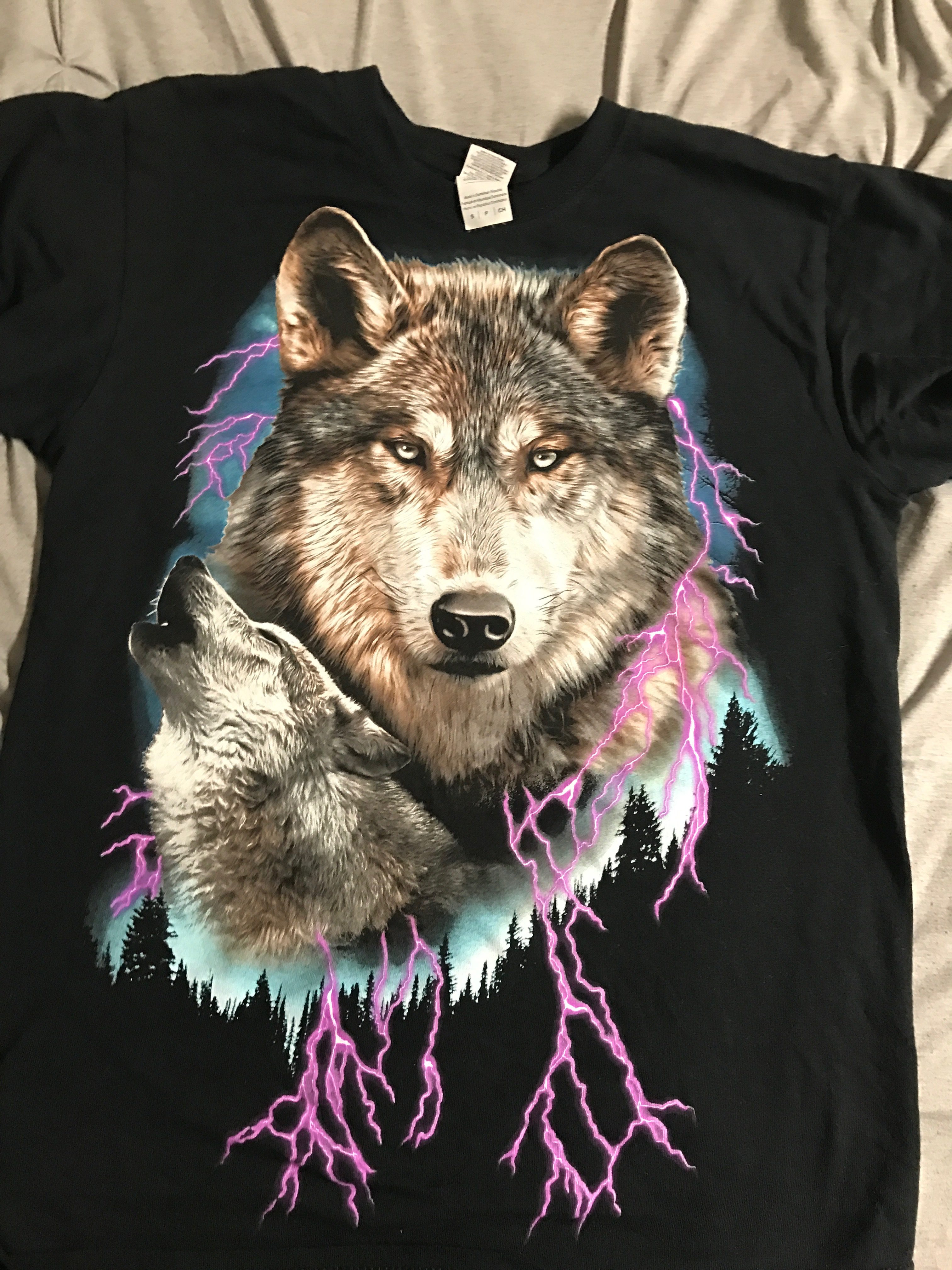
So I own that now.
SKETCHES
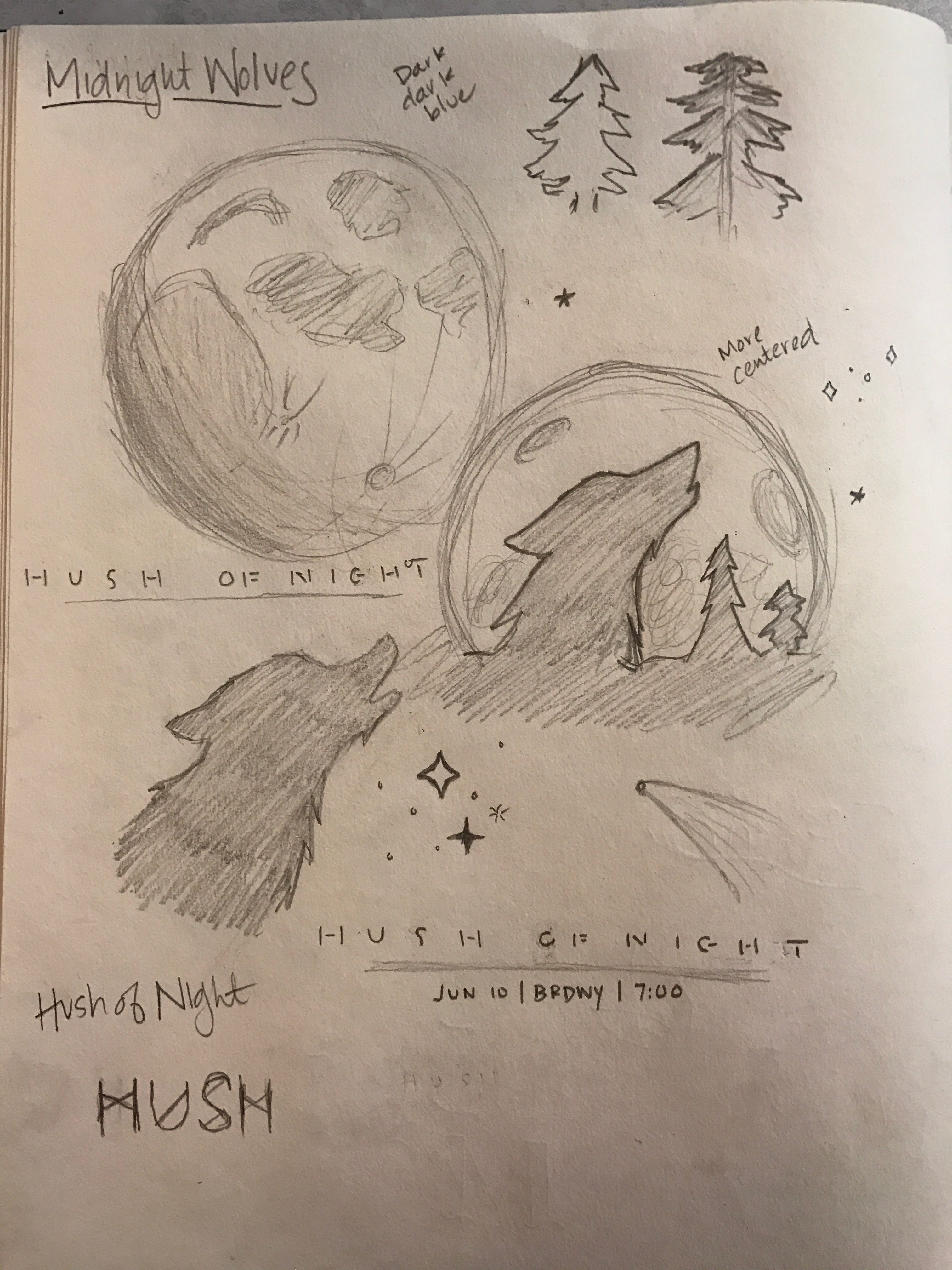
I initially went for the band name Midnight Wolves, and I based my sketches off of that phrase–classic wolf howling at the moon, but I thought that a large silhouette of the wolf against the moon would be different compared to what we usually see. However, as I was sketching, I realized that Midnight Wolves was a pretty literal translation for what I was sketching, so I wanted to change the name. I still wanted it to be nighttime themed, so I went to the thesaurus and typed in midnight to see if there were any different or unique phrases to the time. There were a few good ones, like twilight and witching hour, but my favorite was the phrase Hush of Night. I thought that it was a good way to replace Midnight Wolves but still keep the sketches that I came up with.
DRAFT
I first worked on the font. I didn’t want it to be a common font that you see, so I found a nice sans-serif font and cut it up to make it look a bit more futuristic. Then I lengthened the H and the T just to add just a bit more to the font. I originally didn’t have the glow around the words and just around the moon, but I wanted there to be more unity to the poster, so I added the glow around the words to make them stand out just a bit more. I also began to add hand drawn stars, but after doing a few, I felt that it was too simplistic. I needed to add more detail.
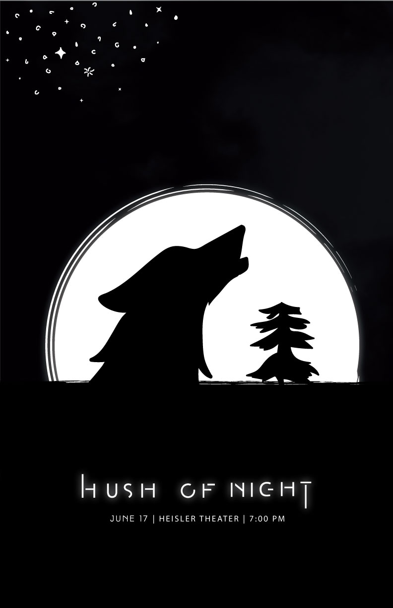
FINAL
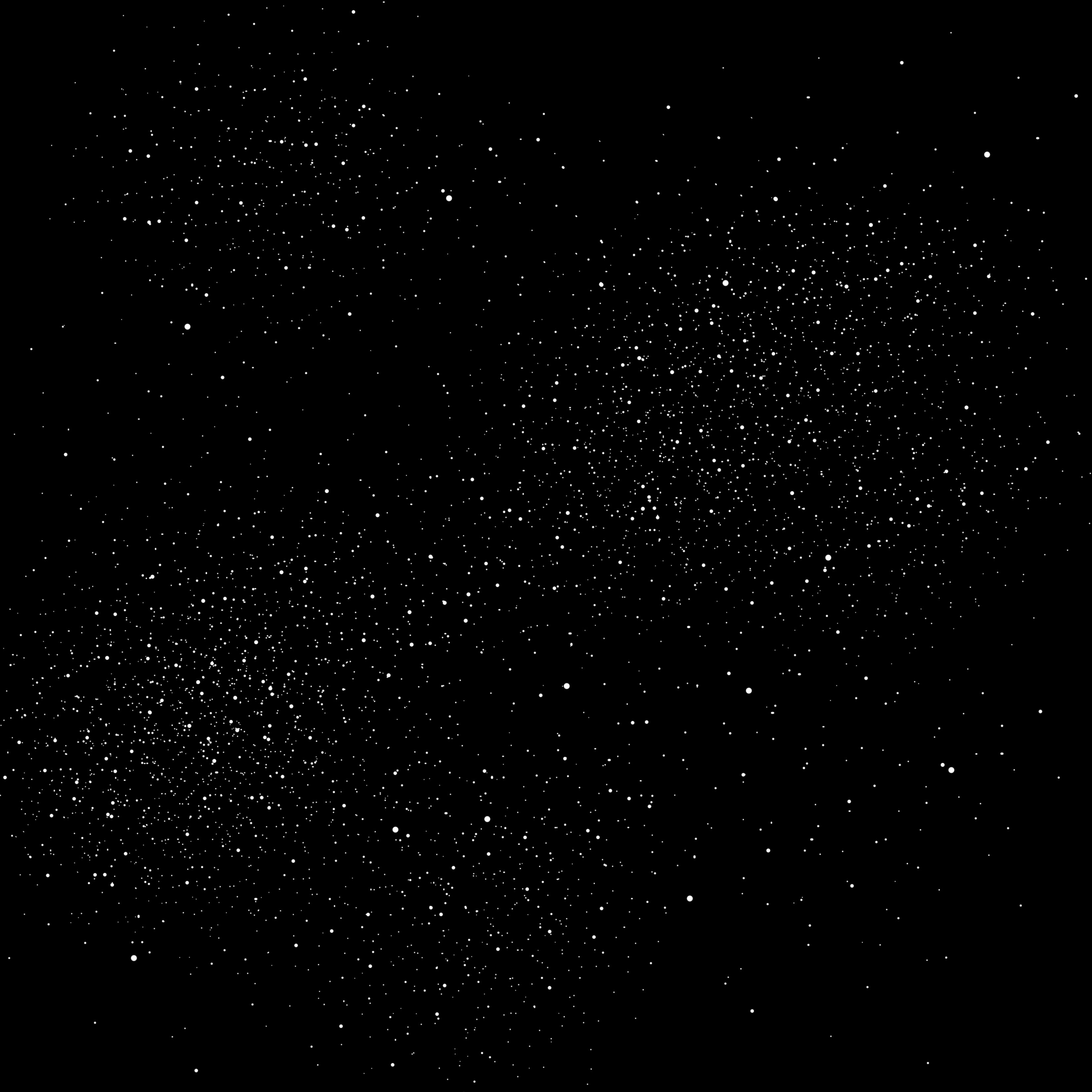
I first wanted to change up the stars. I went in to Photoshop and created my own brush of different sized dots to mimic stars, and then on a black canvas used the brush to create a starry sky.
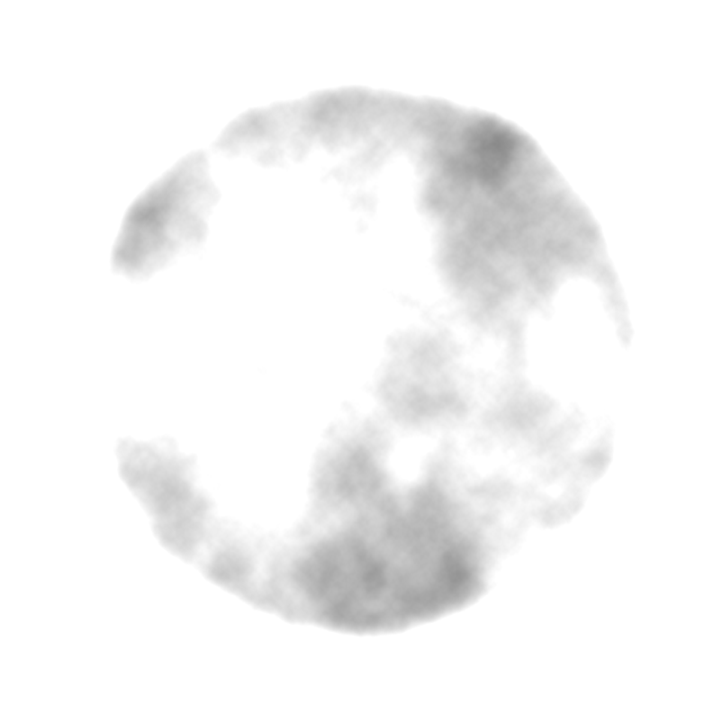
I know that this image looks pretty terrible since it’s against the the white background of my website, but you can see the full detail in the final poster. I created a white circle in Photoshop, and then I added the Clouds filter inside the circle. I then put white over top of the filter and then added a Linear Dodge to give it the texture and craters that the moon has. Finally, I added the same glow to the updated moon that I had on the text of the band name.
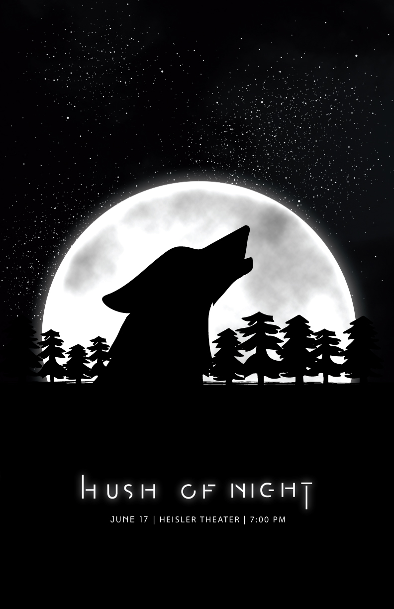
Finally I added more trees to the silhouette against the moon and added a second cloud texture to the stars to make the sky look even more realistic. Overall, I am really pleased with how this turned out! I love the glow on the moon and the text. I think it adds a sort of ethereal feeling to the poster. I’m also happy with the moon I created.
Basically, I’m just happy with everything.
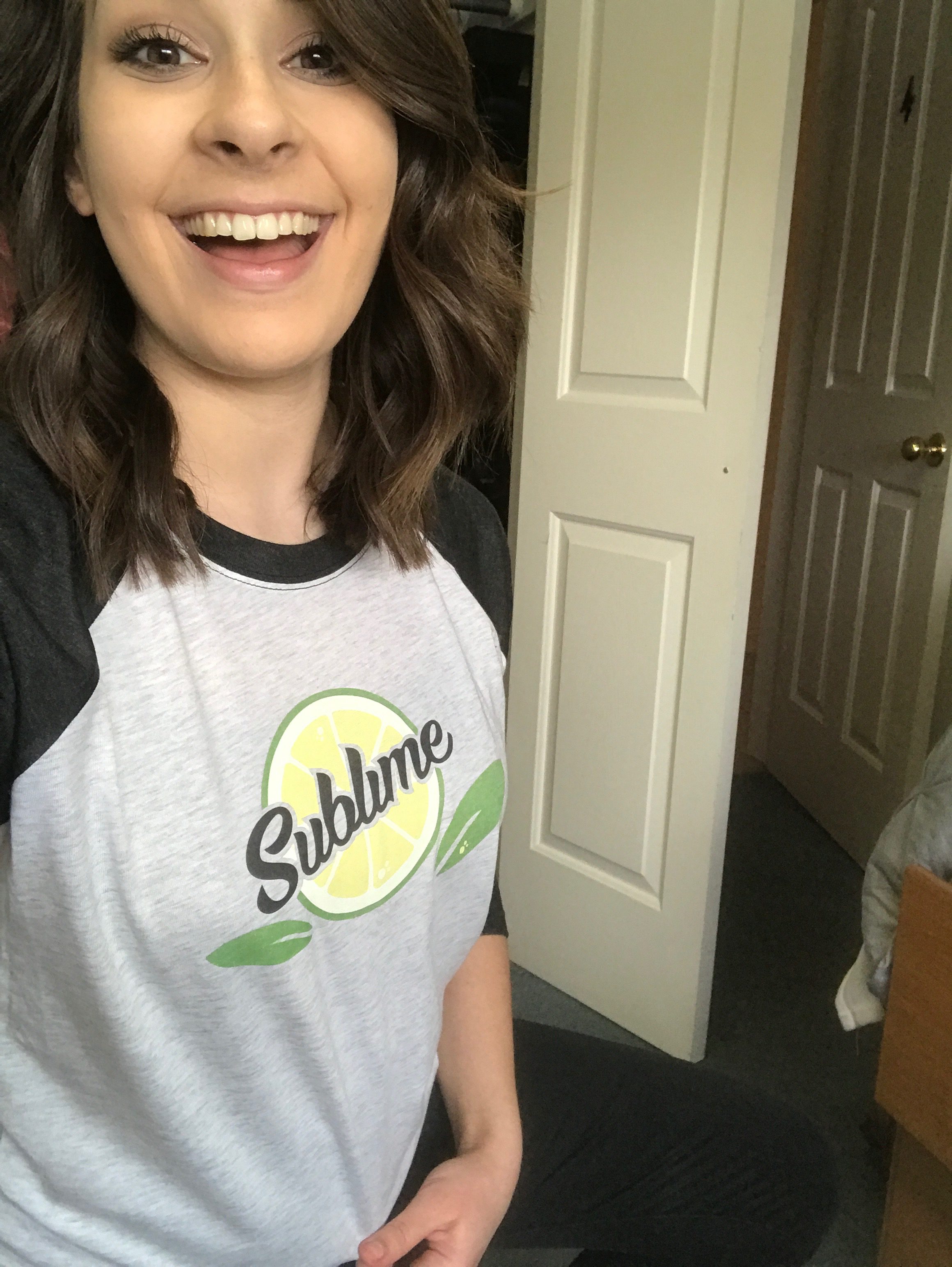
You Are Sublime
This one of the projects this semester that I was looking forward to the most. I didn’t really know what I wanted to do right off, and one day while I was browsing Pinterest, I saw a cute hand drawn card that said “You are Sublime!” with a cute little lime with a face on it. I liked the idea, and I wanted to try and recreate that somehow in my own way.
SKETCHES
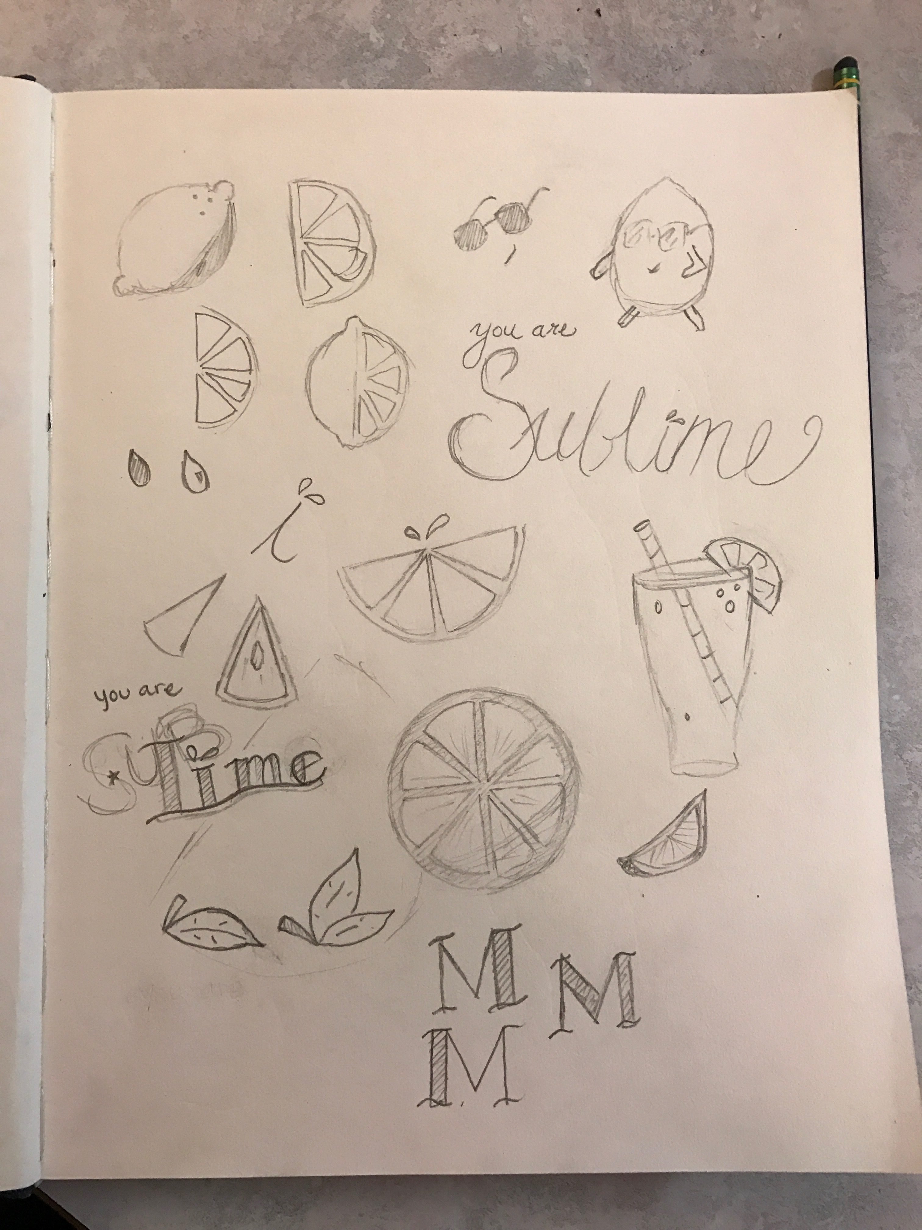
All I knew when I started sketching was that I wanted there to be a lime, but I didn’t know how I wanted to to be portrayed. Did I want it to have a face? Just a slice? Half a slice? When originally going in to my sketches, I wanted the whole phrase “You are sublime” to be on the shirt. I was also a little unsure with the fonts. Did I want them to be script fonts, or thicker? Basically, I sketched every way I could think of to draw a lime.
FIRST DRAFT
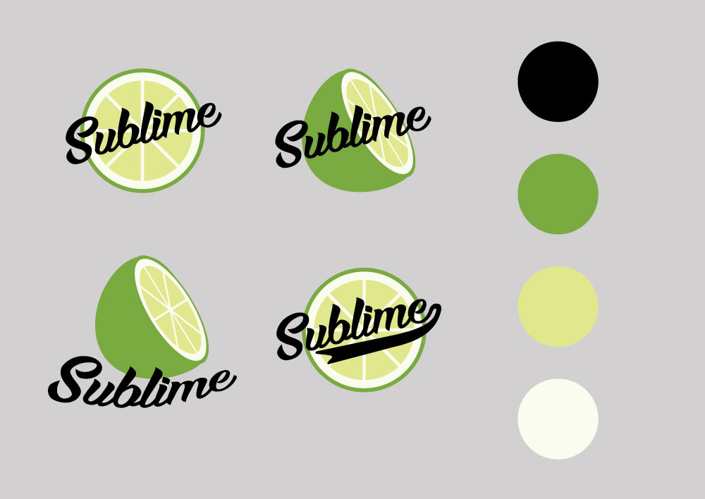
I was only limited to four colors when designing this project (five, if you utilized the color of your shirt in your design), but unlike some people, I didn’t really struggle in this area, as my design was simple enough. But when I was in Illustrator, I still wasn’t sure what I wanted, so I created four potential designs for my shirt, and then asked for feedback from my friends and people in my class to find the average favorite design. Most people agreed with me for the top left, so that’s what I went with!
Something still wasn’t feeling exactly right with my chosen design, though. It was still a bit too simple for my liking.
SECOND DRAFT
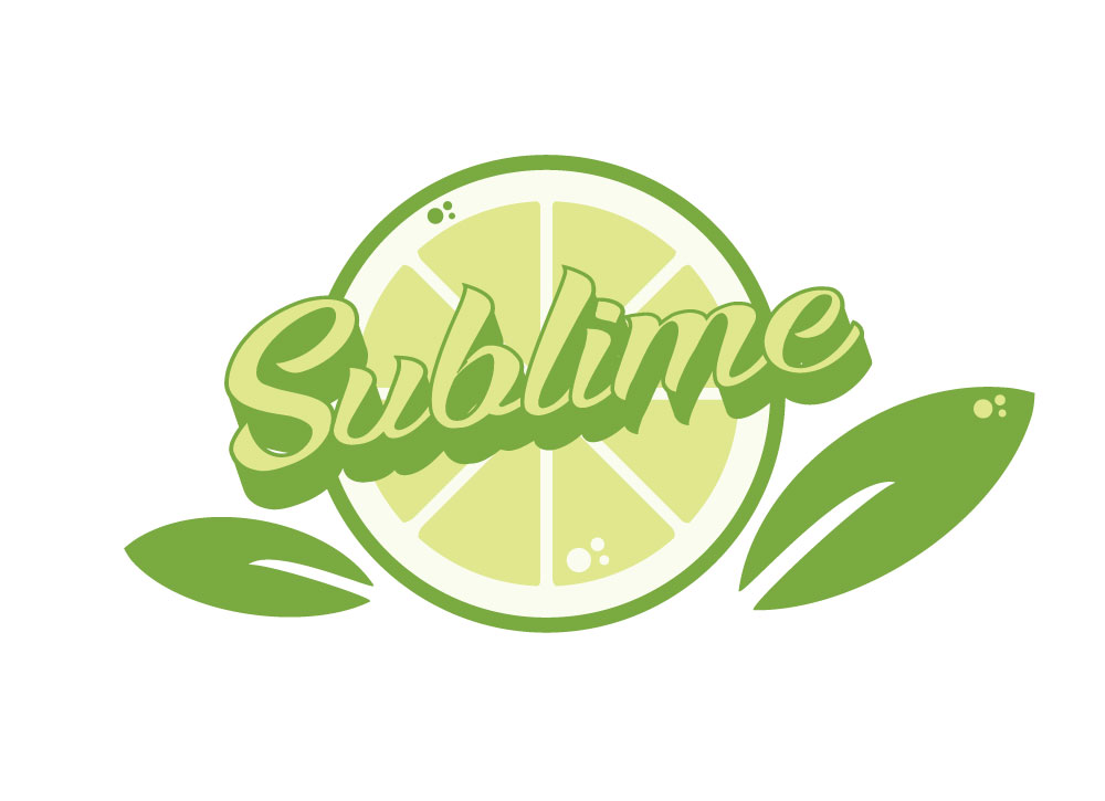
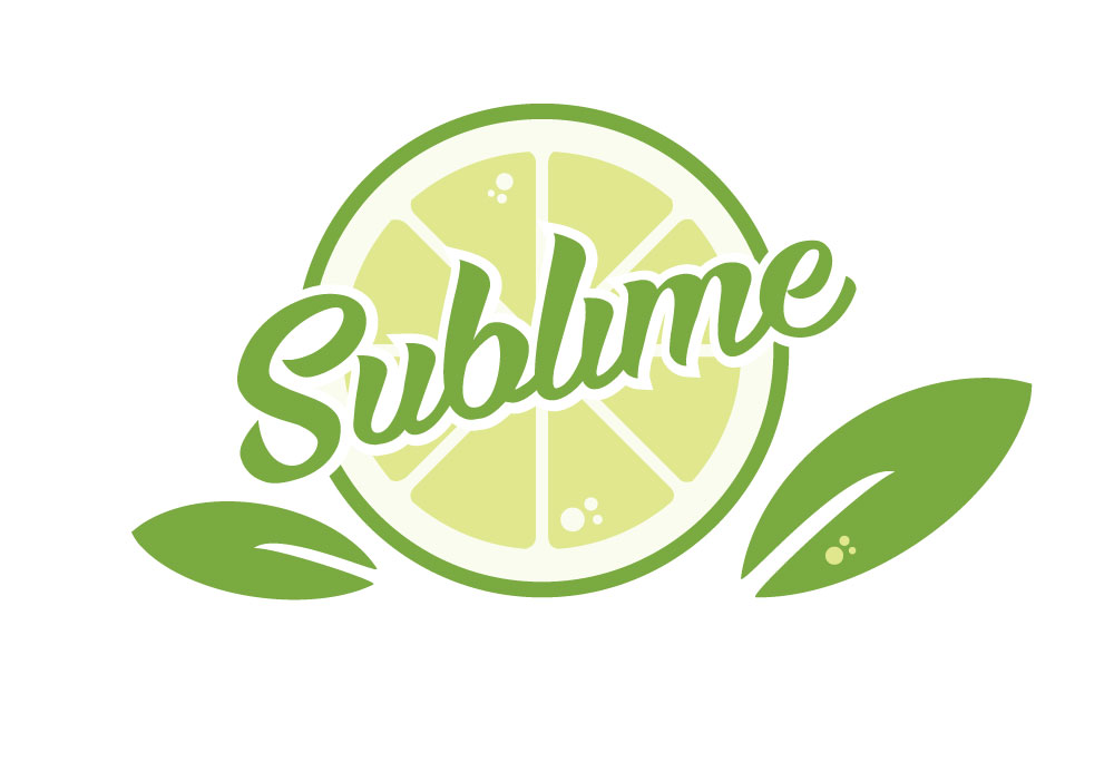
I went and visited my teacher for some feedback, and he helped me come up with these two potential designs. I finally decided on the right one, as I felt the 3D effect contrasted too much with the flatness of the lime and the added leaves.
FINAL
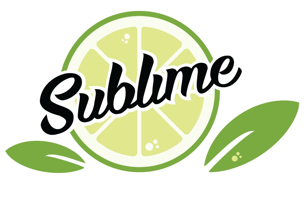
Since I was going for a baseball tee with black sleeves, I decided to change the font to black to match the shirt, and I am really proud of how it turned out!
Sound the Alarm – Photo Realistic Clock
I’m gonna be honest: I did not think I could pull this project off. When my professor told us we had to recreate a photo realistic clock with merely four weeks of experience in Illustrator, I was ready to just give up at that second. But after seeing all the results from past students, I felt a sudden surge of confidence that maybe this was actually possible.
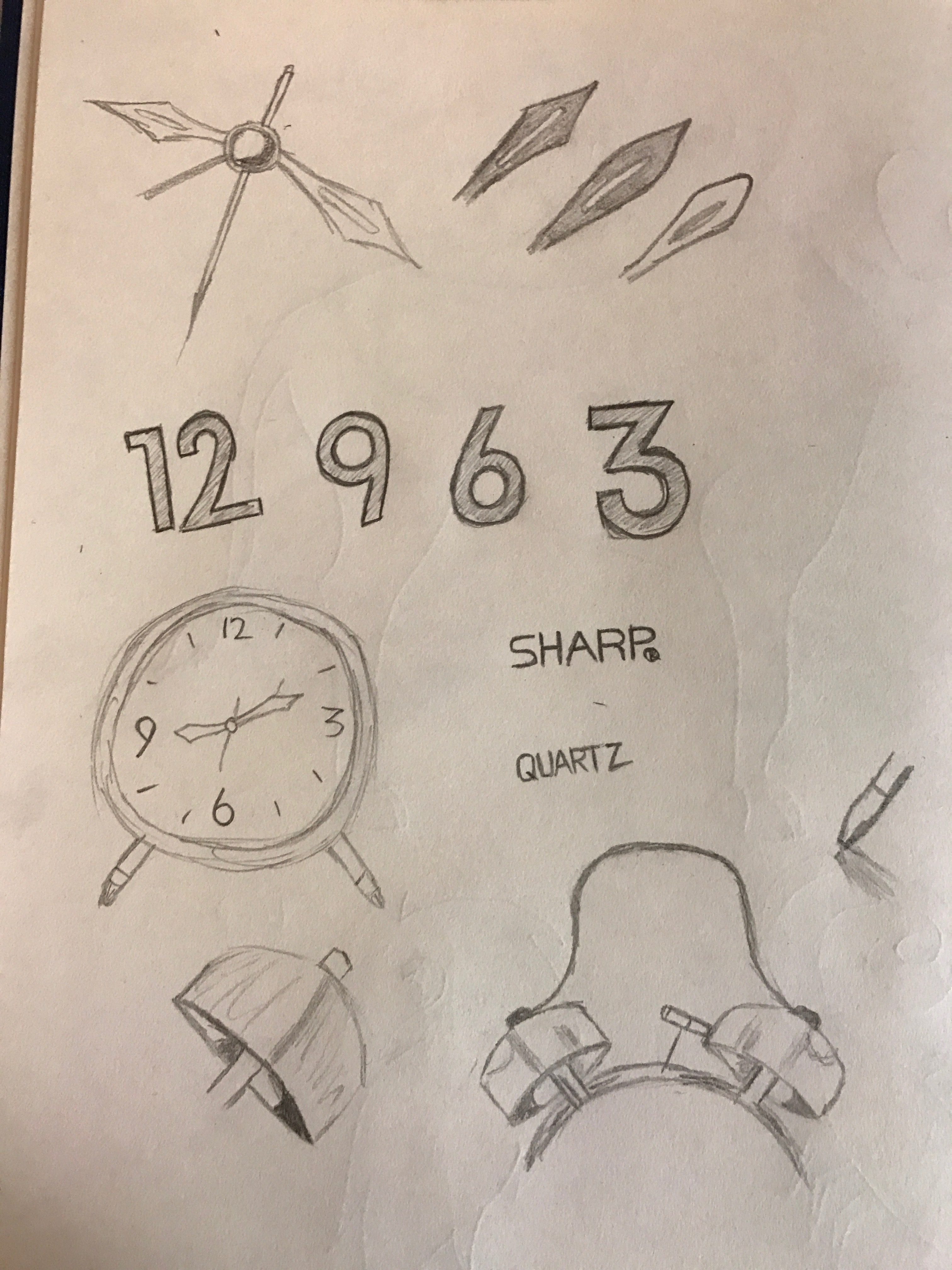
SKETCHES
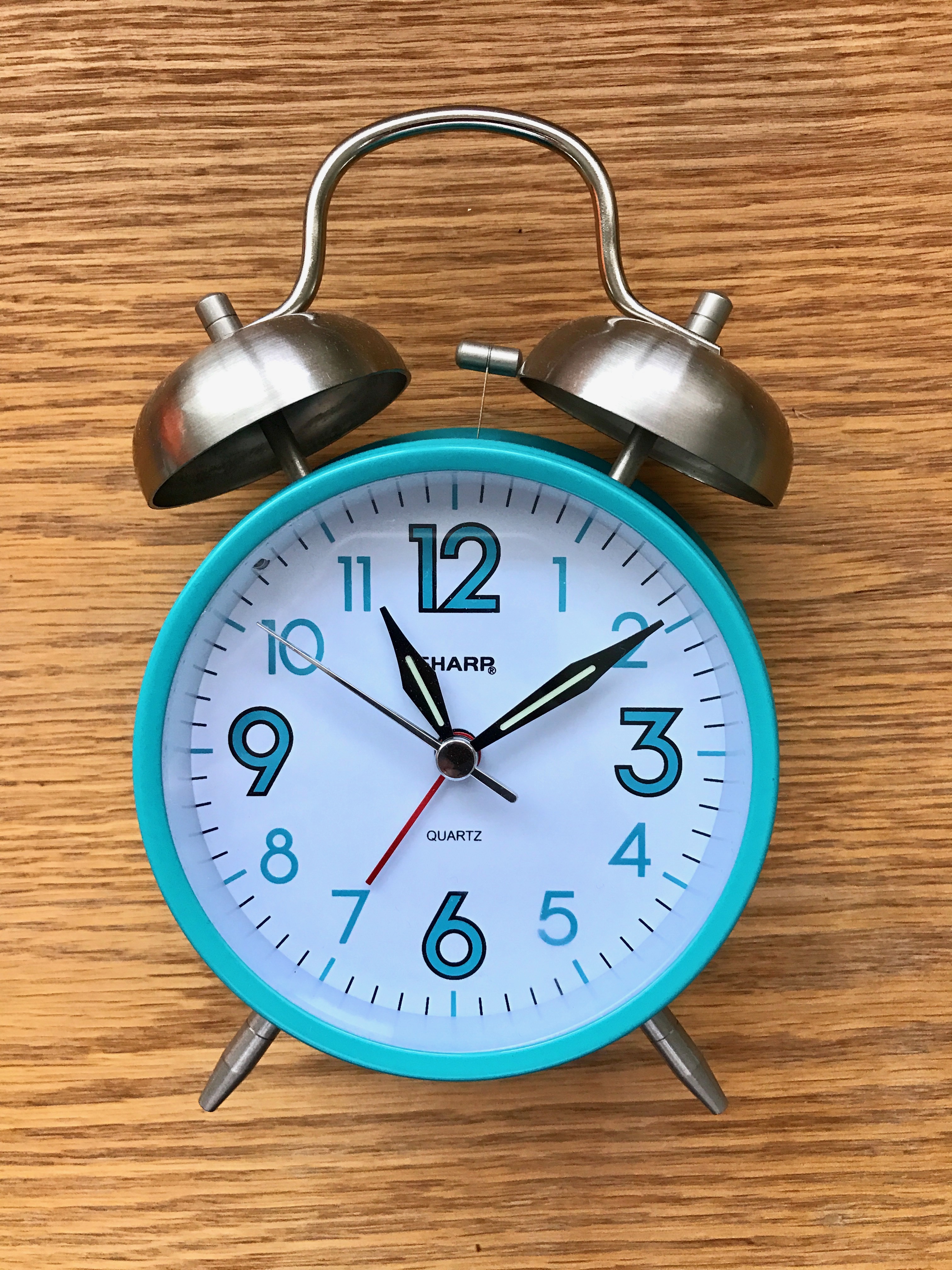
My roommate has this really cute teal alarm clock that she uses to wake up, and when I learned we had to do, I knew I wanted to try and recreate her alarm clock. For my sketches I set her clock in front of me and tried to recreate elements that stood out to me. I practiced drawing the elements that stood out to me the most: the bells, the numbers, and the shape of the hour and minute hands.
DRAFT
I was a little intimidated about figuring out how to do all the proper and shading–especially on the highlights of the two alarm bells, so I decided that I would first get the shapes of everything down first. Start with the basics and then work my way up. This actually turned out to be a good decision in the long run, because I didn’t have to recreate any of the shapes. I still wasn’t happy with the shapes of the bells initially, though, so I did eventually have to redraw those.
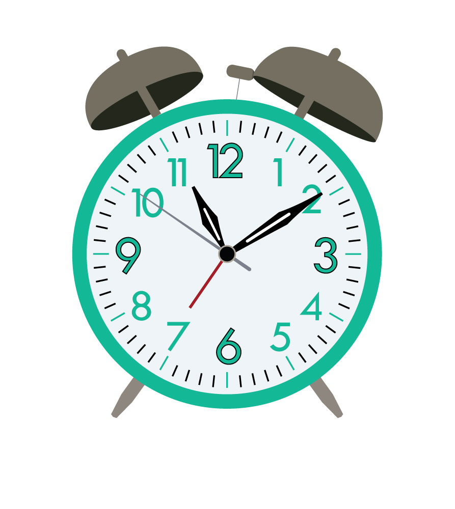
FINAL
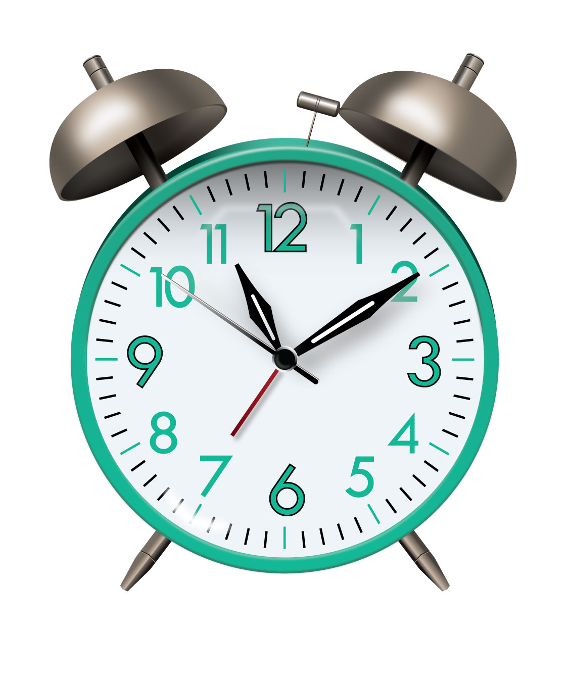
After I got some help on the alarm bells shine and highlights, I finally tackled the rest of the clock, and after getting the help I needed, it was actually a lot easier than I expected! There were a lot of small details that I hadn’t noticed in my initial photos, so I had to make sure to include those in my final draft to make it look as realistic as possible. But all in all, I am really happy with what I achieved! I never thought I would be able to pull this project off, and I’m really happy with what I’ve learned from it as a result–gaussian blur, gradients, and how to add depth to objects.
This is Lizzy Johnson
Lizzy Johnson’s Instagram
- 6 years ago by lizzymjo You have saved our lives! We are eternally grateful! #halloween2018 #theclaw
- 6 years ago by lizzymjo This goodbye was one of the hardest I’ve ever had. My baby brother, my only brother, is becoming a man and giving up two years of his life to serve the people of Mexico. I’m so, so proud of him and the love he has for this gospel. Two years looks like an eternity right now, but I hope they’ll go by fast. Te amo, Hermano Johnson. I’ll see you in two ❤️ #pueblasouthmission #calledtoserve #notearslefttocry #rememberwheniwastallerthanyou
- 6 years ago by lizzymjo wassup homies ya girl's announcing her graduation a week late #stillcountsthough #byecollege #byui
- 6 years ago by lizzymjo Y'ALL. I had the most incredible opportunity this semester to write and direct an original short film to be shown on the silver screen. And as if that wasn't amazing enough, we won not one, not two, but THREE out of the six awards given at the premiere, including the Critics Choice Award. I am in shock. I am so thankful for my amazing team who helped bring my story to life. You guys are stupendous. I love you all so much! I still can't believe it. #extraction #amidreaming #oscarshereicome #byui


