I was commissioned by Hildog Farms in Kalaheo, Hawaii to design a logo to put on jars for their new honey farm. I was given a lot of creative freedom in designing this logo, so I immediately got to work.
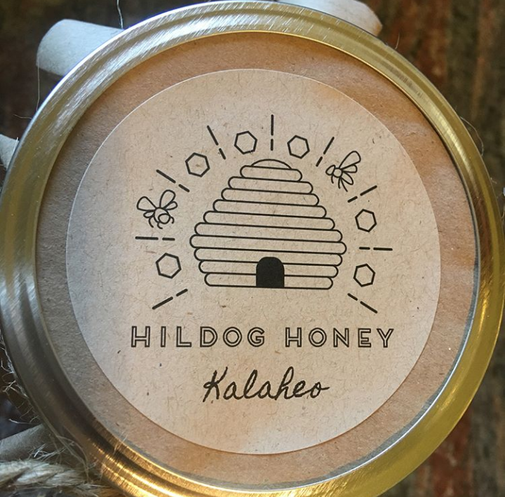
The first thing I wanted to do was incorporate the classic image of a beehive. However, I didn’t want the logo to look like every other beehive that has been designed before.
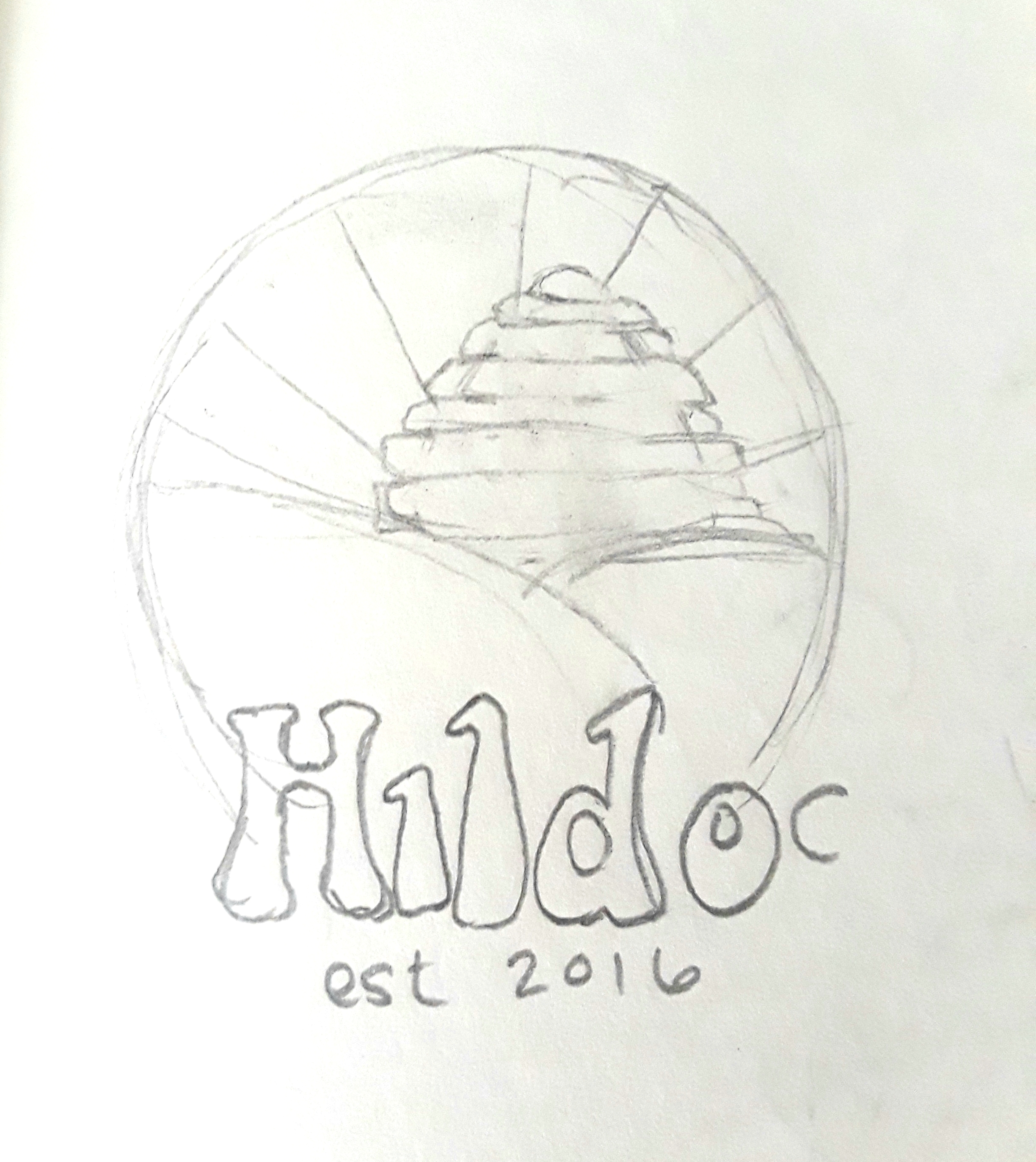
I started designing an initial basic logo for the farm itself, with a rising beehive representing the sun, rays of light emitting from the hive, and then two rolling hills in the foreground. However, I felt like while this logo could be given to represent the farm in its entirety, I felt that there should be a separate logo for the honey jars. Speaking with the owners, they agreed, and I immediately got to work.
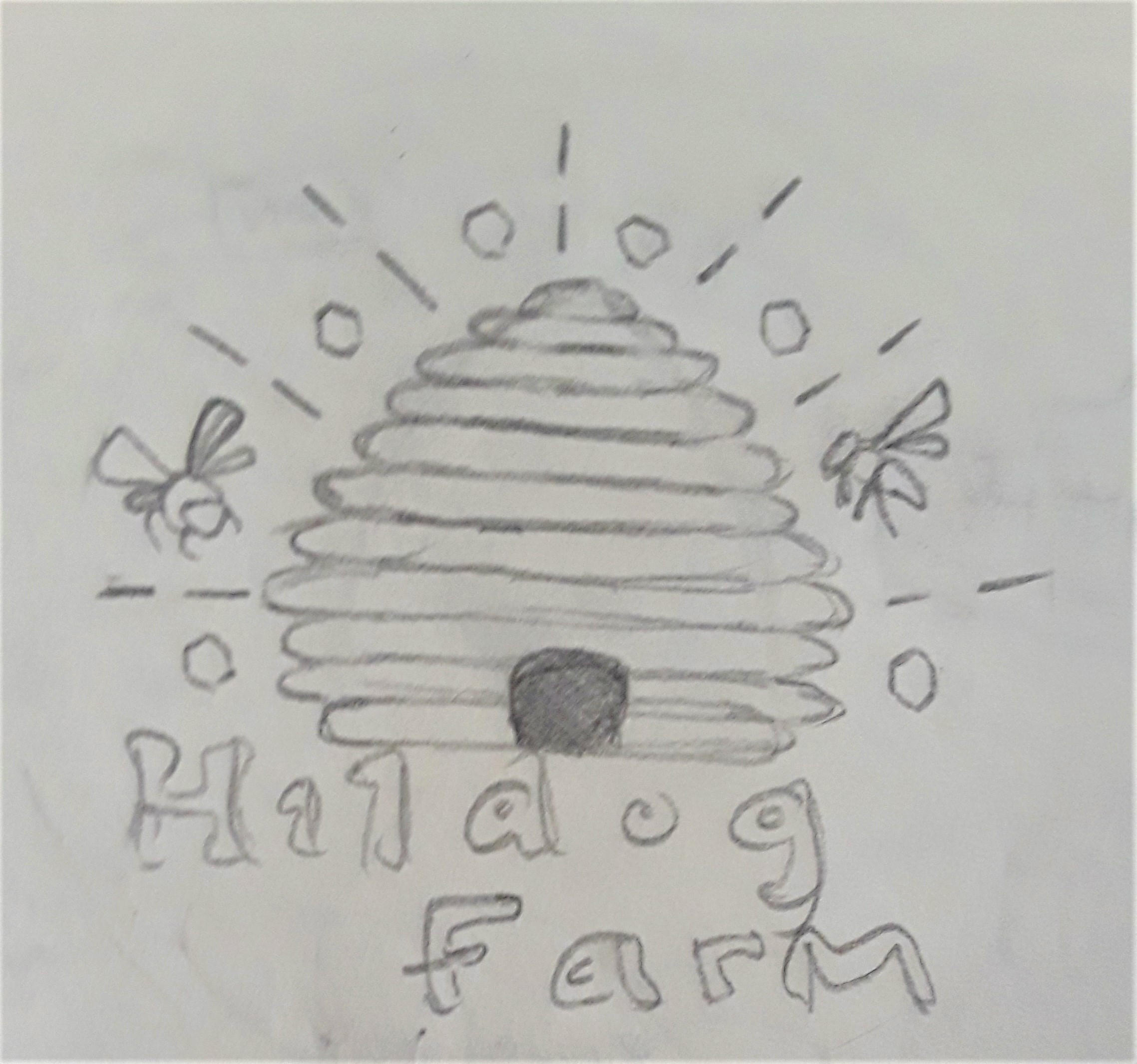
I’ve always loved the line art style of illustration and graphic design, and I wanted to create that instead of a fully colored logo to go on the labels. I initially started with just the beehive and then the words “Hildog Farm” underneath. It was still looking plain, so I decided to add more to the logo. I did some research by looking up images of honey bees flying and landing on flowers, and knew that this would be a great addition to have the bees floating around the hive. I also added accent lines surrounding the hive, as well as several hexagons within the empty areas between the lines.
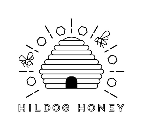
Creating the logo was fun and simple! I first used the Rounded Rectangle tool to build the shape of the beehive and its lines. Once I created the shape I liked, I then imported the sketch that I created above and used the Pen tool to trace around the shapes of the bees flying around the hive. Lastly, I used the Pen tool to draw two lines and the hexagons, and then copied both to surround the beehive at equal intervals using the Rotate tool.
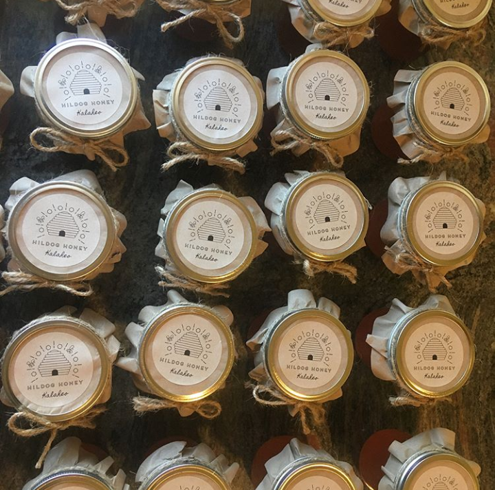
The logos turned out wonderful! The clients were incredibly happy with how they turned out, and they look perfect on the homemade jars of honey.