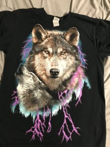
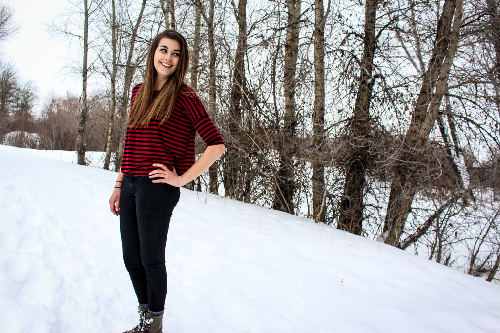
This was a project I was really excited for! We were supposed to create a gig poster for a band that we created that embodied the feeling that the band creates with its music. I wanted to do some sort of indie folk, acoustic guitar sounding band, but I wasn’t entirely sure what to name it. I’m gonna be honest though, my initial inspiration for this poster is a little ridiculous. I was with my roommate and we had run to Walmart to go grocery shopping. We passed by the men’s clothing section, and you know those outrageous t-shirts that have the massive falcons or wolves with mountains and lightning and stuff?
I’ll just show you. Because I totally bought the shirt.
So I own that now.
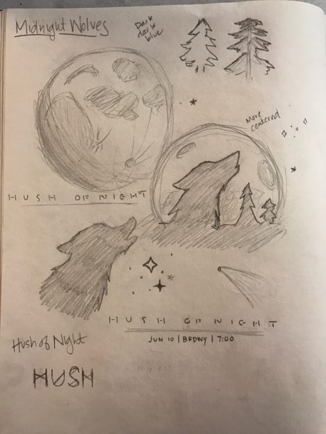
SKETCHES
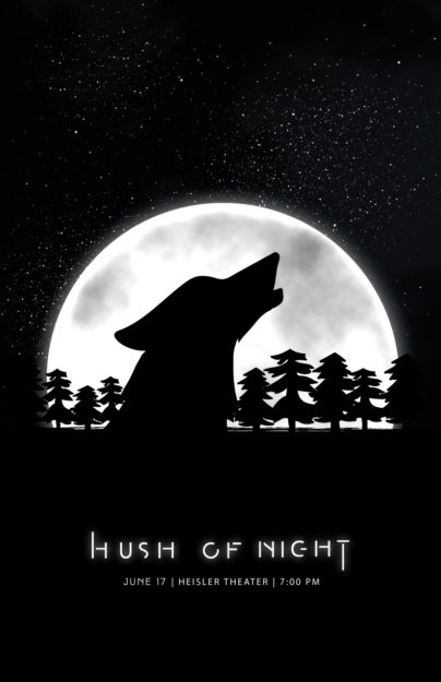
I initially went for the band name Midnight Wolves, and I based my sketches off of that phrase–classic wolf howling at the moon, but I thought that a large silhouette of the wolf against the moon would be different compared to what we usually see. However, as I was sketching, I realized that Midnight Wolves was a pretty literal translation for what I was sketching, so I wanted to change the name. I still wanted it to be nighttime themed, so I went to the thesaurus and typed in midnight to see if there were any different or unique phrases to the time. There were a few good ones, like twilight and witching hour, but my favorite was the phrase Hush of Night. I thought that it was a good way to replace Midnight Wolves but still keep the sketches that I came up with.
DRAFT
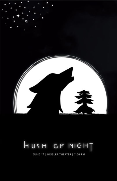
I first worked on the font. I didn’t want it to be a common font that you see, so I found a nice sans-serif font and cut it up to make it look a bit more futuristic. Then I lengthened the H and the T just to add just a bit more to the font. I originally didn’t have the glow around the words and just around the moon, but I wanted there to be more unity to the poster, so I added the glow around the words to make them stand out just a bit more. I also began to add hand drawn stars, but after doing a few, I felt that it was too simplistic. I needed to add more detail.
FINAL
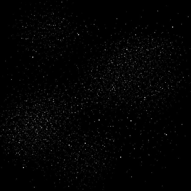
I first wanted to change up the stars. I went in to Photoshop and created my own brush of different sized dots to mimic stars, and then on a black canvas used the brush to create a starry sky.
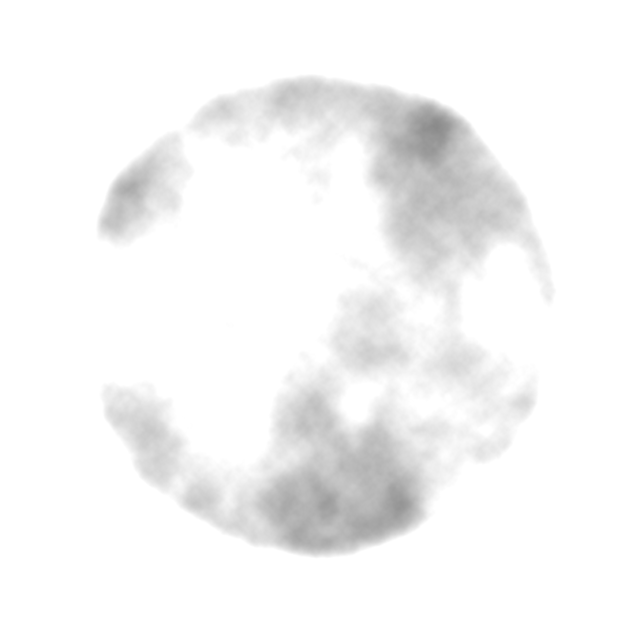
I know that this image looks pretty terrible since it’s against the the white background of my website, but you can see the full detail in the final poster. I created a white circle in Photoshop, and then I added the Clouds filter inside the circle. I then put white over top of the filter and then added a Linear Dodge to give it the texture and craters that the moon has. Finally, I added the same glow to the updated moon that I had on the text of the band name.
Finally I added more trees to the silhouette against the moon and added a second cloud texture to the stars to make the sky look even more realistic. Overall, I am really pleased with how this turned out! I love the glow on the moon and the text. I think it adds a sort of ethereal feeling to the poster. I’m also happy with the moon I created.
Basically, I’m just happy with everything.

