Time for a rebrand!
Since I’m now further down the road to graduation, it means that I was asked to redesign my logo for my own personal brand. I was really excited for this project because I that I’ve gotten more confident in my skills in Adobe Illustrator, and I felt like my own logo needed to be changed for watermarks on my photos and design projects. The blue and the gold of my current logo were sometimes hard to see or contrasting against the images, so I wanted to go in the direction of something simple and easy to see.
SKETCHES
I’ve been really interested in the simple, rounded design that’s easily timeless and won’t fall out of style–something that falls in the design of small icons. So I went to the literal drawing board and started sketching out some ideas.
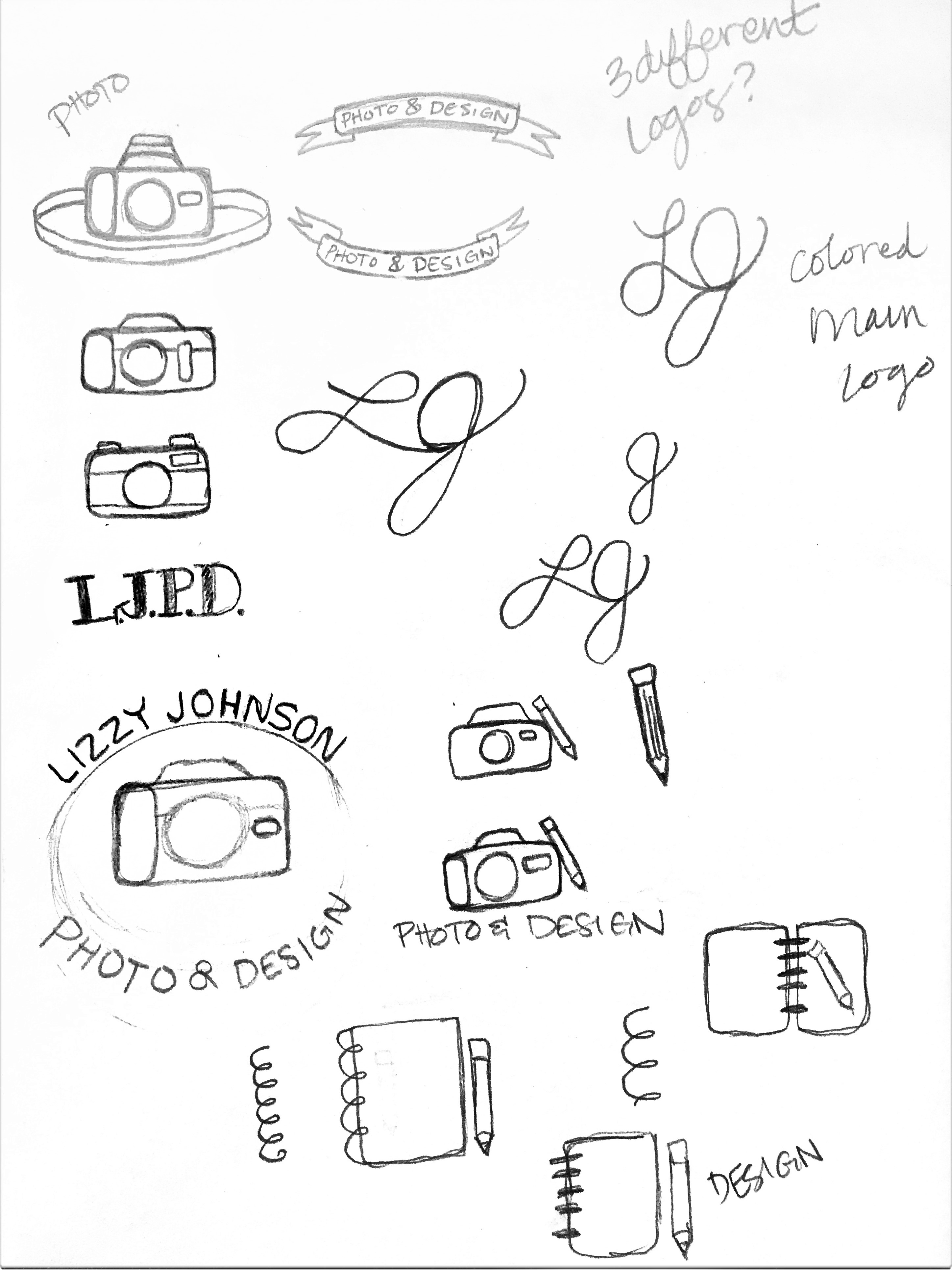
I was originally thinking of doing some sort of use with my initials, but I wasn’t very happy with what I was doodling, and I felt like a lot of designers and photographers have been using just their initials as their logo or brand, and I wanted to do something different. After drawing some simplistic cameras, I first came up with the idea of creating something that looked almost like a stamp that I could place in the corners of my artwork to brand it as my own. As I was sketching, I decided to come up with three different logos for myself. One for my entire “Photo & Design” brand, and then one for my photography and another for my design.
PAGE TO SCREEN
![]()
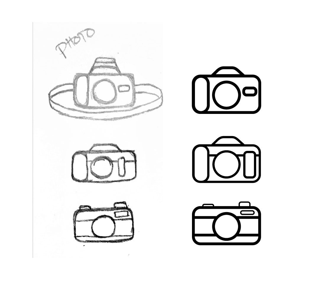
I then started to transpose my three ideas of simplistic cameras into Illustrator. I used both my own DSLR and vintage cameras to inspire ideas for the design. Once I created these three, I chose my favorite–the top one–and then added my name and desired business. I initially didn’t want to have a circle surround the design, as I was afraid that circles encasing a logos was overused, and instead created the circle with my brand surrounding the camera and pencil. I also added an “Established” and “2016” to fill the empty spaces in between the words to help close the circle, and then moved on to my other two logos for solely photography and graphic design.
INITIAL LOGOS
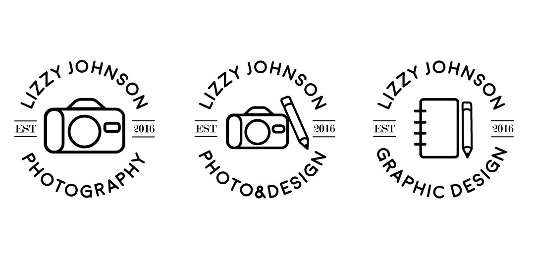
I liked how these logos looked at first, I felt like I had managed to capture a stamp-like, simplistic design, but then realized that even though my design was simple, having too many logos for different projects might get confusing. Having three different logos could becoming too convoluted for people to immediately recognize my brand. So I scrapped the Photography and Graphic Design logos and decided to go in for a refinement of the main Photo & Design logo instead.
REFINED LOGO
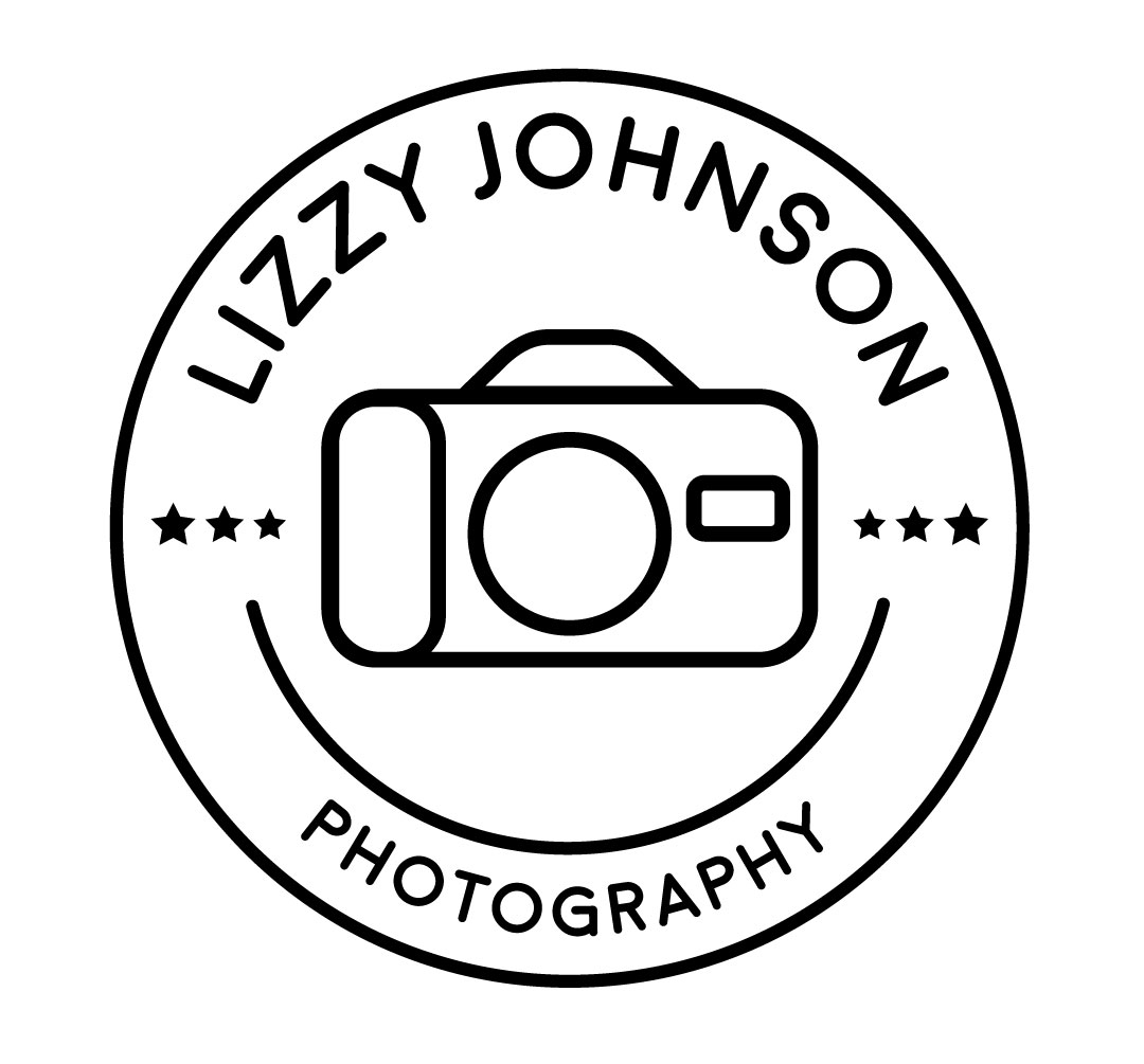
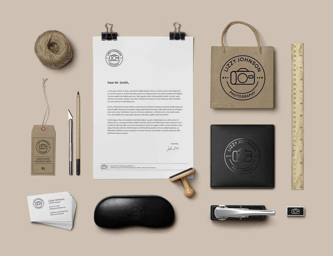
I also scrapped a few things with the Photography logo as well. Instead of using an “Established” and “2016”, I replaced them with three stars on either side of the camera. I’m still building my portfolio and trying to put my best work out there, and I decided that showing how young my brand was wouldn’t really help. I completely got rid of the pencil and added a circle around the logo. Since my inspiration for my design was vintage stamps and camping logos, I realized that having a circle encapsulate the design really helped pull the entire thing together, and with the accent line underneath the camera helped make the logo turn more into a target with the camera lens being the bulls-eye.
I’m really glad I decided to refine my logo to make it look the best it could be. I think it really reflects my personality, style, and love for simplistic design. I can’t wait to use this in the future!