
I’m gonna be honest: I did not think I could pull this project off. When my professor told us we had to recreate a photo realistic clock with merely four weeks of experience in Illustrator, I was ready to just give up at that second. But after seeing all the results from past students, I felt a sudden surge of confidence that maybe this was actually possible.
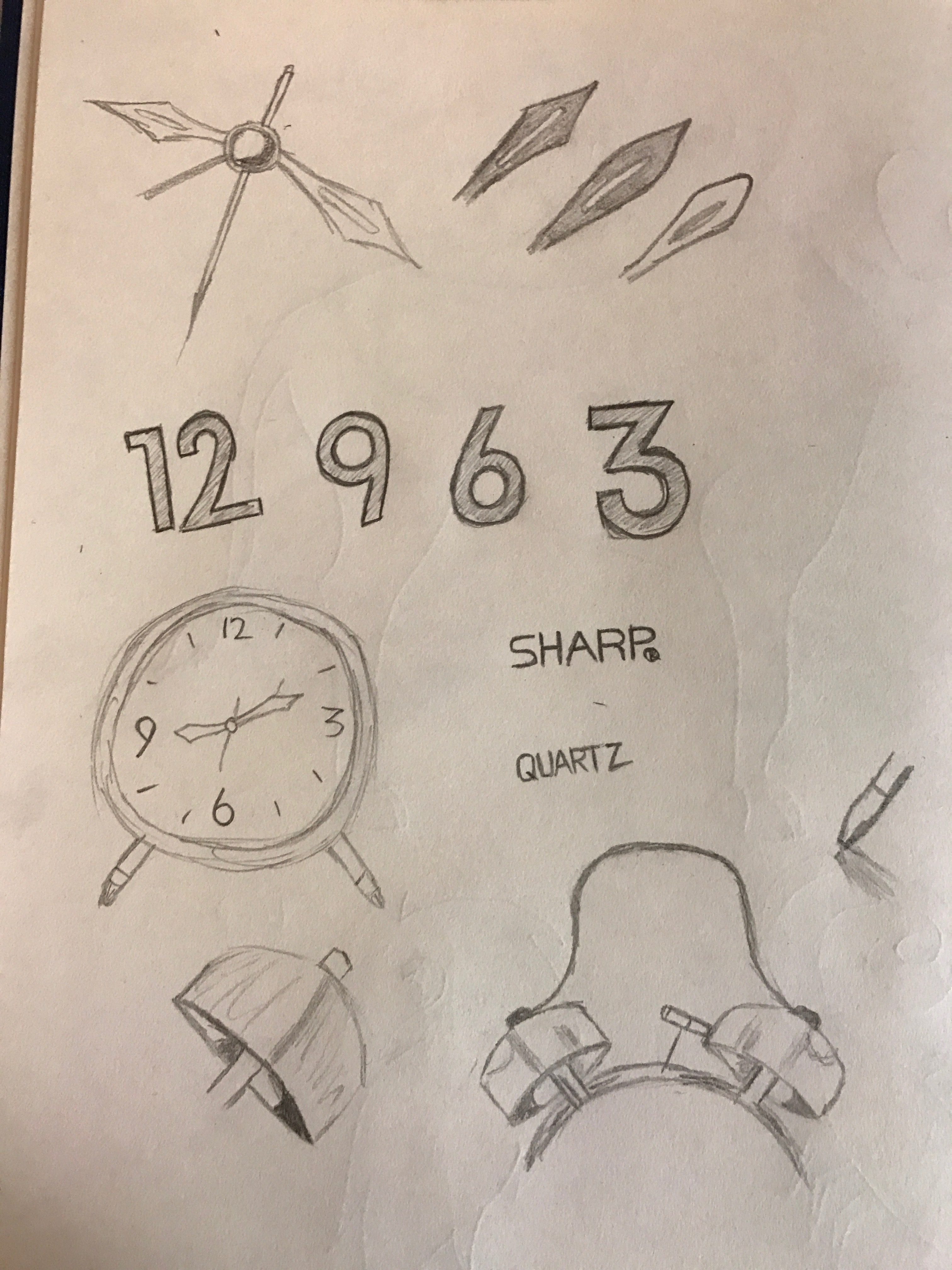
SKETCHES
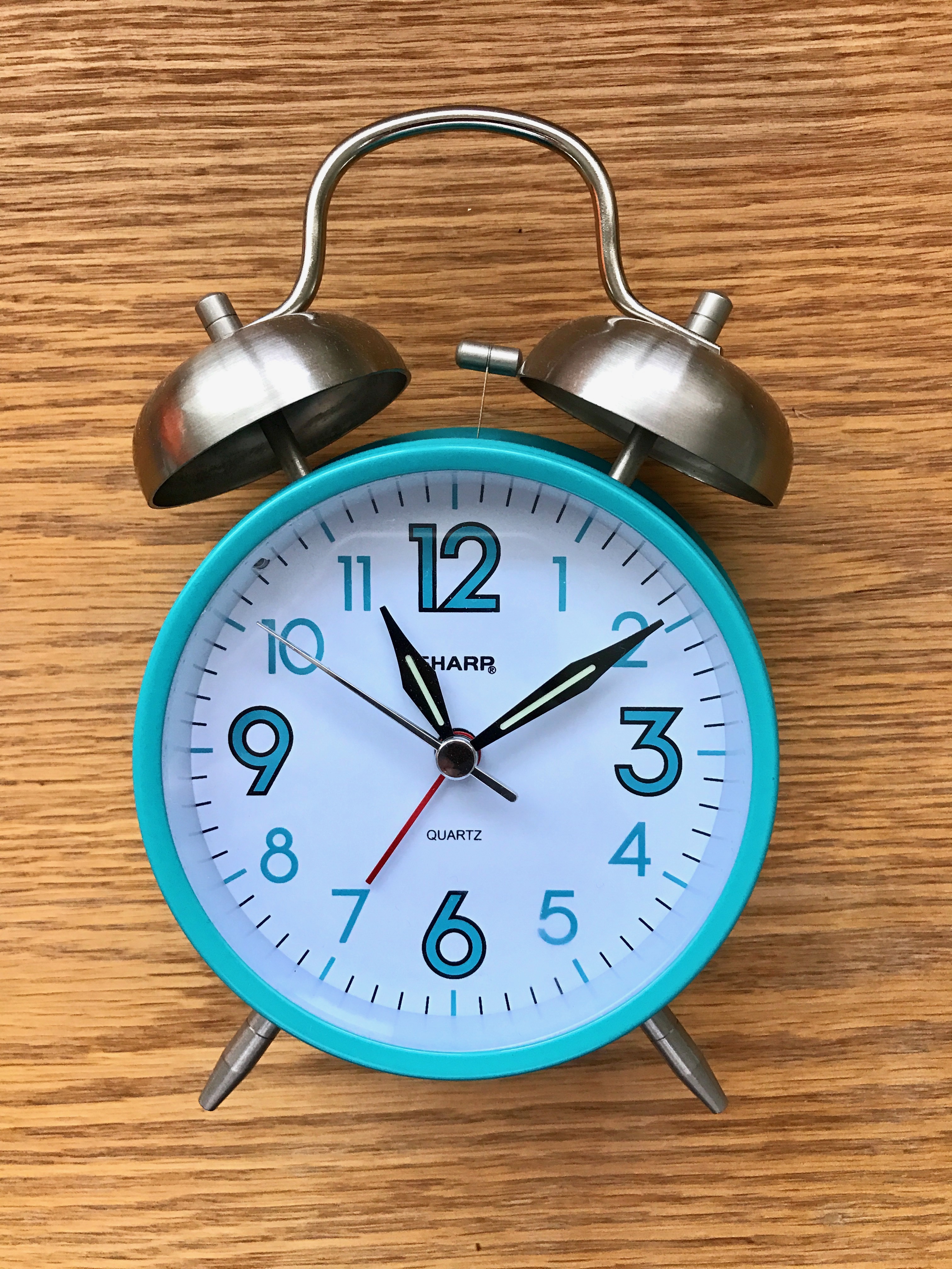
My roommate has this really cute teal alarm clock that she uses to wake up, and when I learned we had to do, I knew I wanted to try and recreate her alarm clock. For my sketches I set her clock in front of me and tried to recreate elements that stood out to me. I practiced drawing the elements that stood out to me the most: the bells, the numbers, and the shape of the hour and minute hands.
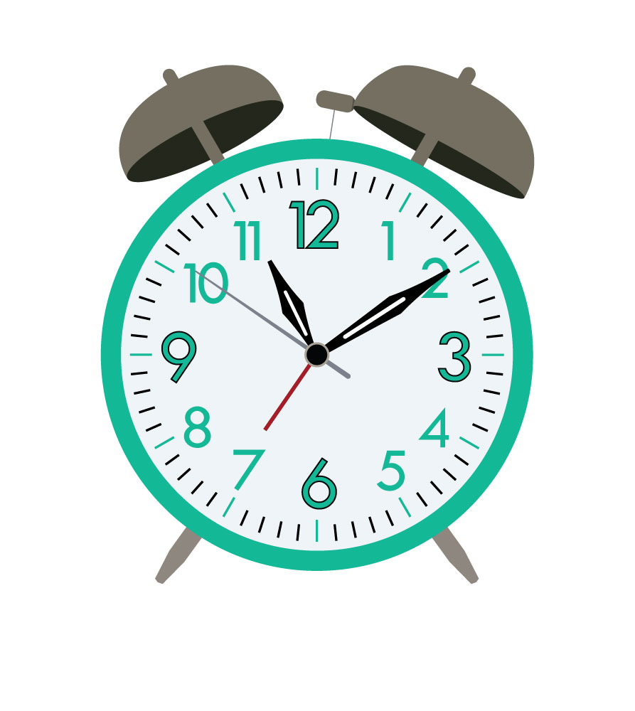
DRAFT
I was a little intimidated about figuring out how to do all the proper and shading–especially on the highlights of the two alarm bells, so I decided that I would first get the shapes of everything down first. Start with the basics and then work my way up. This actually turned out to be a good decision in the long run, because I didn’t have to recreate any of the shapes. I still wasn’t happy with the shapes of the bells initially, though, so I did eventually have to redraw those.
FINAL
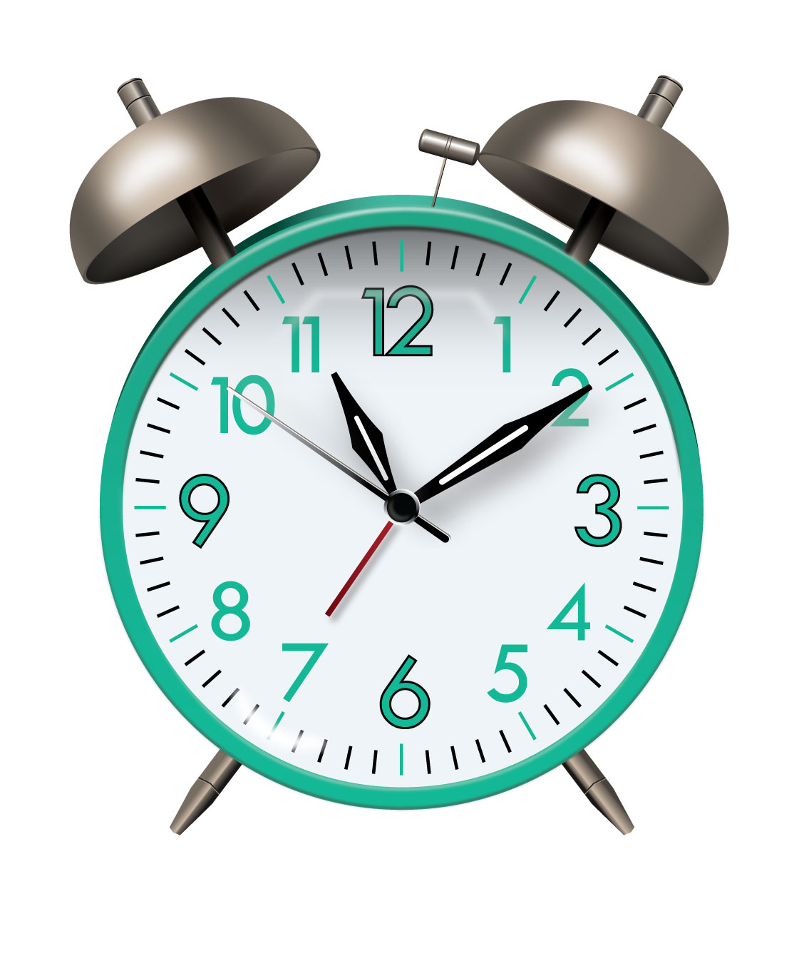
After I got some help on the alarm bells shine and highlights, I finally tackled the rest of the clock, and after getting the help I needed, it was actually a lot easier than I expected! There were a lot of small details that I hadn’t noticed in my initial photos, so I had to make sure to include those in my final draft to make it look as realistic as possible. But all in all, I am really happy with what I achieved! I never thought I would be able to pull this project off, and I’m really happy with what I’ve learned from it as a result–gaussian blur, gradients, and how to add depth to objects.