
For this project, I was asked to find a product that could use a design overhaul, if you will. I went to the store and wandered the aisles for a few minutes and found myself gravitated to the candy aisle. I think half the reason why I went down there was because I was craving chocolate, and it was a good thing too because I was able to find the product that I wanted to do a package redesign–a Hershey Symphony Bar.
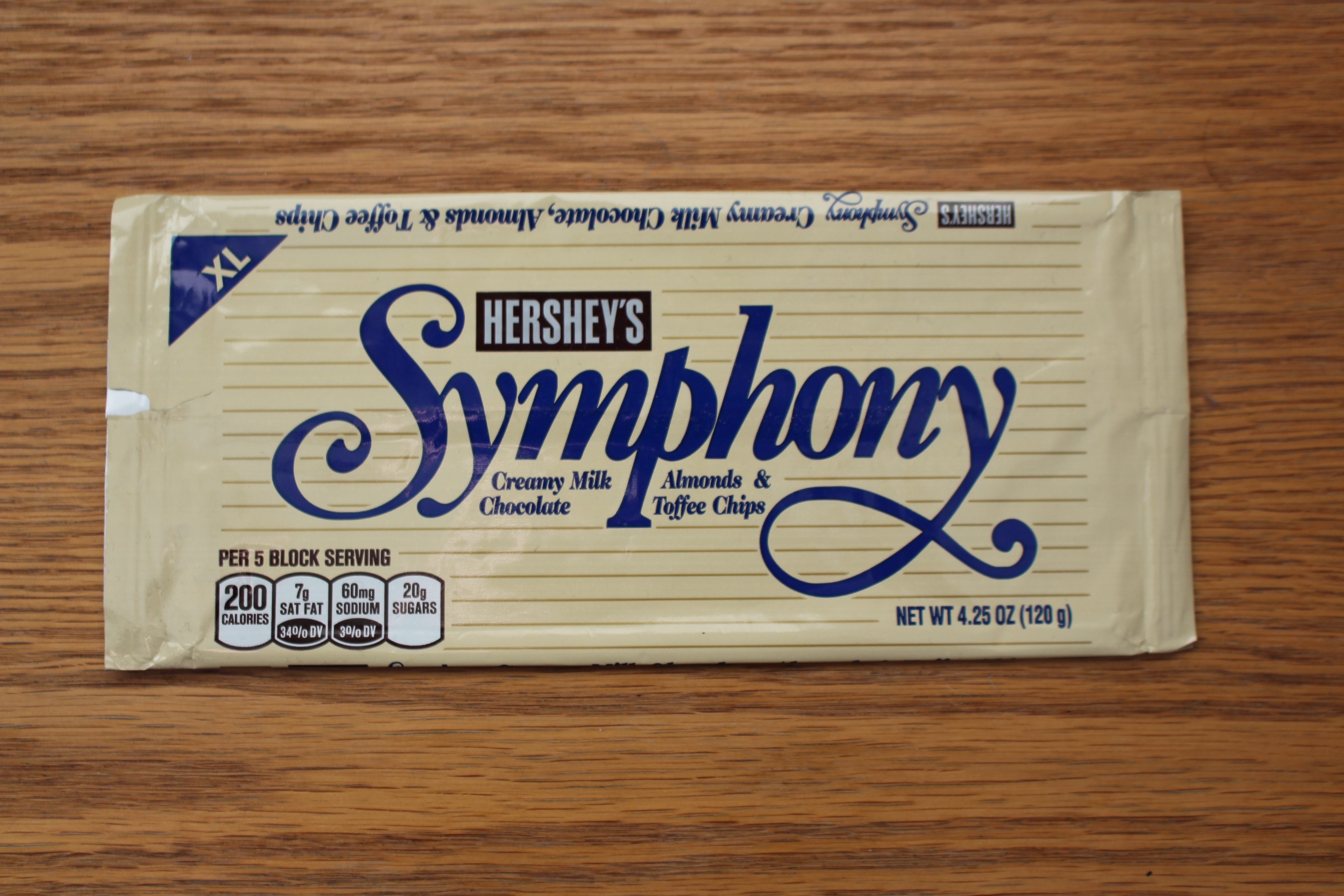
I’ve always found the packaging being a bit bland. I did understand that it’s wanting to look more elegant in comparison to a regular Hershey Bar, but the beige and navy blue seems a bit outdated and, to me at least, a little boring. I wanted to make the design more eye catching and exciting to potentially bring in younger consumers who had never tried or heard of a Symphony bar by adding brighter, more eye-catching colors and a more lively font. I also noticed on the original design, there was no reference to music or symphonic elements at all, and I wanted to include those as well.
INSPIRATION
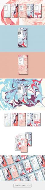
I went to Pinterest to try and find some bright packaging inspiration. I found these two packaging designs by Aoshuang Wang and, unfortunately, and artist I cannot find, with their colors to be very influential in my final design
SKETCH
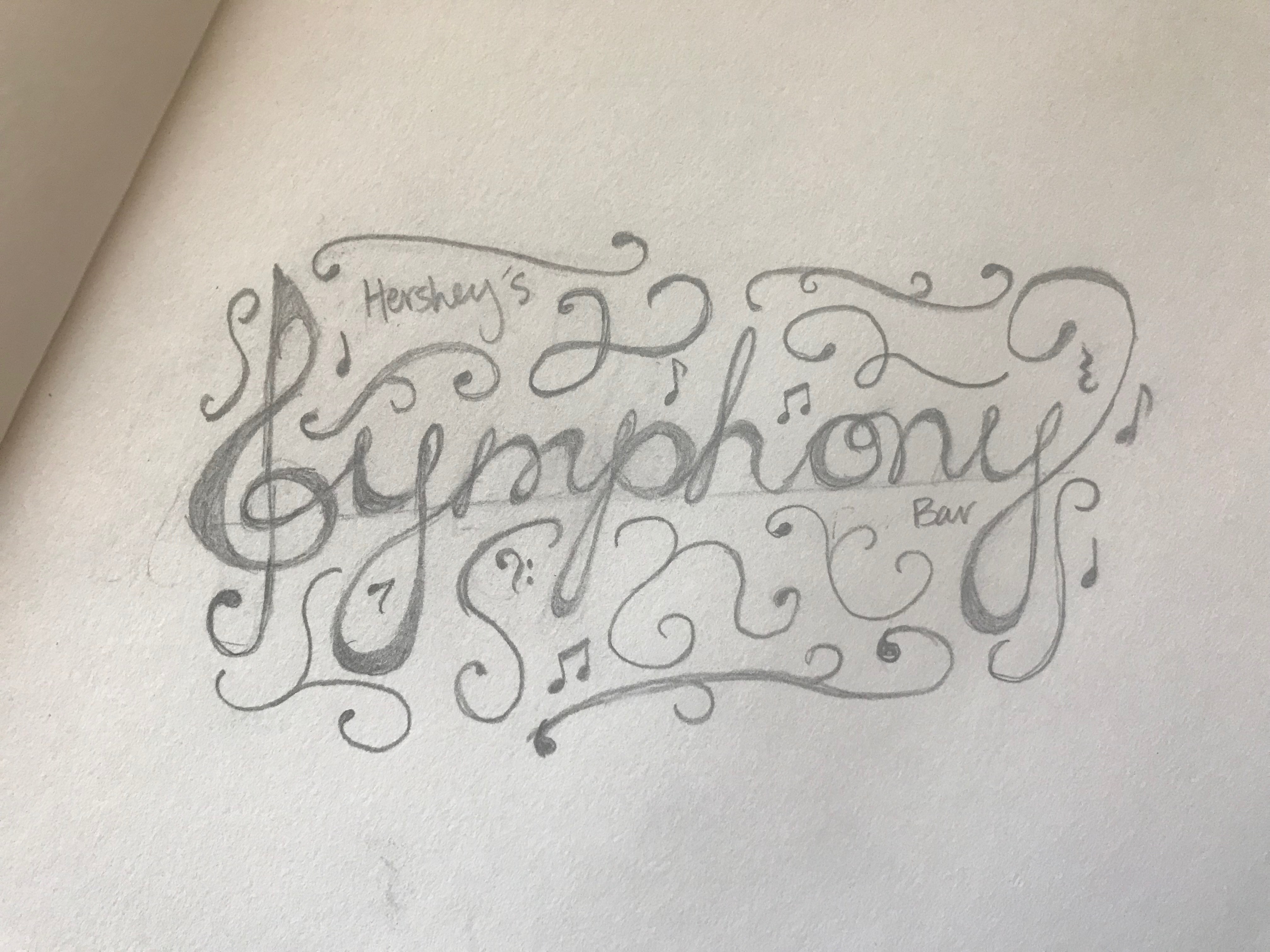
I initially wanted to try my hand at hand lettering and calligraphy, and I was really pleased with how my initial sketch and idea turned out. I incorporated a treble clef as the capital ‘S’ for Symphony, and then added swirls and curlicues around the cursive to make the design more cohesive. I then added small musical notes, rests, and an additional bass clef to include the elements of music. But, as I’ve come to realize, your initial design and idea usually doesn’t work out.
TEMPLATE
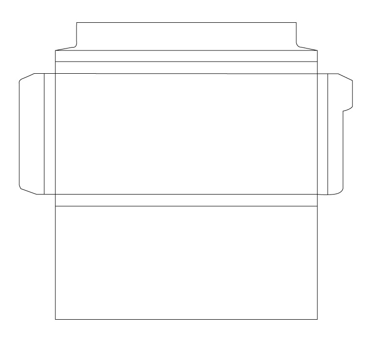
The original design of the Symphony Bar comes on a flimsy plastic that you’re supposed to rip apart, and that would be nearly impossible for me to try and find some way to print on plastic and seal it shut. So instead what I did is return to the store and find another chocolate bar of the same size that used cardboard or cardstock to create a template to make a new small box for the chocolate. I found a Lindt chocolate bar that had the perfect size and carefully scanned it into the computer.
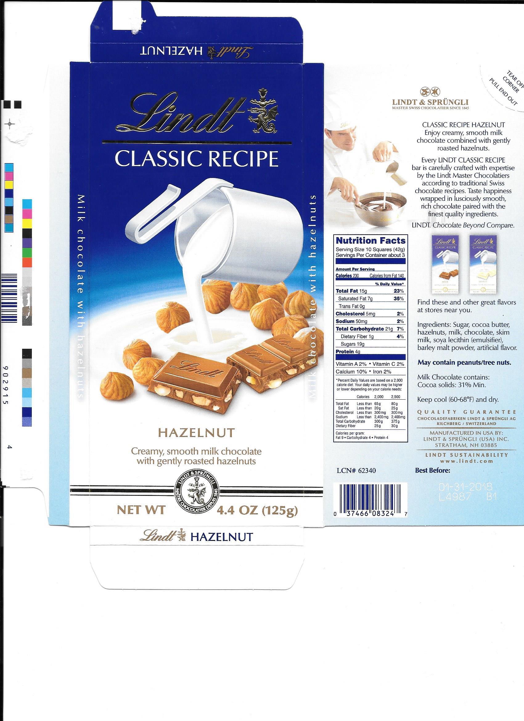
I then traced the scan and all of its folds to create the perfect template, and then turned it on its side to follow the direction of the design I wanted.
DRAFT

I found this beautiful color scheme on Adobe Color and I was really drawn to the blue and light tans. Using the last two colors in the color scheme still reflects the old design, but still gives a brighter, fresh take. Once I decided on my color scheme, I imported a picture of my sketch into Illustrator and wanted to trace my lettering. I originally tried with the pen tool, but it wasn’t looking the way I wanted, so I decided to redo it with the blob brush tool instead.
However, as I looked at my design, I really just did not like how it looked. When I used the blob brush tool, I didn’t have a pen and tablet to trace it by hand. I instead had to use a mouse to trace it as best as I could, and it was just not looking how I imagined it. So instead, I scrapped the hand lettering all together and instead went for a thick, old timey font.
INITIAL REDESIGN
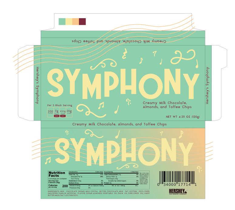
I got rid of most of the swirls, and only kept the three that I liked the most. I also added a wavy musical staff to incorporate more musical elements to the design. I also copied the actual nutrition facts and portion sizes, and created a bar code and UPC that I’m pretty sure would actually work. However, after receiving some feedback, I knew that there could be a few more tweaks to be made.
FINAL REDESIGN
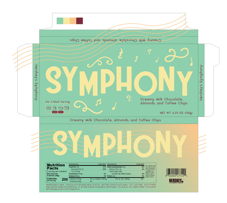
There were a few tweaks to the details that I needed to make. First, on the right side of the template, the Hershey’s Symphony was floating too close to where the fold needed to be, so I brought that text down just a hair so it would be better centered. I also fixed the alignment of a couple music notes and the “Creamy Milk Chocolate” on the front of the package, made the bar code smaller and the nutrition facts bigger, and then got rid of all the swirls and music notes on the back of the package. I felt like it was too crowded and sporadic around the back SYMPHONY, so I removed them all together to keep the design simple and clean.
FINAL PACKAGE
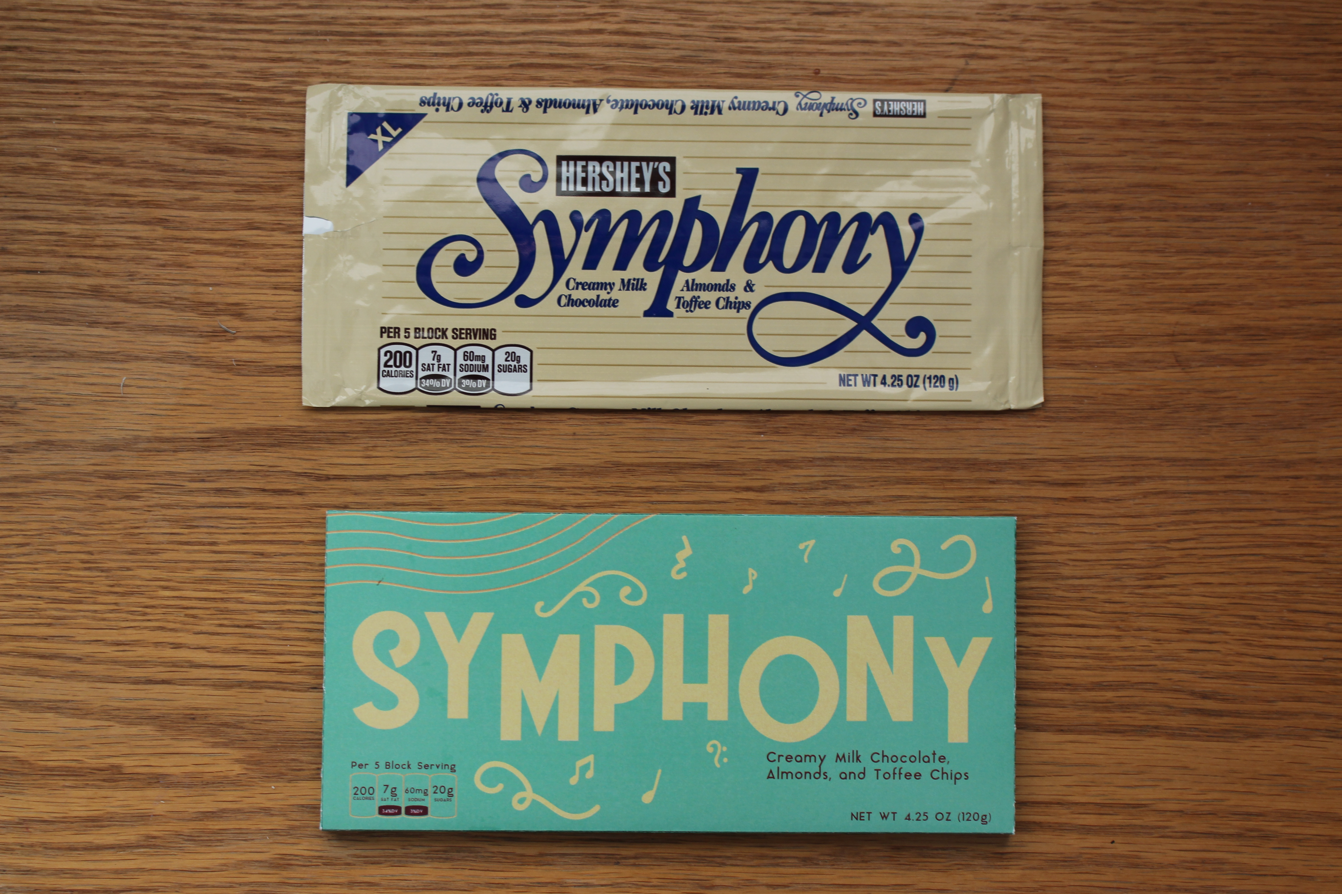
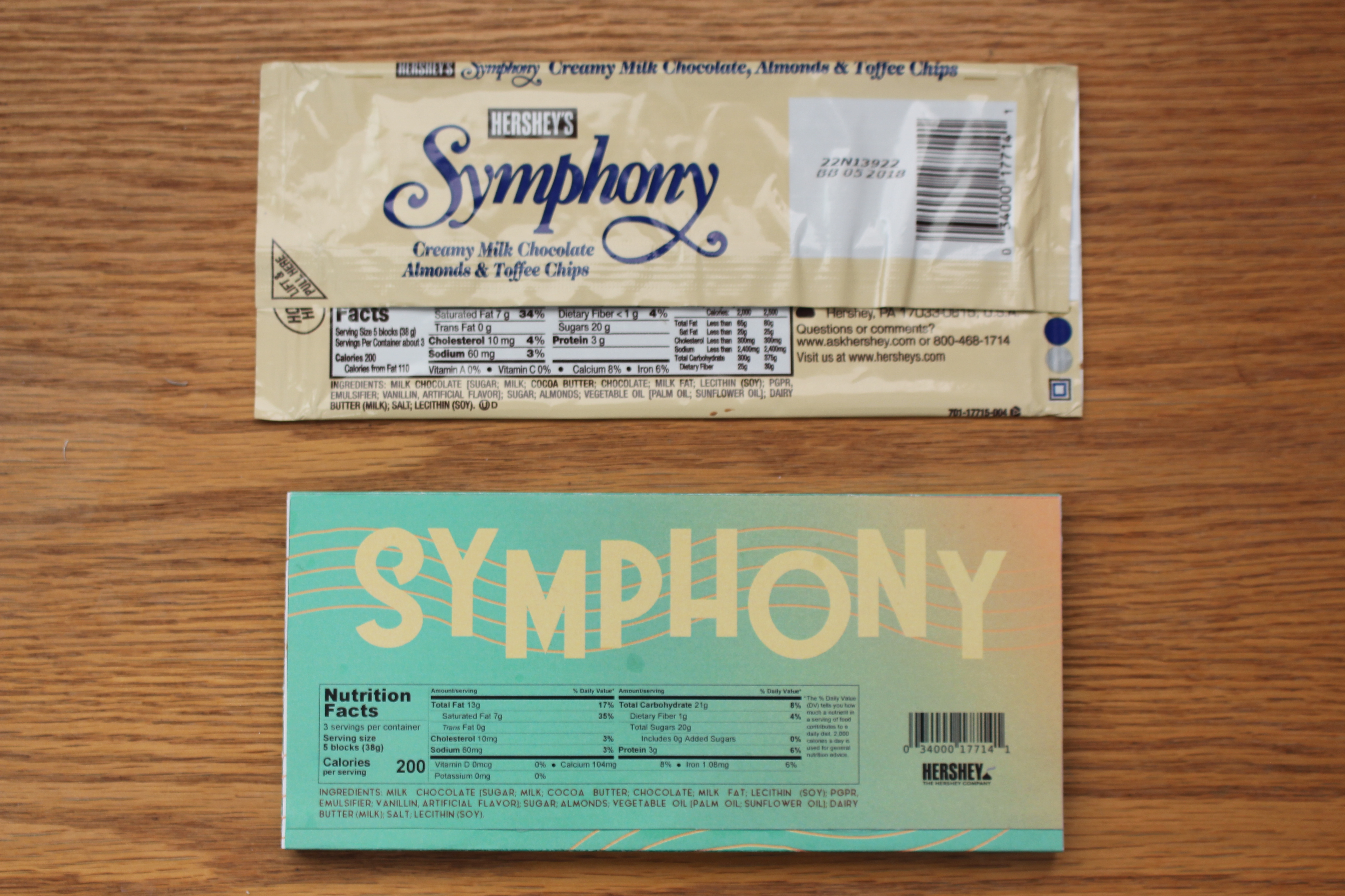
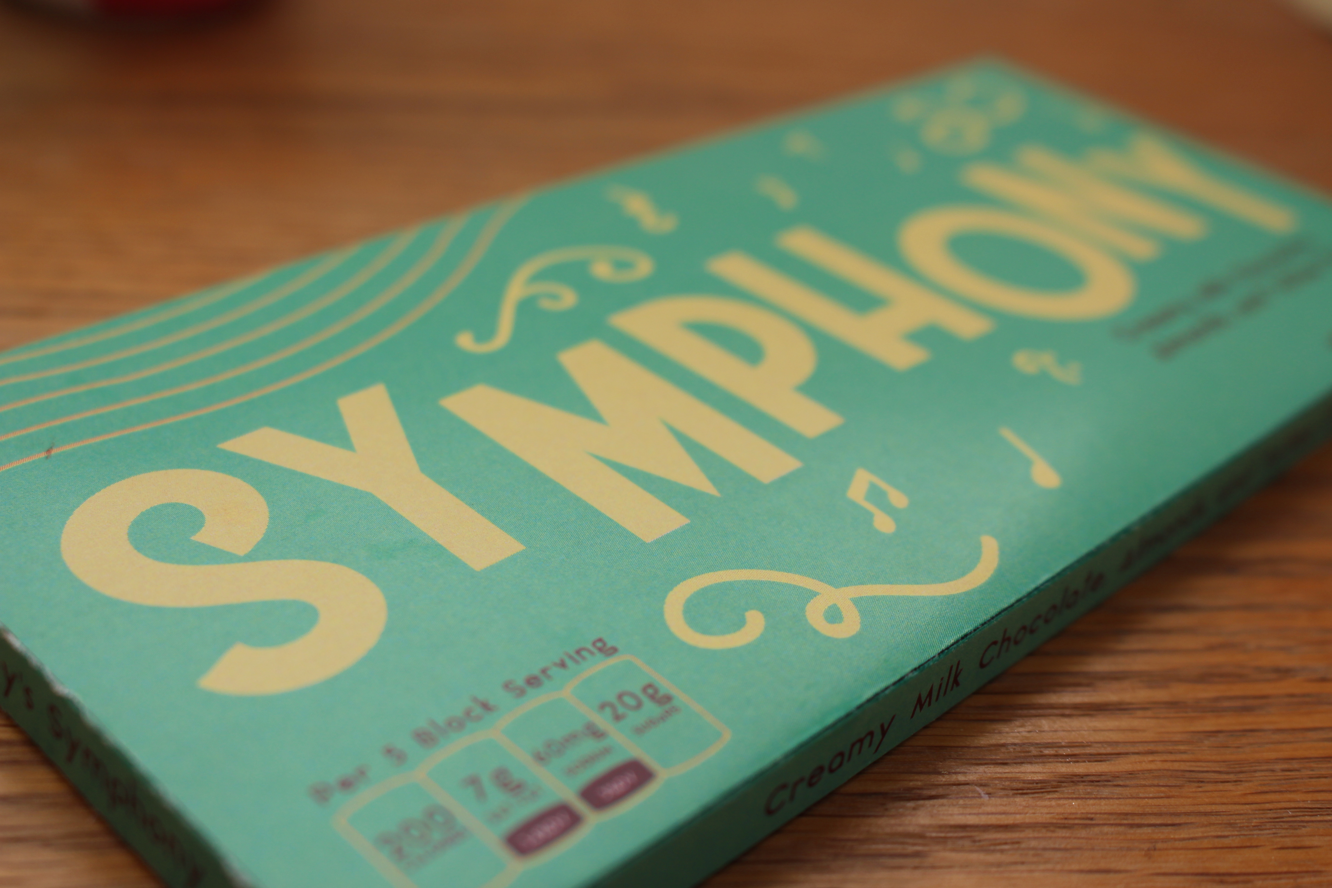
I am so, so happy with how this turned out! I was able to print this, get the dimensions right, and fold it perfectly on the first try. I didn’t have a scoring board or a bone folder, so I had to use some ingenuity to get the folds right on the cardstock without the paper cracking. I used the end of auxiliary headphones and a sewing ruler to press creases into the paper to make it easier to fold, and then unwrapped the Symphony chocolate bar and placed it inside my own packaging. And amazingly, it fit! It folded over the bar perfectly and I used a little bit of Elmer’s White Glue to seal the packaging shut.
I’m hoping with this new redesign it will attract younger and newer consumers and their curiosity of what the chocolate bar tastes like. The incorporation of musical notes and elements also brings together the design with the name. This project has taken up a lot of my time, and honestly, the pay off was completely worth it. This chocolate bar would look perfect sitting on the shelves of a grocery store.