
I’ve loved Harry Potter since I was a little kid. I started reading the books when I was around 1st or 2nd grade, and I’ve been obsessed with them ever since. I try to reread the books every summer, I’ve seen the movies more times than I can count, and I own several pieces of Harry Potter merchandise. Needless to say, when I was asked to create an infographic on anything I wanted, Harry Potter instantly came to my mind. I’ve always been interested in the differences between the US and UK texts, and the amount of thought that went into creating the names for spells, so I settled on doing my research on the Language of Harry Potter.
SKETCHES
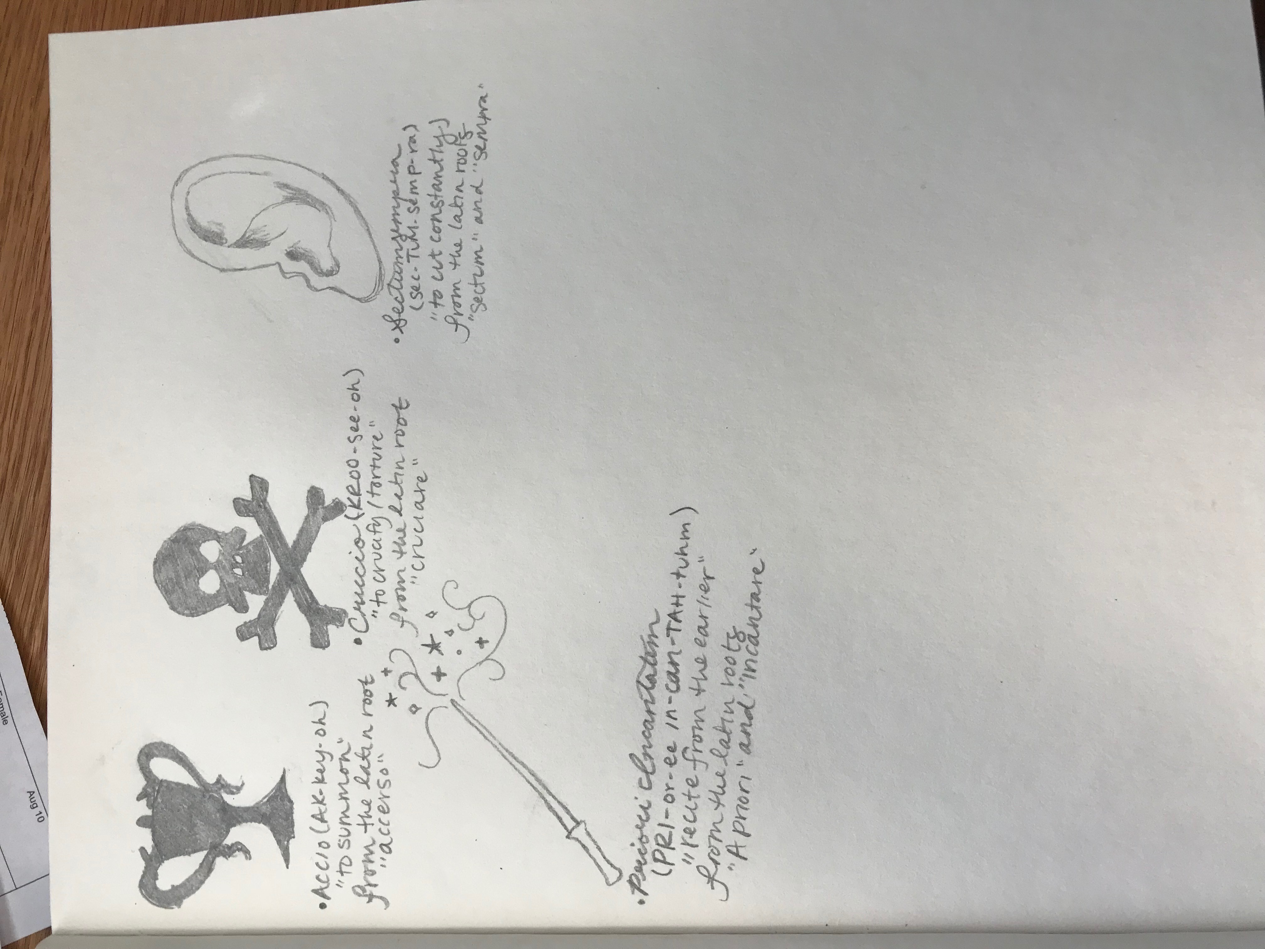
I knew that this would be a big project, so I did a ton of research and then slowly condensed that research down as I began to sketch. There are several ideas and drafts that I ended up scrapping while sketching simply because I didn’t have enough room. I still had a ton of fun. Seriously, I could not have been happier just drawing Harry Potter related doodles in my sketchbook for a few hours.
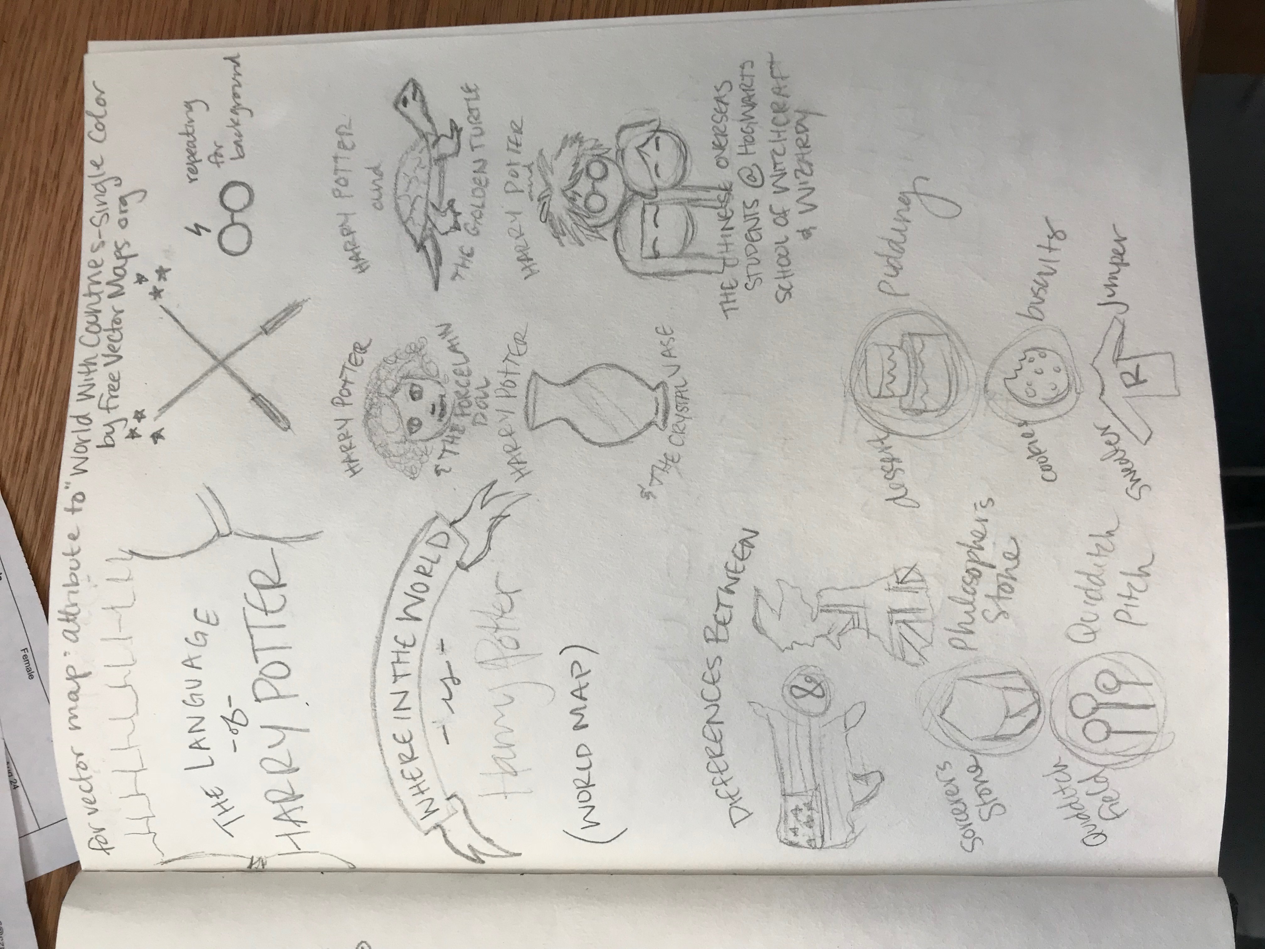
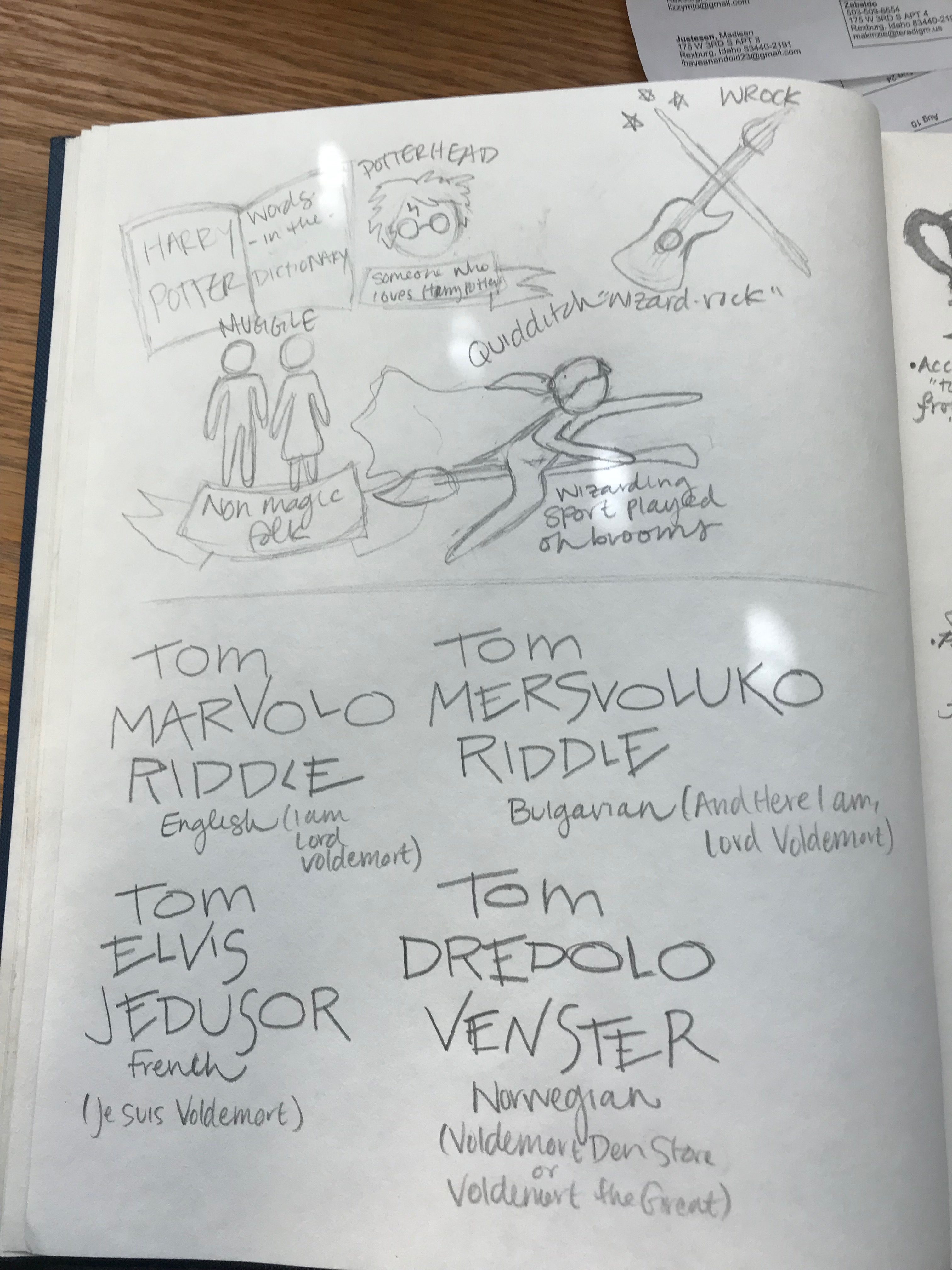
As you can see above, I had a few sketches that weren’t used in the final graphic, such as Chinese bootleg versions of the 7th Harry Potter book, different translations for the name “Tom Marvolo Riddle” and words that were created for the Harry Potter series that ended up in the Oxford English Dictionary.
ICONS
My favorite things that I made for the infographic were the small icons that showed the comparison between the the United States version of the Harry Potter and the United Kingdom version. Slang and terms are different depending on which country you’re from, even if both places are English speaking. I always found it interesting that the UK version of the first book is called “Harry Potter and the Philosopher’s Stone”, and that definitely stemmed my inspiration for this segment of the infographic.
![]()
I settled on four words for these icons: Sorcerer’s Stone/Philosopher’s Stone, Quidditch Field/Quidditch Pitch, dessert/pudding, and sweater/jumper. I wanted to create them as simplistic as possible while still getting the idea across as to what each item is. My favorite is either the stone or the cake. I still can’t quite decide!
INITIAL INFOGRAPHIC
As I was creating the infographic, I wanted to pull even more inspiration from the books themselves: specifically the third book and the Marauder’s Map. I love how in the map the footprints of each character are labelled with a small scroll with their name floating alongside, and I wanted to incorporate that into my design.
![]()
I struggled for a while coming up with a color scheme for my infographic. I knew I wanted to use the classic gold and red of Gryffindor house, but I didn’t really know what other colors to use as an accent. However, when I came up with the idea of using the Marauder’s Map as inspiration, the other two colors clicked in to place: a deep maroon color and navy blue as an accent color.

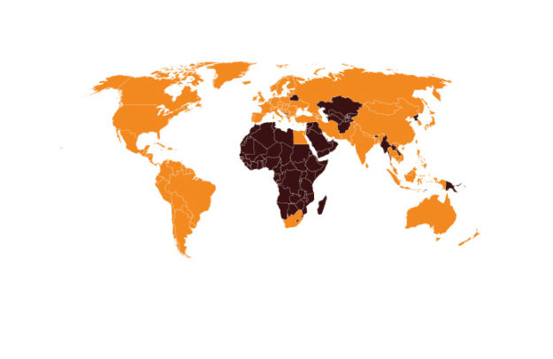
I also designed the majority of what you see on the infographic. The only thing I needed a little help with was for the background, the world map, and the US and UK icons. Other than that, I created everything else myself. It was time consuming at certain times, but I think overall it was completely worth it. I was able to find the parchment background on Vecteezy.com, and it was designed by the user carterart. I also found the map online as well, on FreeVectorMaps.com. It was really helpful finding a detailed world map that I didn’t have to completely design from scratch!
 FINAL INFOGRAPHIC

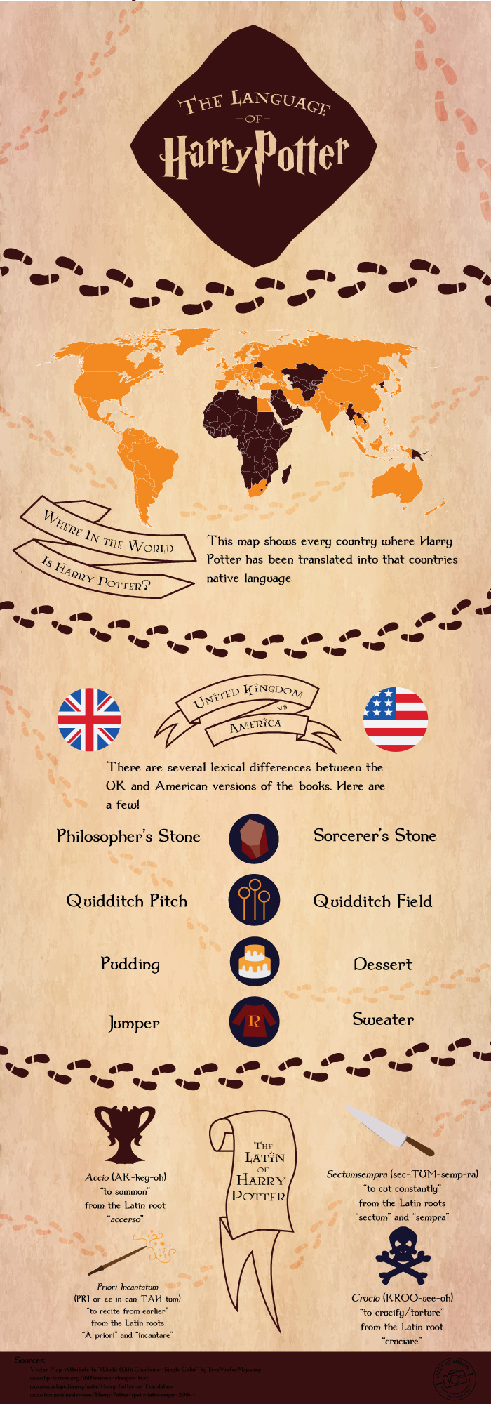
While I drew my inspiration from the Marauder’s Map, I felt like I was still missing one of the key elements of the map itself: the footprints! I noticed that there wasn’t much of a division between the three sections, so I created a custom brush in Illustrator that mimicked the footprints that are seen on the Marauder’s Map and used the maroon color as a division between the three sections. I also created some faded footprints as well to wander through the sections–just like in the credits at the end of the third Harry Potter movie.
In the original design, in the second section, I had ribbons for every word difference between the United States and the United Kingdom. I decided however that it was too cluttered and distracting, and instead changed it so only the section headers would be in the scrolls and ribbons. I also added two descriptions to the first two headers to help make the information in that section more clear.
Finally, I decided the main title needed to be spruced up a little bit, so I roughly modeled the title off of the seal of the title of the Marauder’s Map.
I am really happy with my infographic. I think I stayed true to the idea and aesthetic of Harry Potter and the Marauder’s Map, and this project especially has just gotten me excited for even more Harry Potter related designs I can create.
I even pinned my infographic on my Design Pinterest board. Check it out! https://www.pinterest.com/lizmjo/design/